My personal investigation is about photography and the subconscious, particularly the impulses that a photographer will feel relating to their photographic intuition, the conveying of thoughts or feelings via an image and the artist & viewers immediate responses to images.
Artist Research
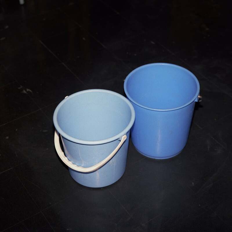
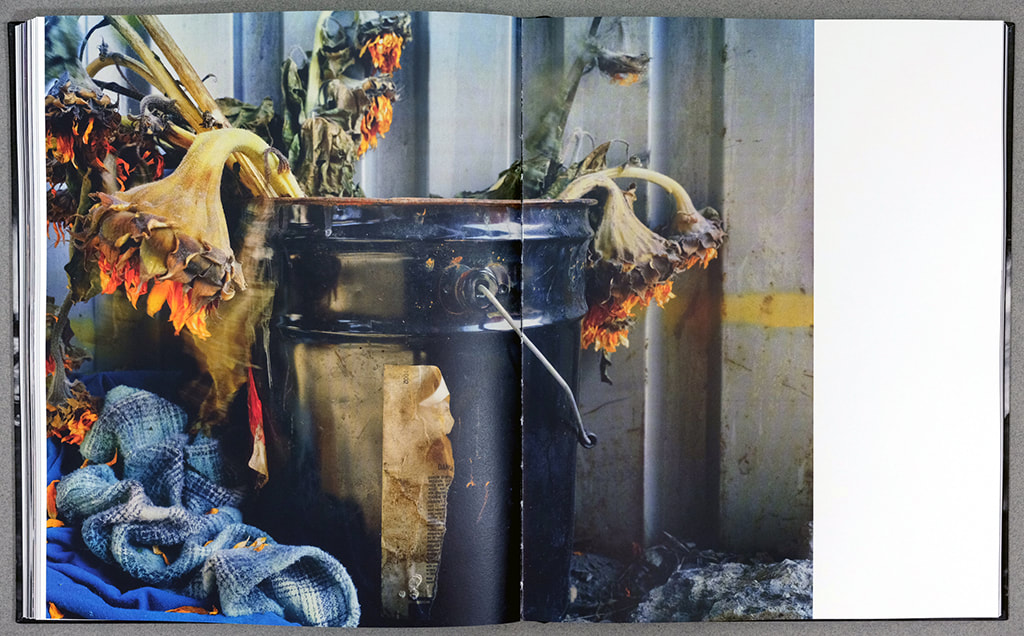
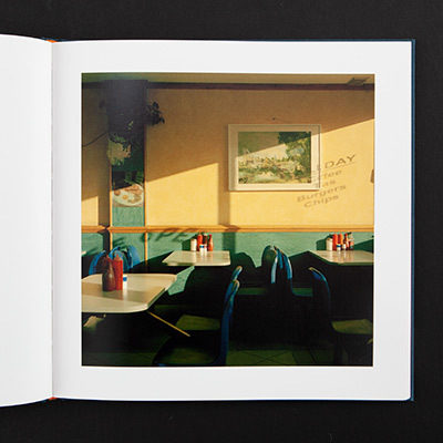
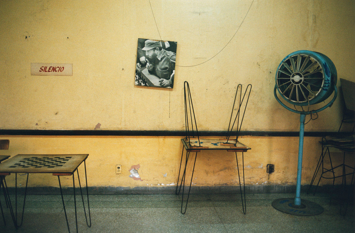
Peter Fraser
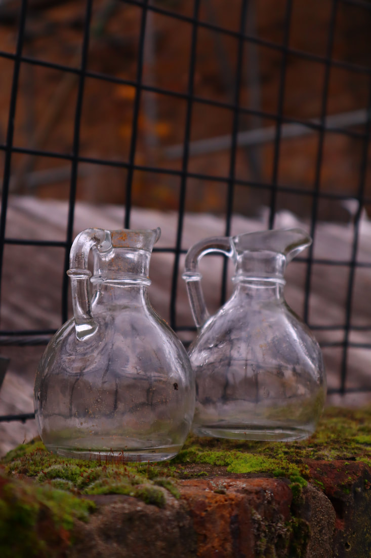
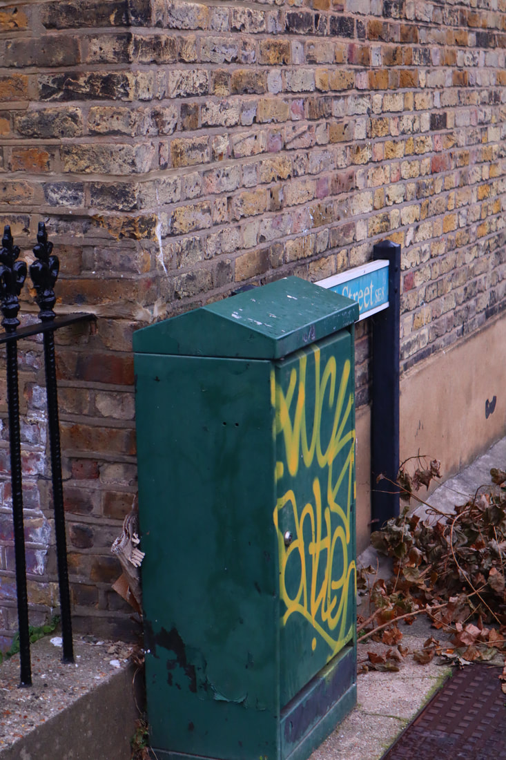
Fraser is a British Photographer who was born in 1953. He rose to popularity with his award winning photobook 'Two Blue Buckets' and is known for his style and approach to photography.
His images are often of everyday objects (see below) and use colour and composition in a way that draws the viewer in.
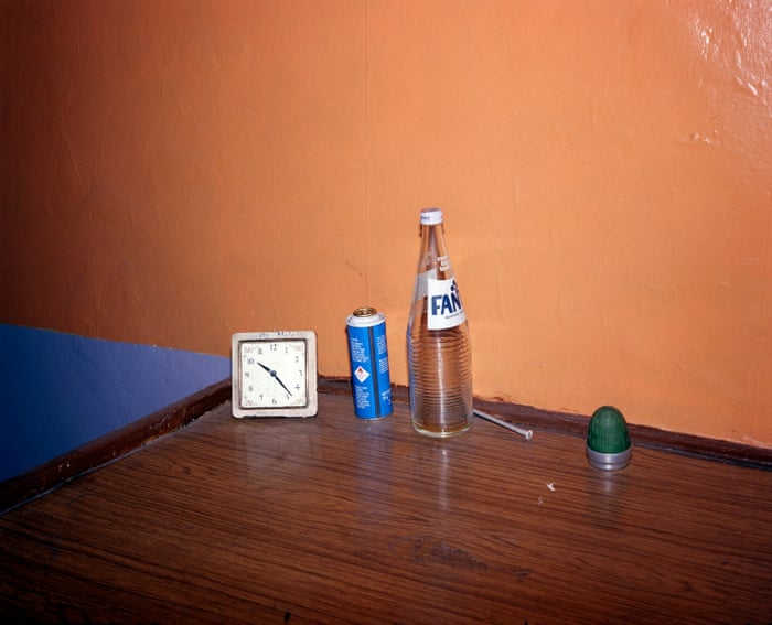
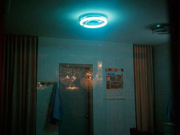
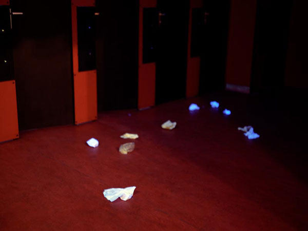
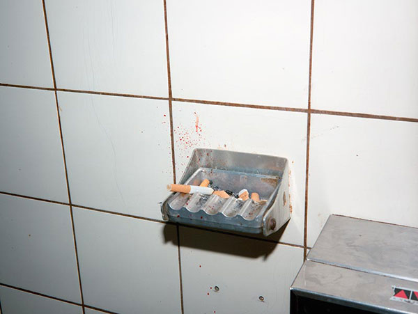
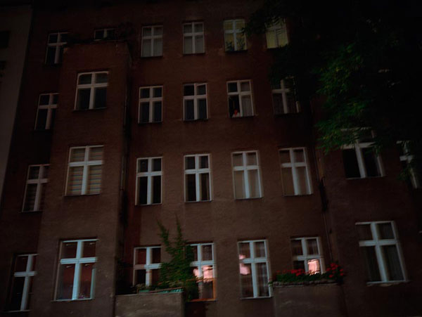
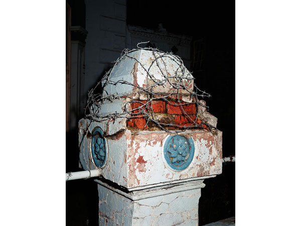
Paul Graham
Paul Graham is a British photographer who works and resides in New York. He started photographing on coloured film in the early 1980's, this revolutionised British documentary photography as the genre consisted mainly of black and white film photographs. After this, many artists switched to colour photography as they saw that it would allow more information to be captured.
His project "New Europe" (1986 -1992) shows the mundaneness and the overlooked elements of 'new Europe' to the viewer via the medium of photography. This project uses colour and vibrance to make this interesting, the four pictures below are examples of this. The left image appearing to be of a bathroom, the middle left being of a dance floor with discarded rubbish on it, the middle right including an ashtray with cigarettes and the bottom left being of a post with barbed wire wrapped around it. If these were not captured images but in front of the viewer, they would have walked past these objects because they are mundane and parts of all of our lives.
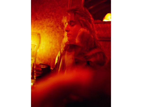
JH Engström
Engström is a Swedish photographer and visual artist. He has studied and applied photographic techniques at the Gothenberg University school of photography and also spent time working in Robert Frank's New York studio in the late 1990's.
His work features portraits of social situations, belongings and urban settings. I'm very interested in how he pairs these genres of photography together as I have multiple ideas for my pieces in my Personal Investigation and am trying to think of ways to 'marry' them and have them co-exist together in the same body of work while keeping the work cohesive.
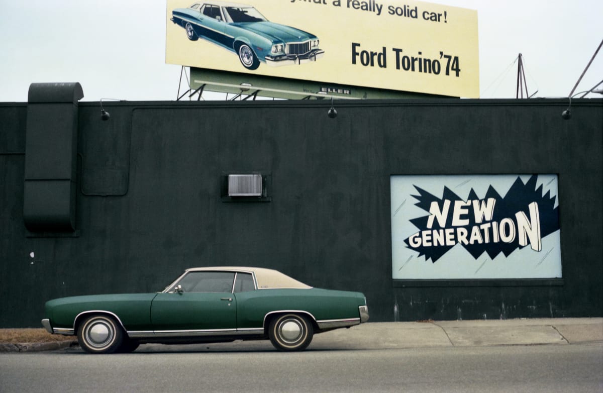
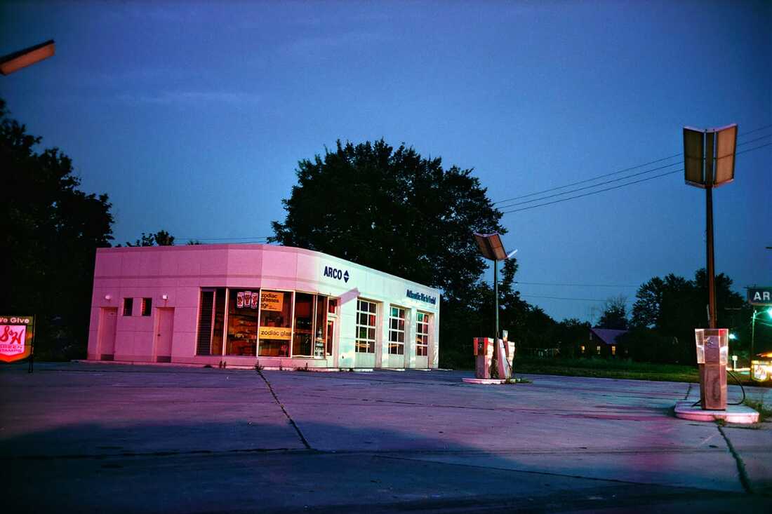
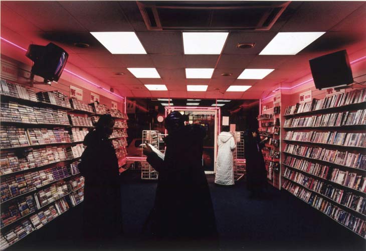
William Eggleston
Eggleston is an American Photographer who is widely credited as bringing colour photography to the forefront of the art world, alongside proving it's value as an art-form. His work captures the interesting and the brightness of everyday life in his area / his environment. His brightly coloured work is highly recognisable and a very big inspiration point for many younger photographers, such as myself.
Upon seeing some of his work I immediately saw how this work was similar to mine in the way that I aim to capture colour and the vibrancy of everyday objects & occurrences as he does in the images below.
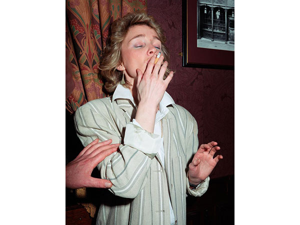
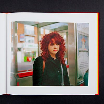
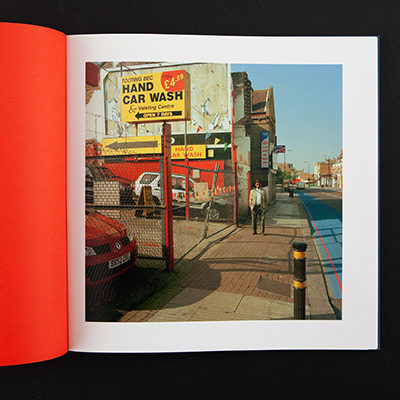
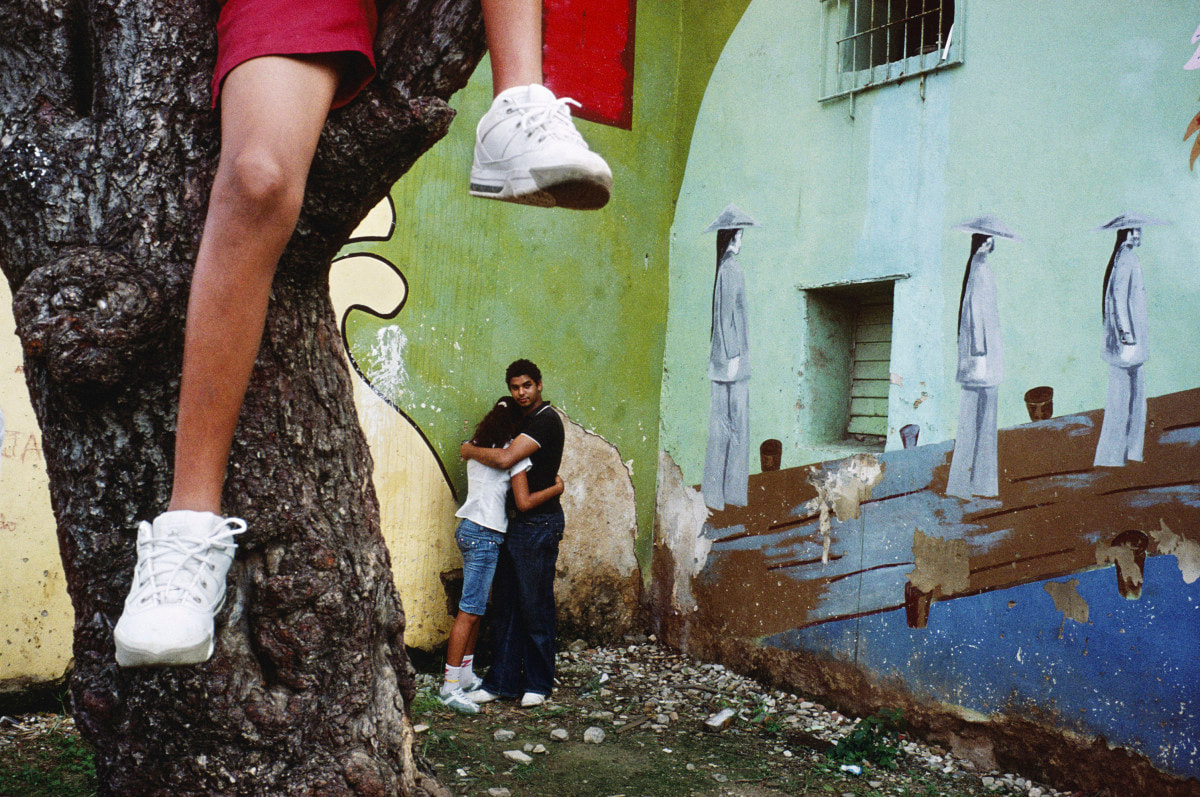
Niall McDiarmind
McDiarmind is a Scottish Photographer who primarily takes street portraiture images and documents the 'British Landscape'. He has made 5+ photobooks documenting his travels around his area, London in general and other places in England, along these travels he meets and photographs people who are in the same space as him in the same time and the places that he goes through on his journey, such as cafes and roads.
I feel as though my work where I'm photographing inside of places or along streets is quite visually similar to his work with that subject matter, The similarities were first pointed out to me by one of my teachers who compared my work to his in terms of how we both capture colour, shadows and the general composition of these images being very similar but slightly different at the same time.
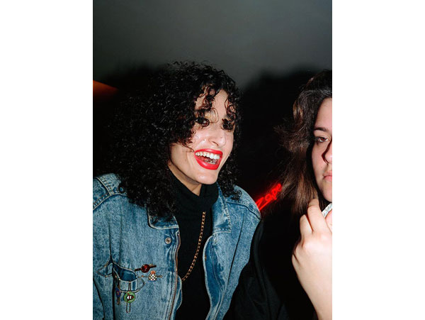
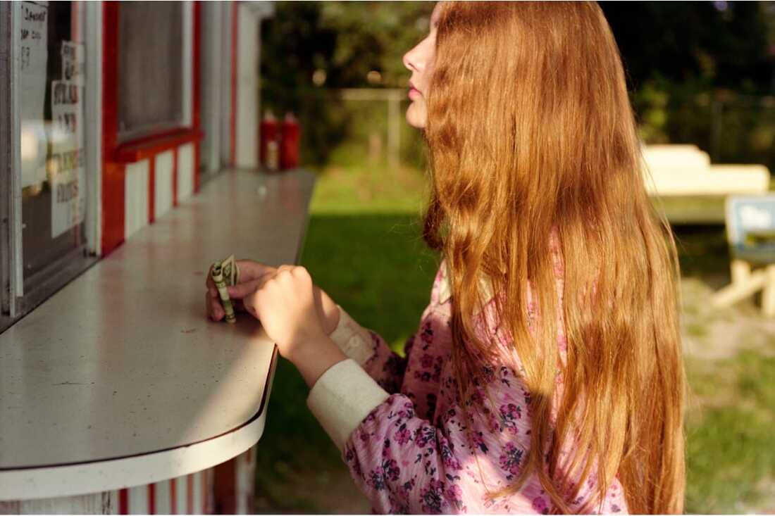
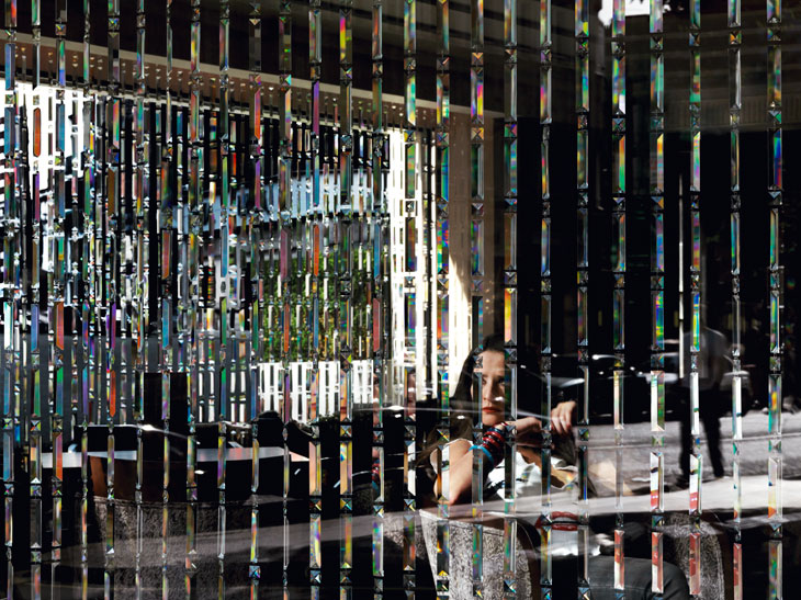
hannah starkey
Starkey is a Female photographer from Belfast, Northern Ireland. She typically creates stage photographs of women in everyday settings, for example, shops, cafes, rooms & in the streets. As seen in the images below, her work looks quite cinematic in terms of the saturation, vibrance and exposure that all work together to build the colour of the images.
My work is quite similar in this way that I try to create a distinct style in terms of the colour and composition of my images in the same way that Starkey does.
Alex Webb & Rebecca Norris-Webb
Rebecca Norris-Webb is an American photographer who was originally a poet. She uses her talents in both medium to pair text with her photographs, as she did in her 2012 publication 'My Dakota. These images relate to my work because these images focus heavily on colour, vibrance and the contrast between the colours that are featured in them. I feel as though my work also does this, my work is visually darker than these images but Mrs Morris-Webb's work especially the images ive chosen, have inspired me to incorporate more brightness into my work.
Rebecca Norris-Webb is an American photographer who was originally a poet. She uses her talents in both medium to pair text with her photographs, as she did in her 2012 publication 'My Dakota. These images relate to my work because these images focus heavily on colour, vibrance and the contrast between the colours that are featured in them. I feel as though my work also does this, my work is visually darker than these images but Mrs Morris-Webb's work especially the images ive chosen, have inspired me to incorporate more brightness into my work.
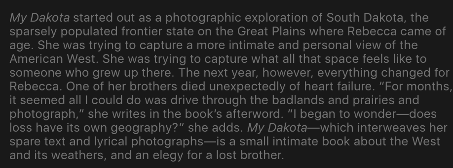
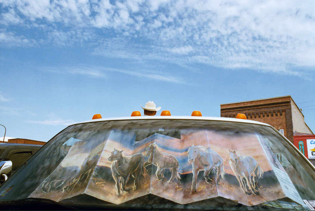
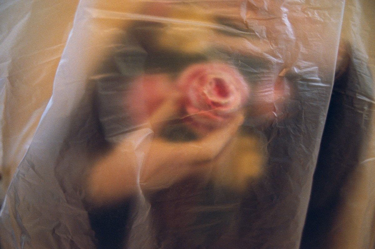
Her husband Alex's work is visually quite similar to hers. However, i feel that his work does not relate to mine in the same way that Rebecca's does. I've found that his work contains a lot more people than hers, which I feel that I don't necessarily want a lot in this project. However, I find his work so beautiful, especially the three images below. These capture the colour, the vibrance and the contrast perfectly. The left image looks as though it has a lowered exposure, which is something that I do to most of my images while taking them.
Text & Image.
The relationship between text and images is something that John Berger analysed in the form of looking at 70's Adverts and Publicity images, and also the way that this juxtaposed in magazines and other publications with images of the suffering that was and still is happening in the world. his criticism and analysis of this, with the fact that he said that advertising shows us 'to be rich we need to spend money on these objects' changed many peoples views on this medium.
there are many photographers and pieces of photography that i love that play on this relationship between words and pictures. this can be done via film, combining poetry with an image, writing onto an image or just making a general commentary on the image.
|
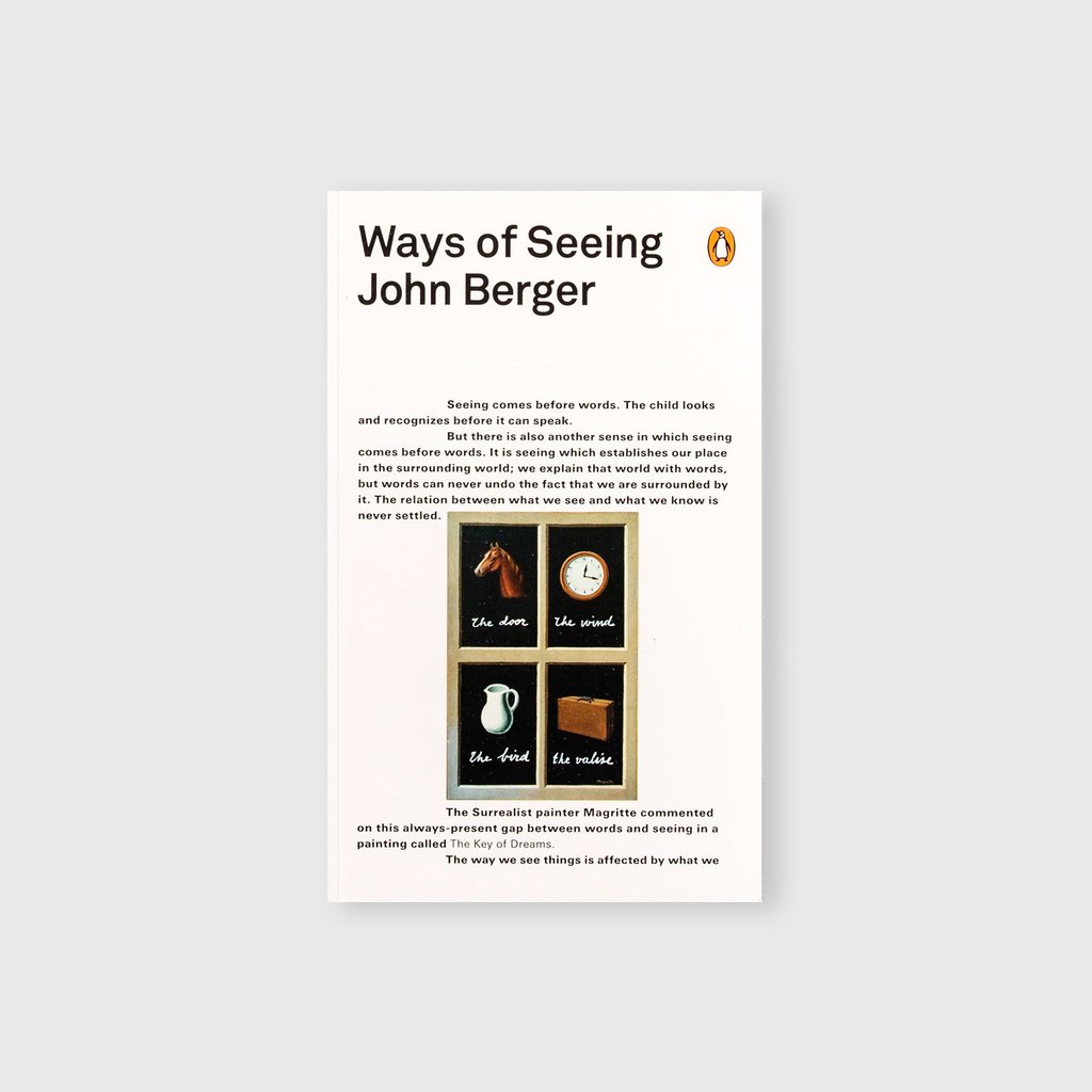
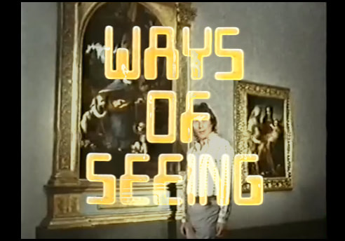
Ways of Seeing - John Berger
in 1972, a 4 part television series by the writer John Berger Aired on BBC2, this series challenged the way that the viewer saw art, advertising and 'new' colour photography. This series was then published as a book, further condensing Berger's ideas on viewing art into a 196 page book. This book focuses on the reader's relationship with the art that they are viewing, and in my opinion attempts to dissolve the viewers current relationship with the way that they see art. |
|
|
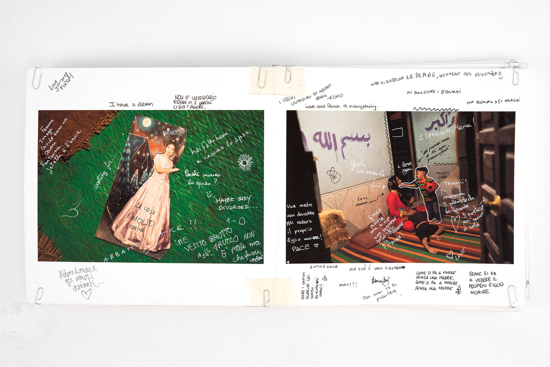
As it May Be - Bieke Depoorter
This is a photobook that documents the reality of people living in Egypt during the Egyptian Crisis. She began photographing for this project in 2011 before returning to Egypt in 2017. When she returned in 2017, she asked people from the country who weren't photographed for the book for their opinions in the form of written annotations on the images. |
|
|
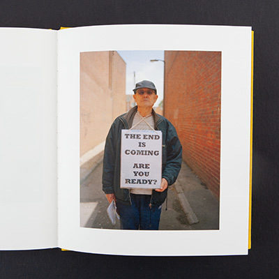
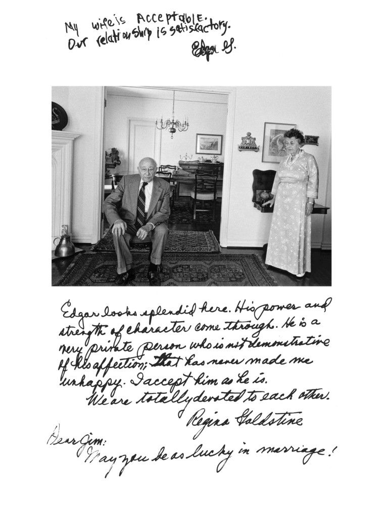
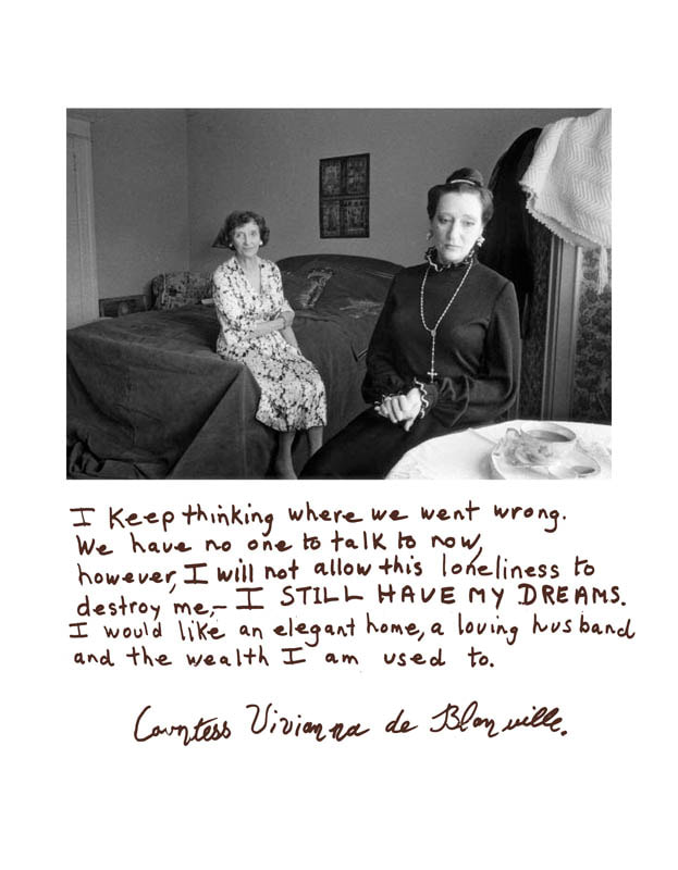
Rich and Poor - Jim Goldberg
This photobook, published in 1985, focuses on the class divide in the US. This is done by featuring the living setting of someone who is either rich, or poor and seeing some words that were written by them in response to having their image taken for this project. |
|
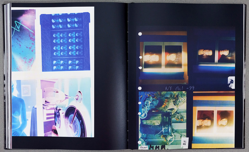
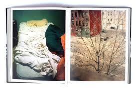
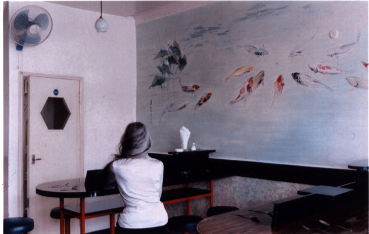
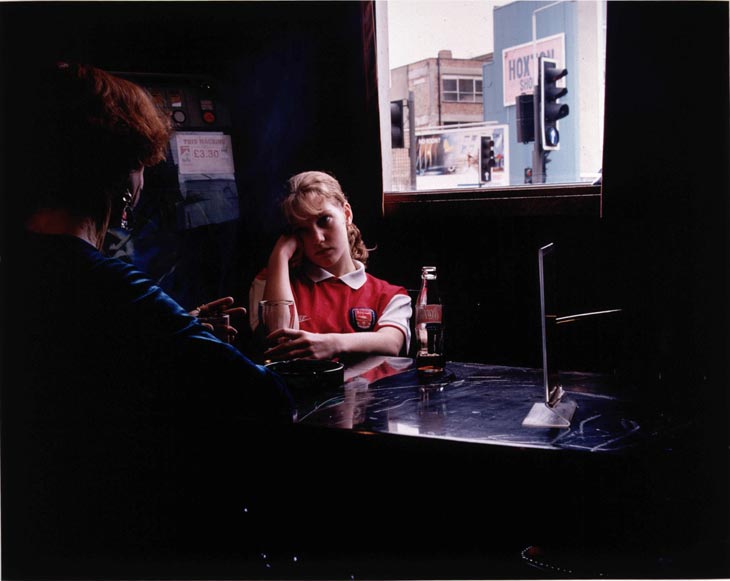
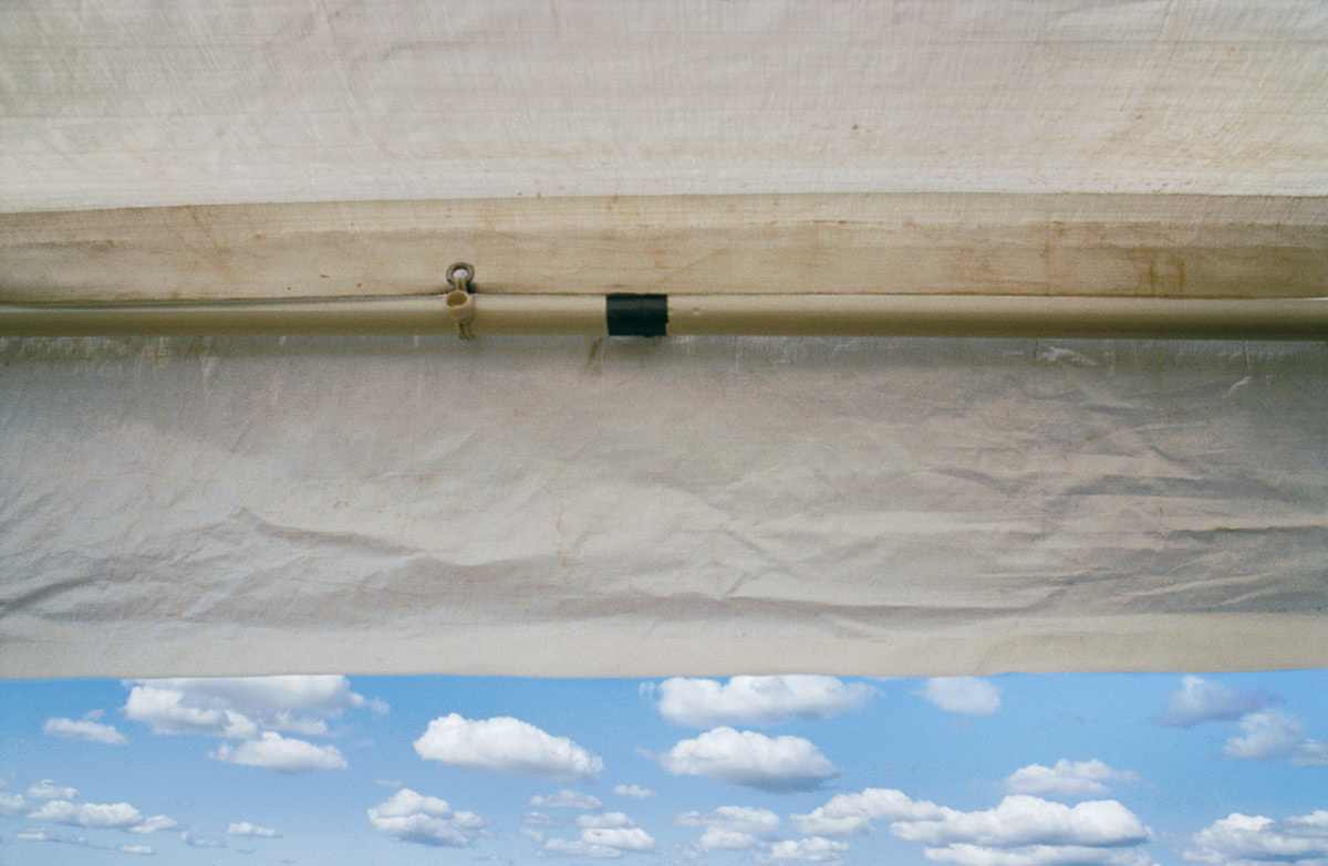
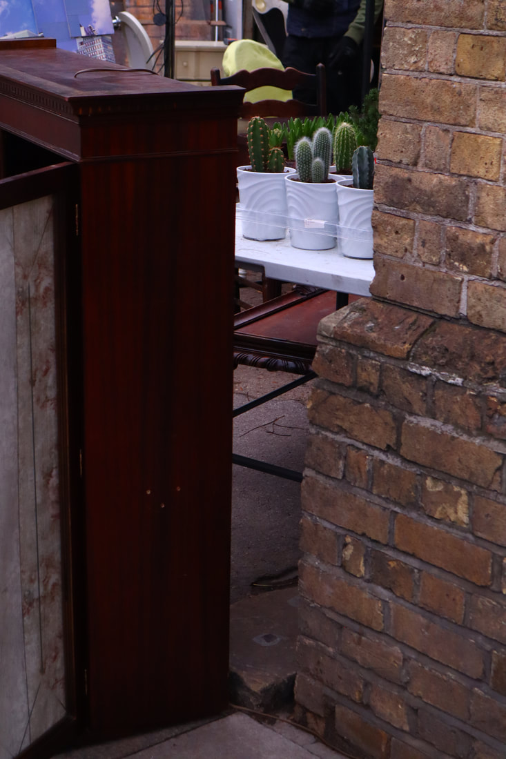
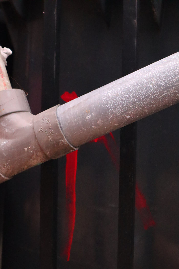
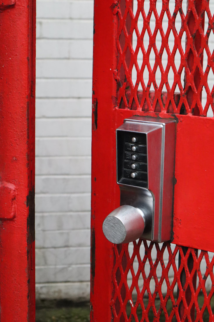
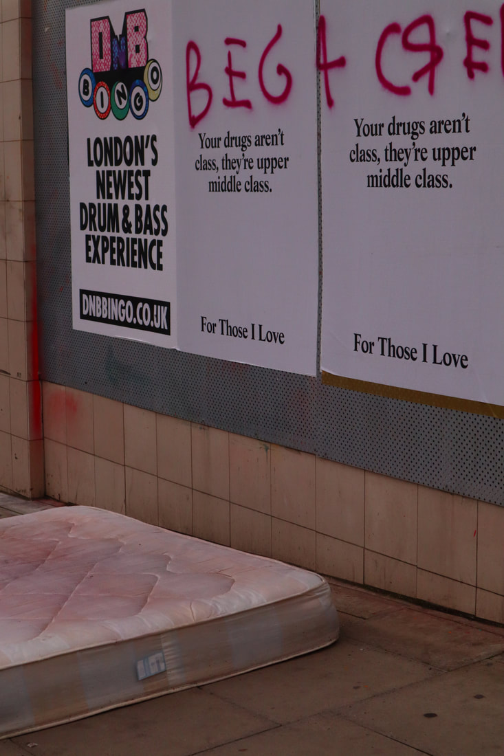
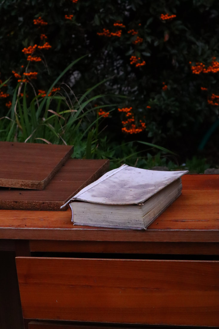
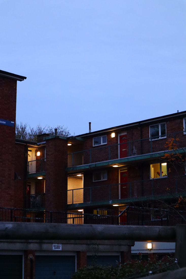
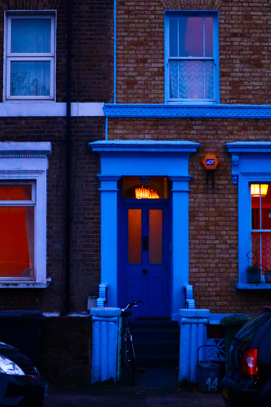
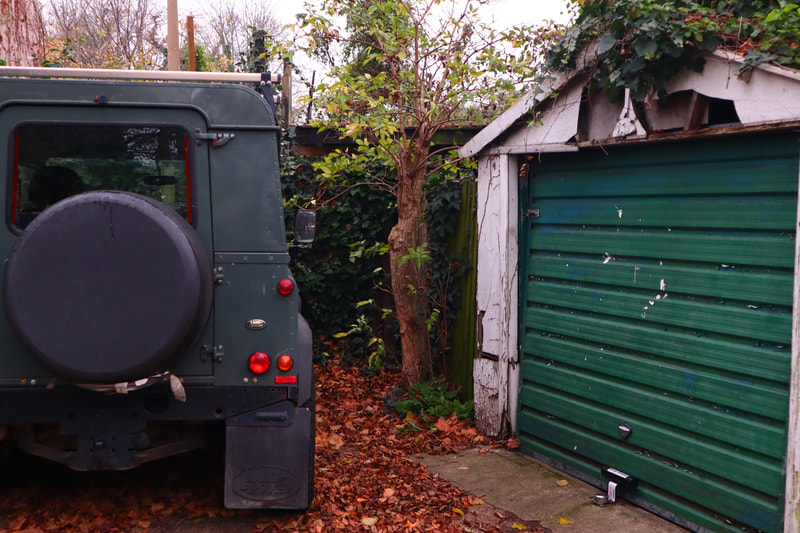
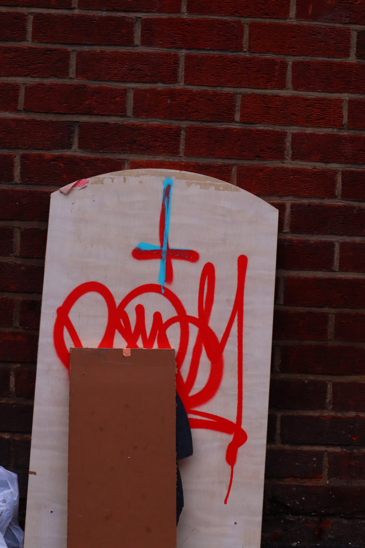
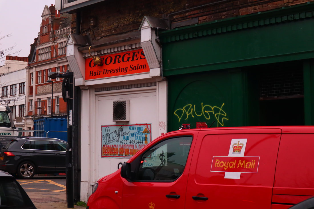
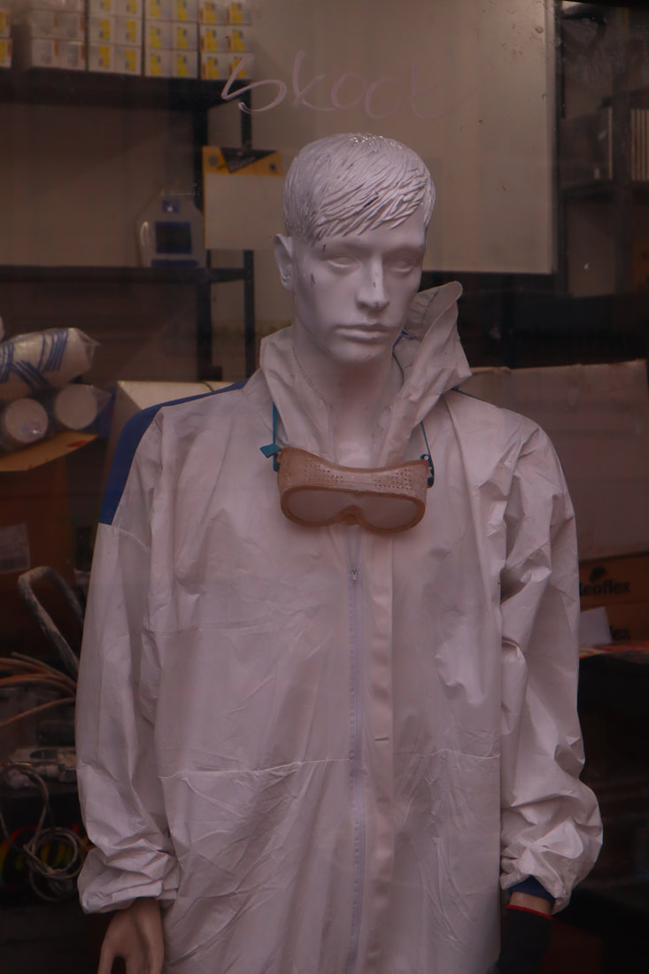
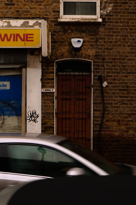
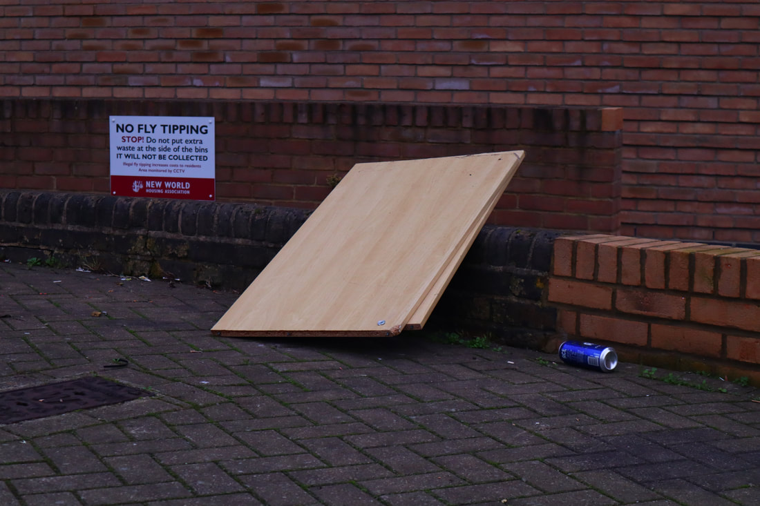
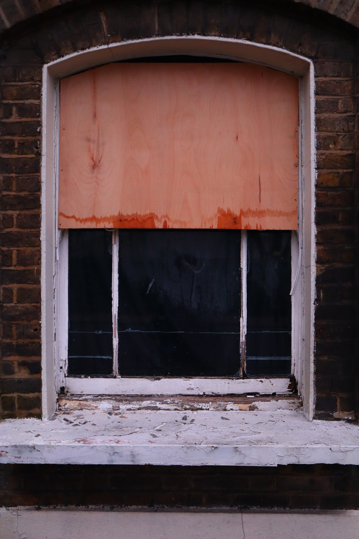
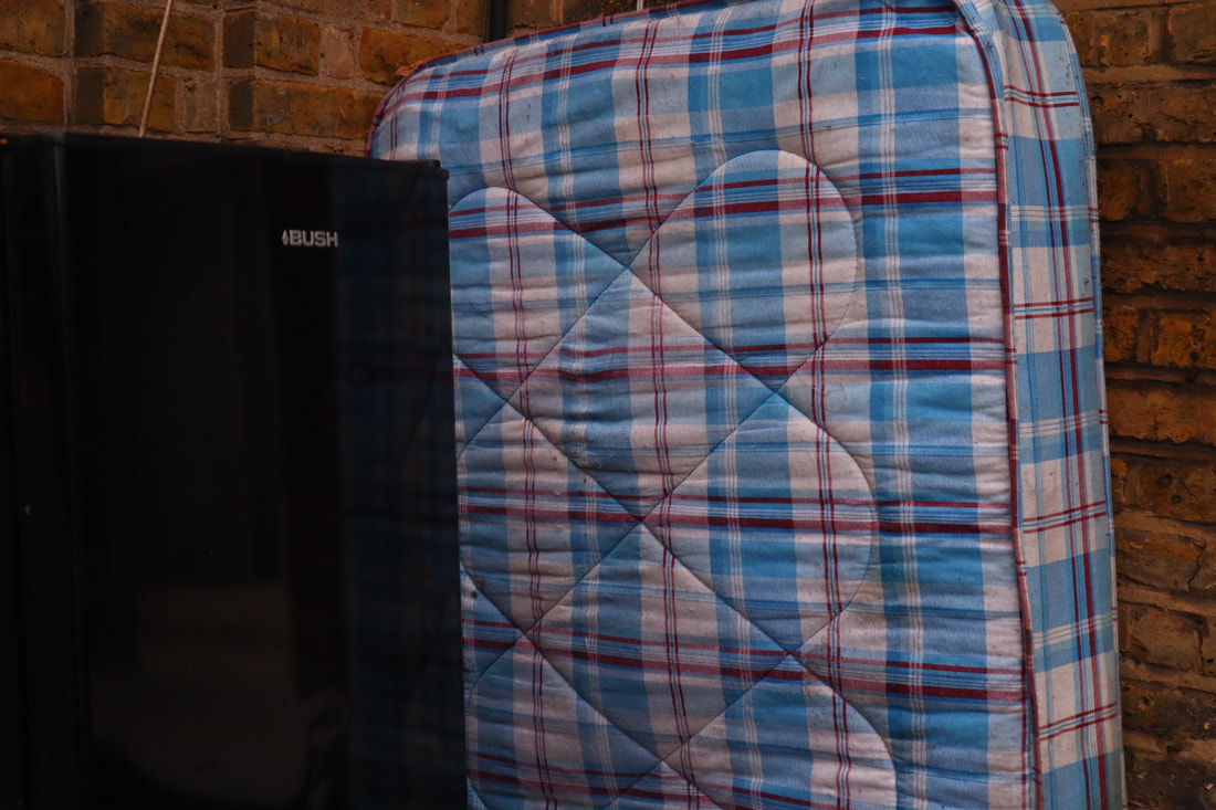
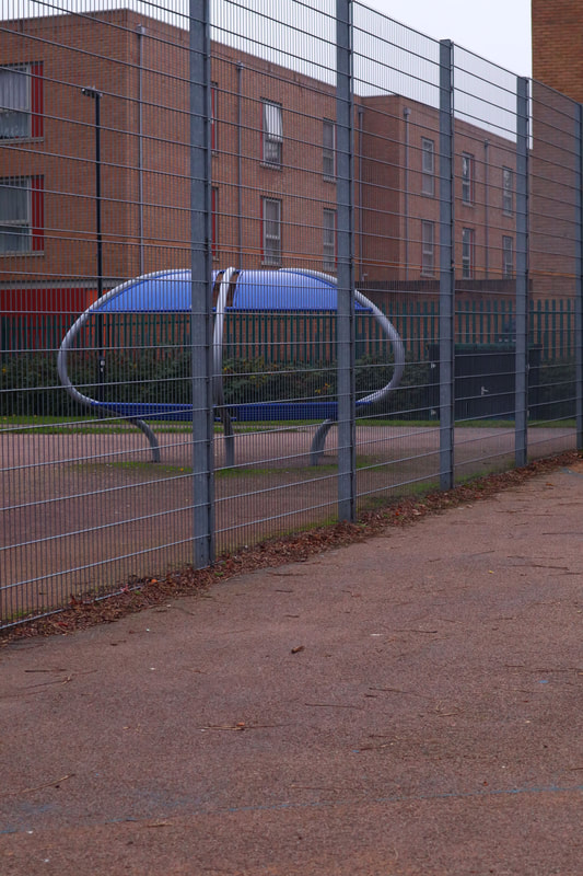
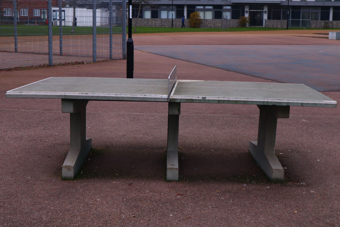
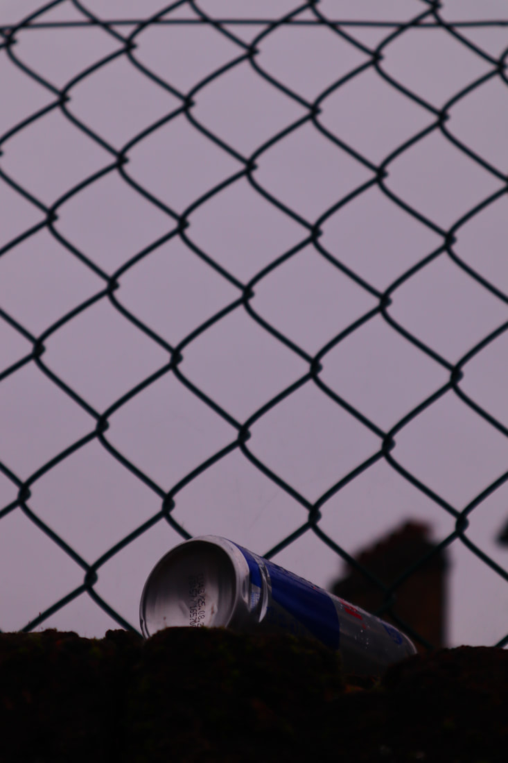
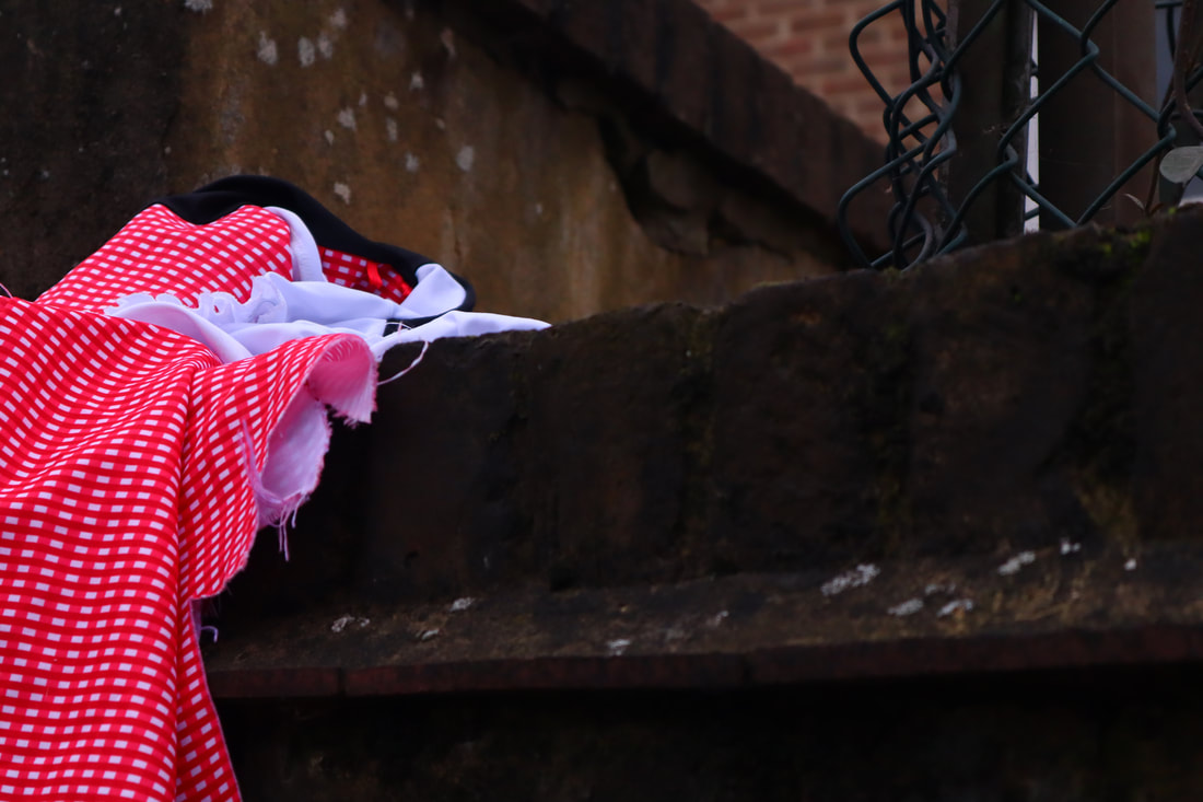
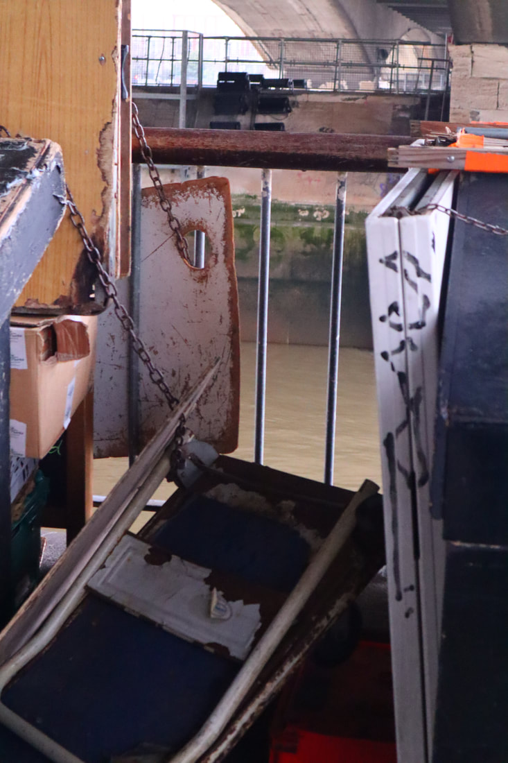
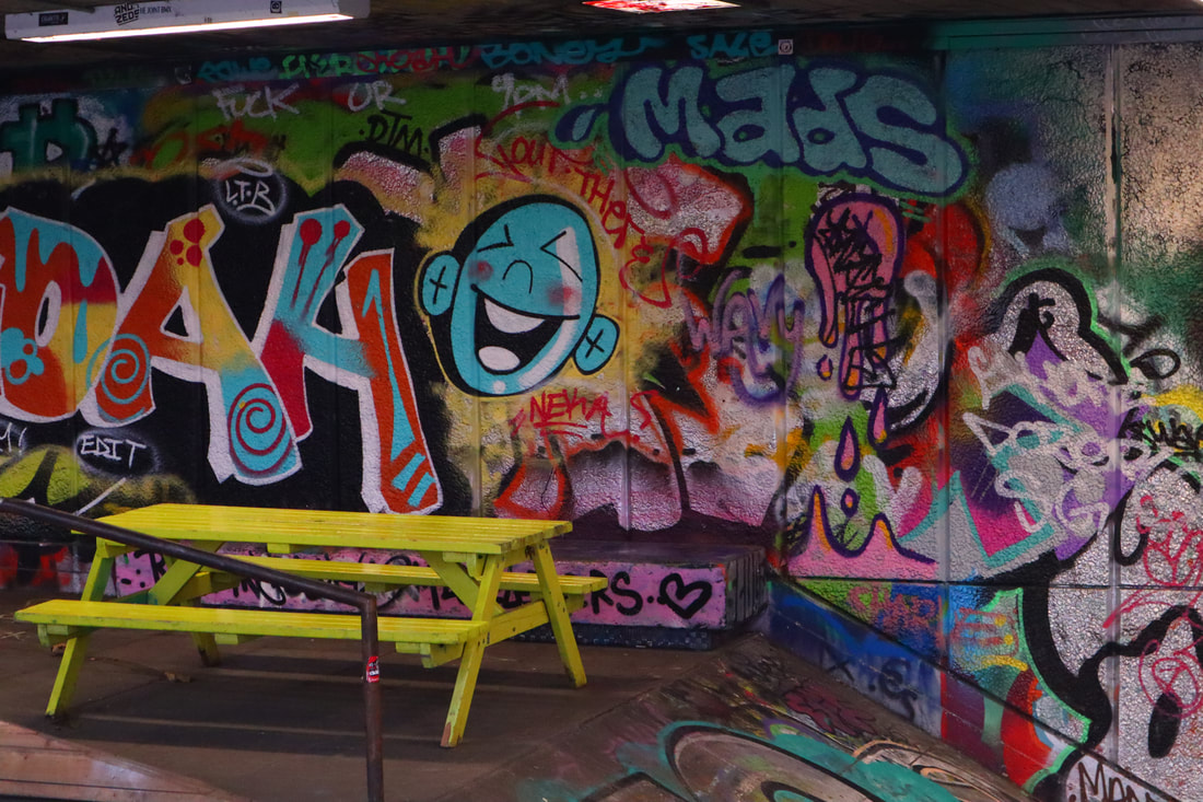
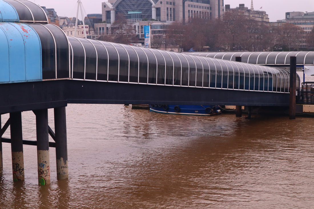
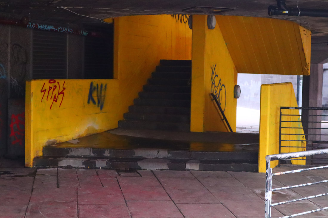
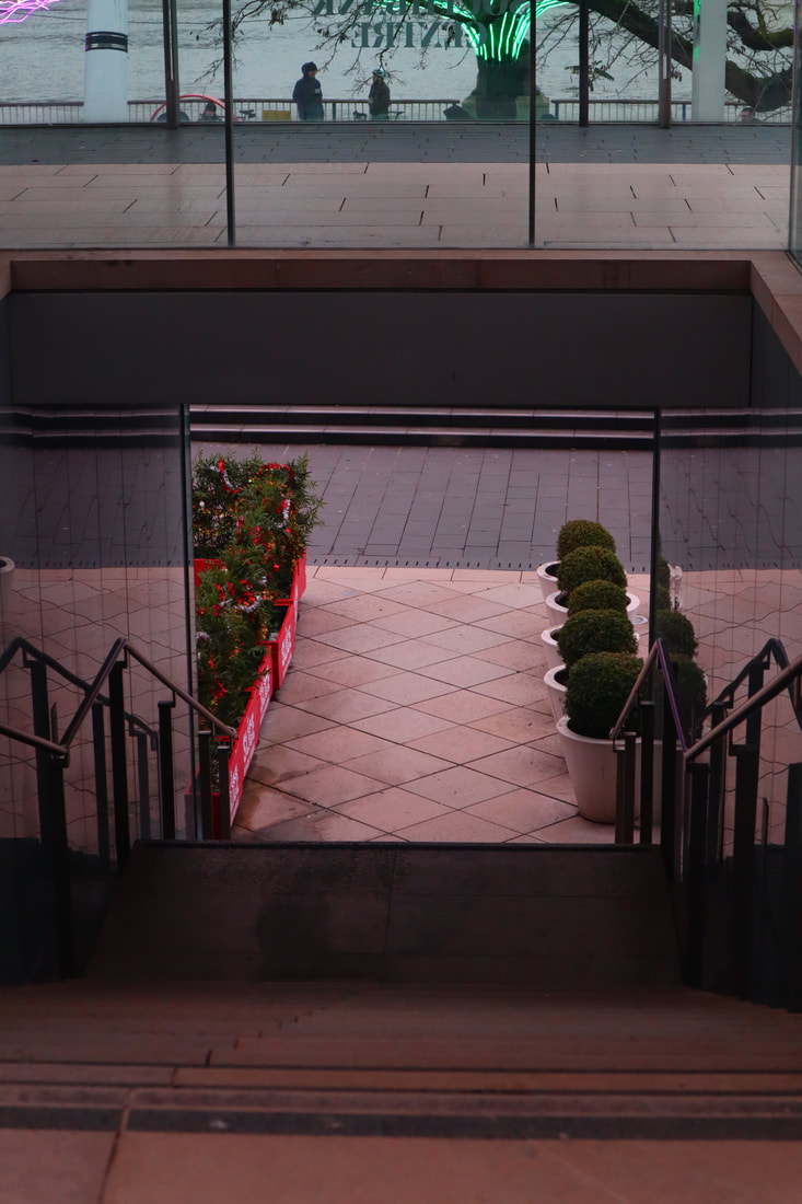
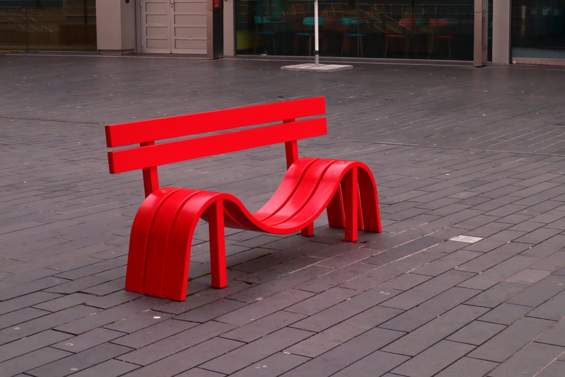
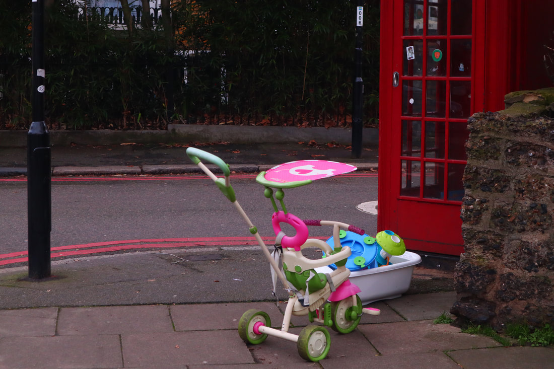
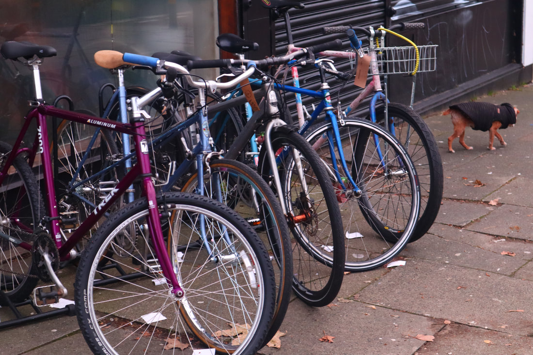
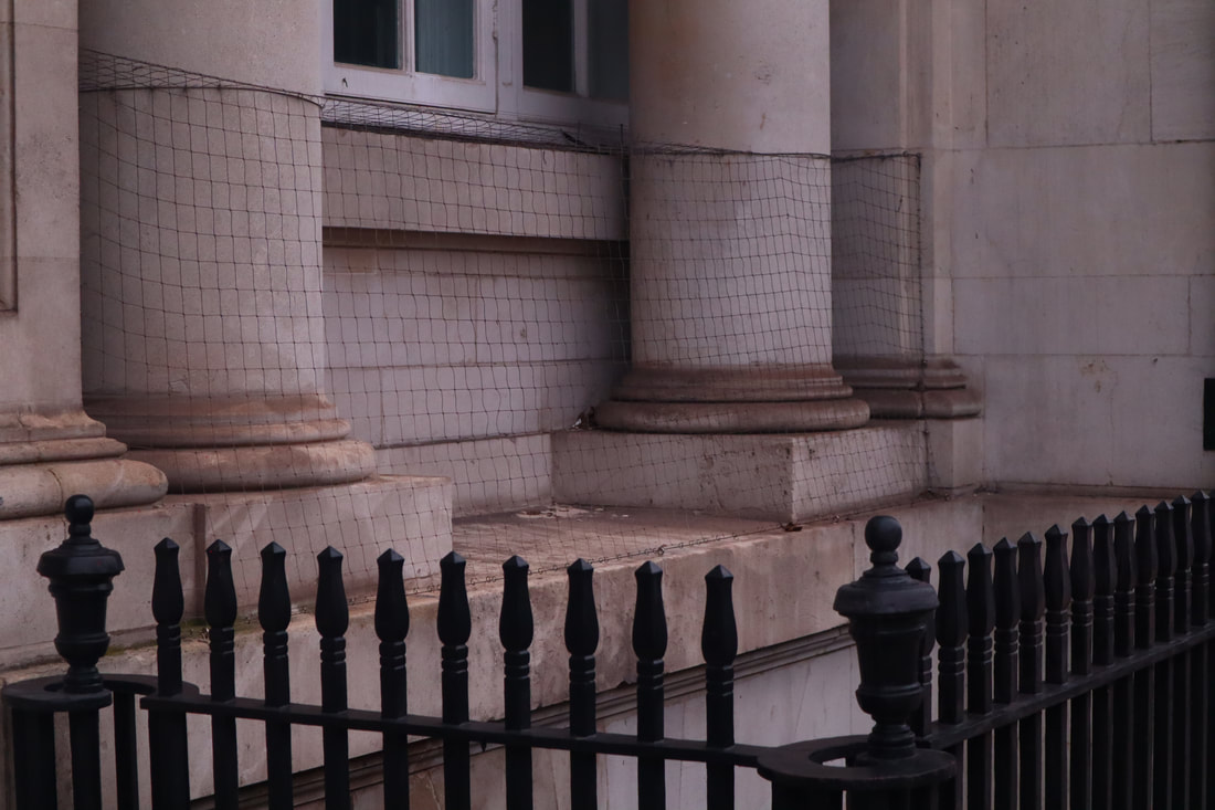
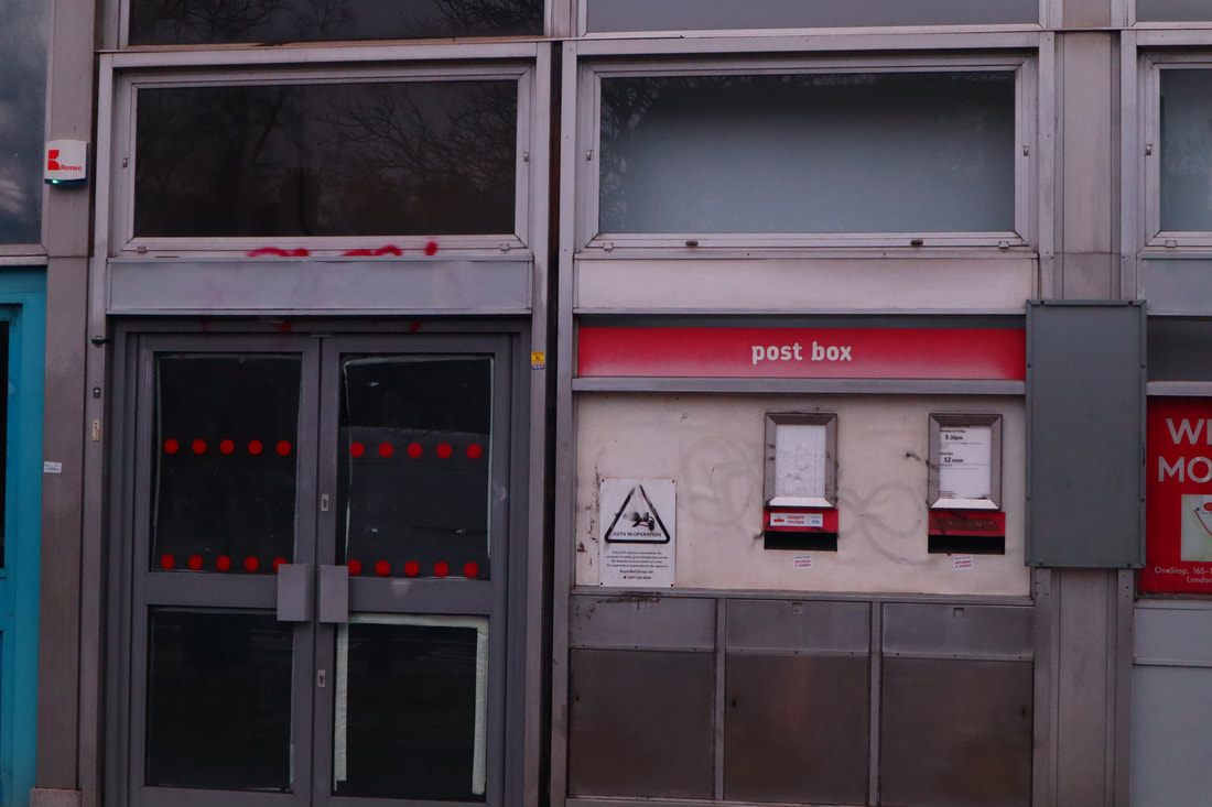
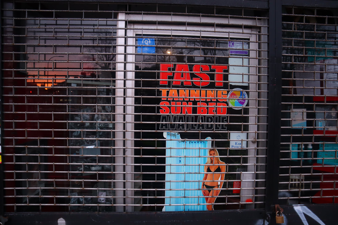
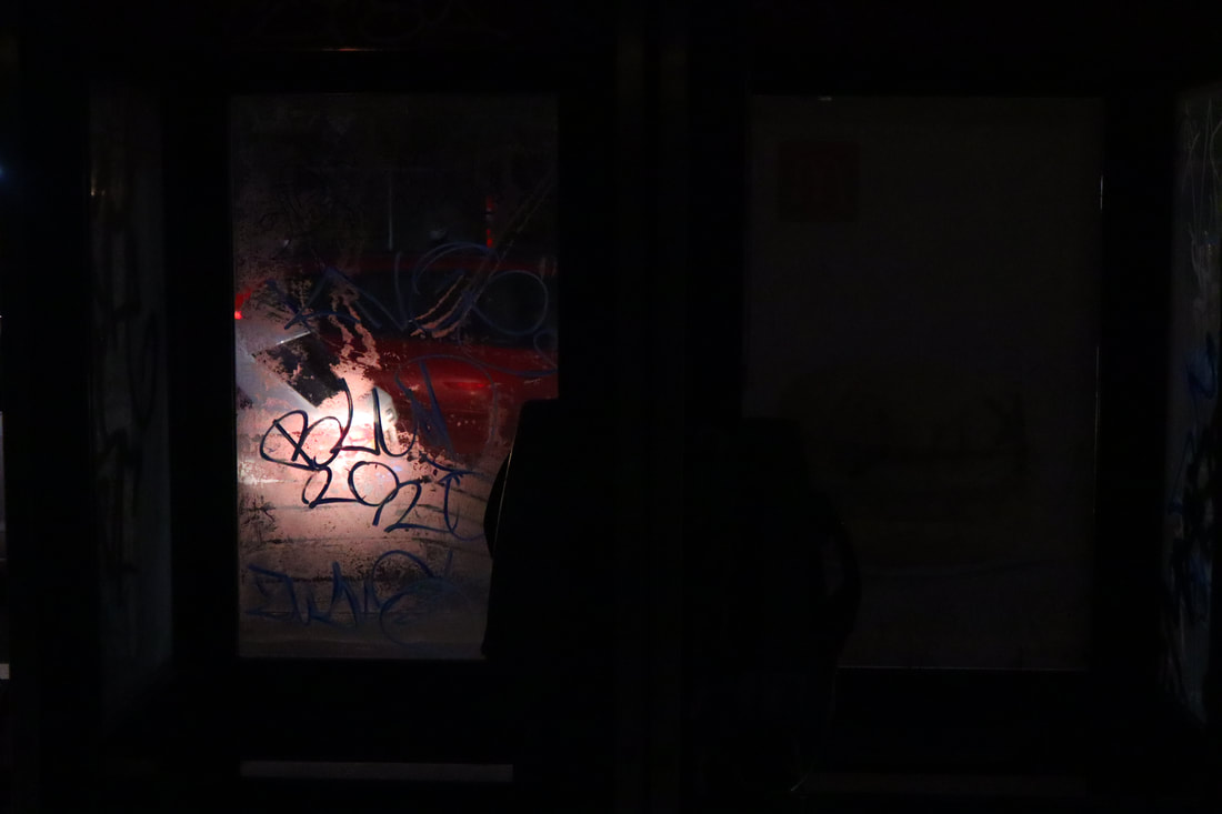
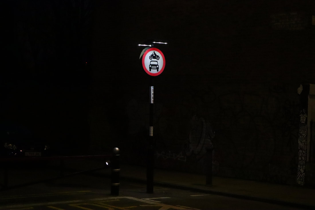
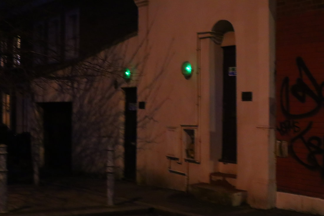
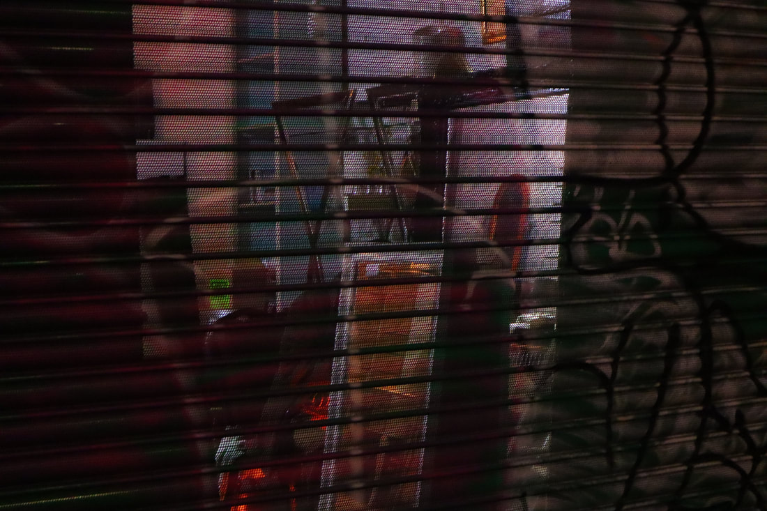
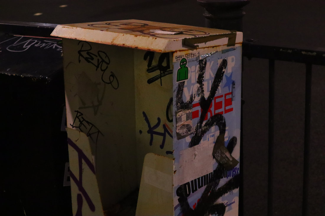
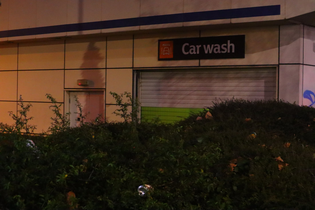
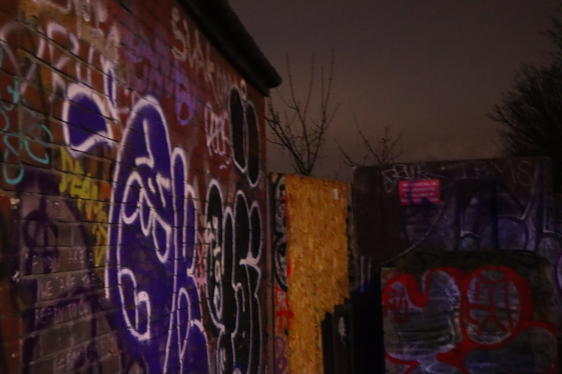
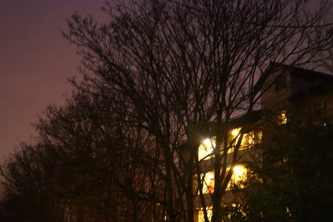
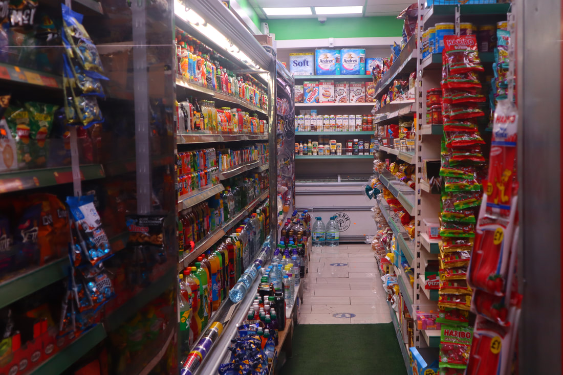
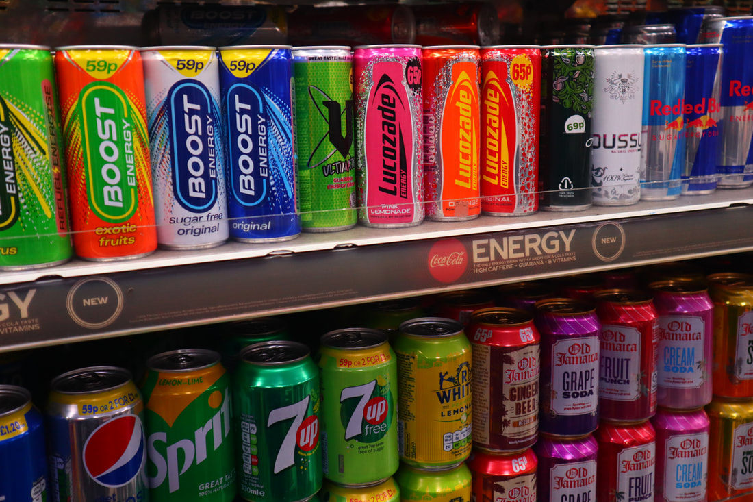
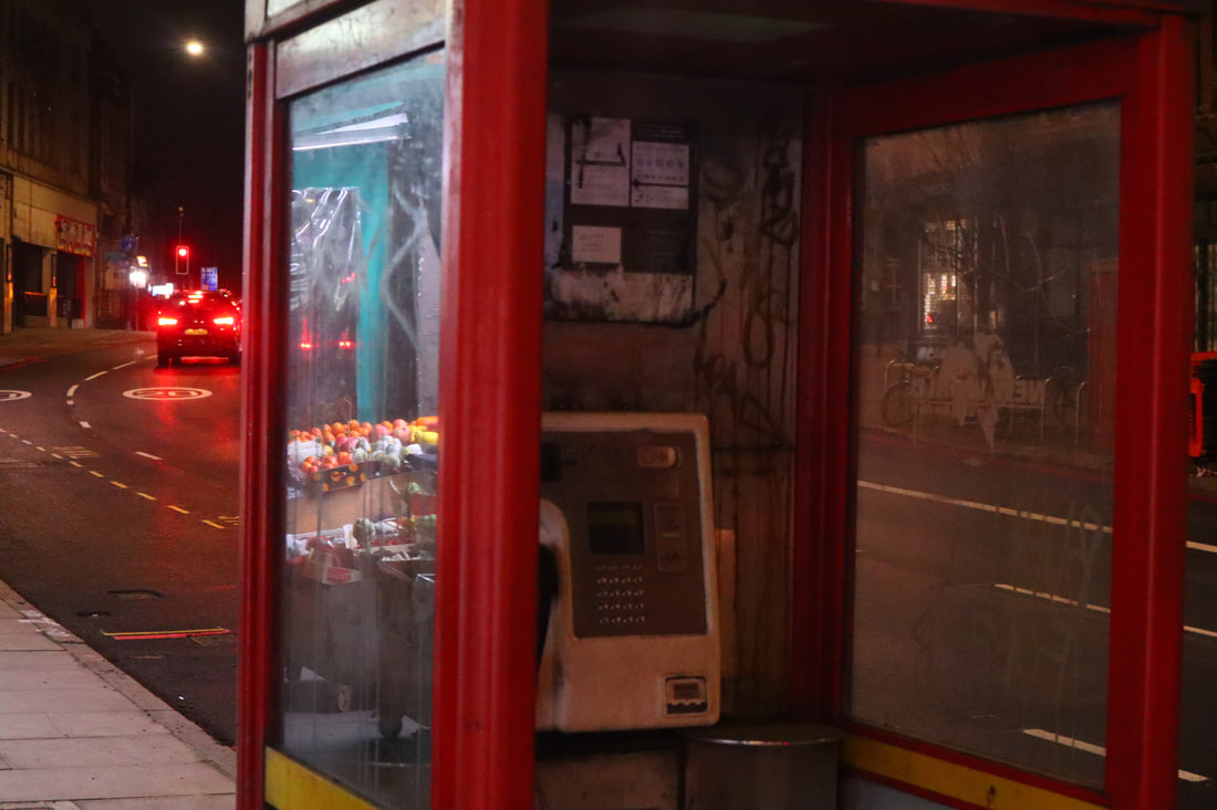
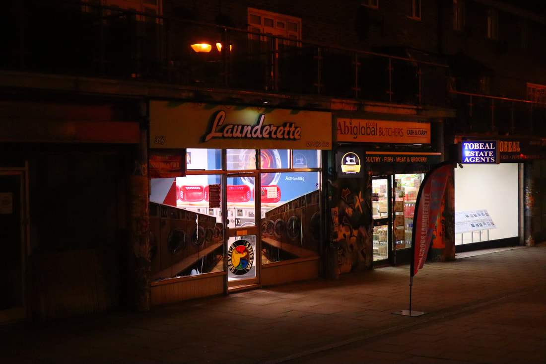
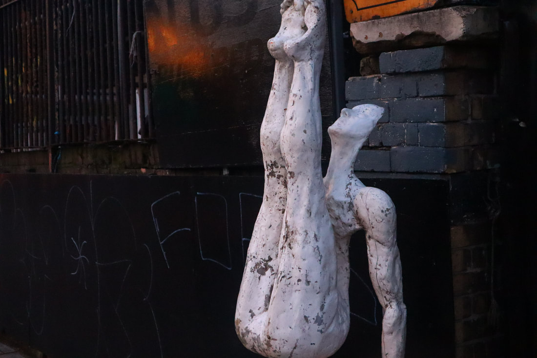
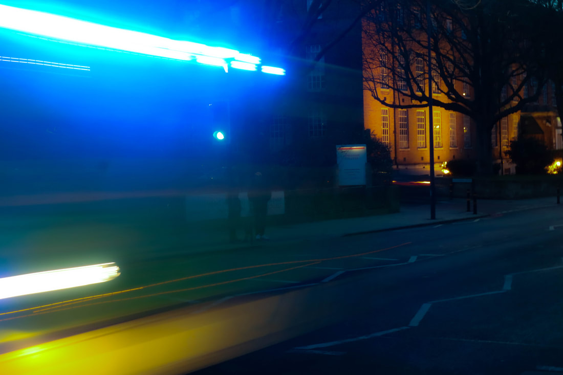
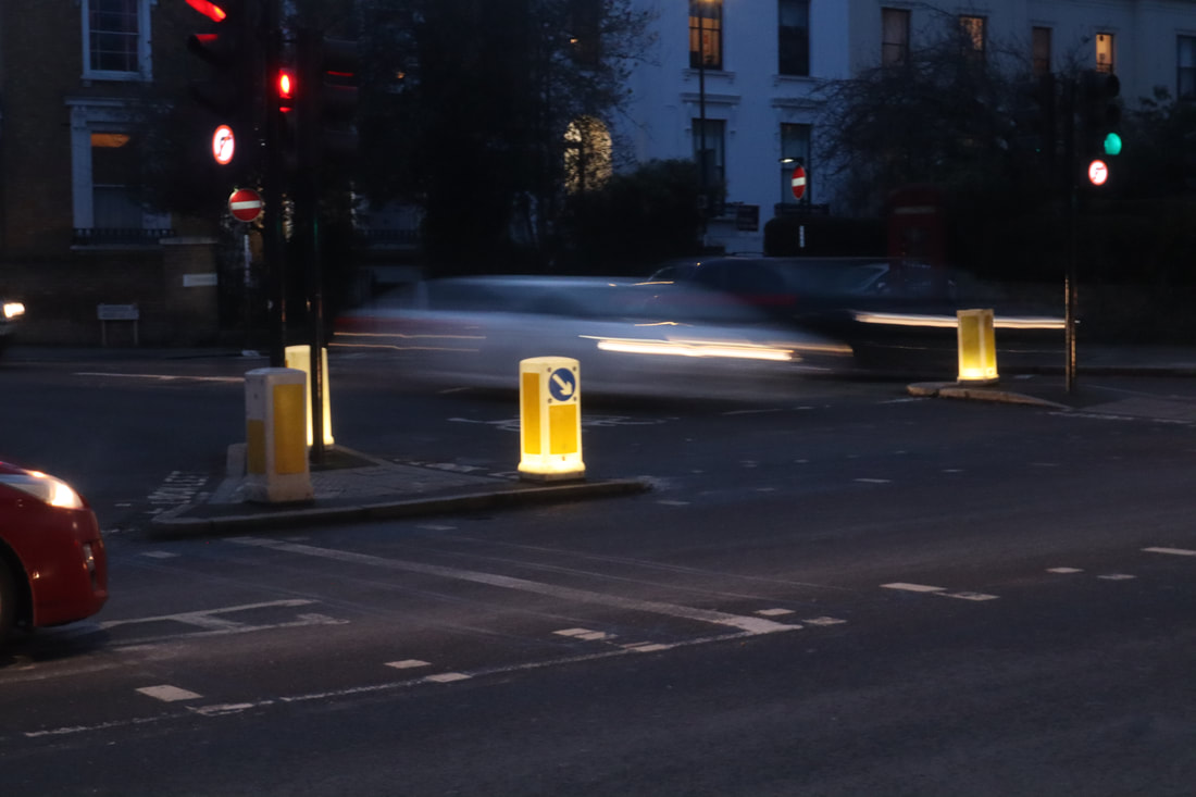
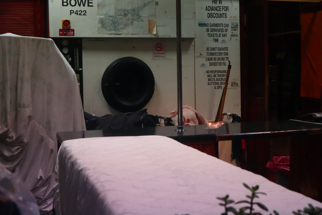
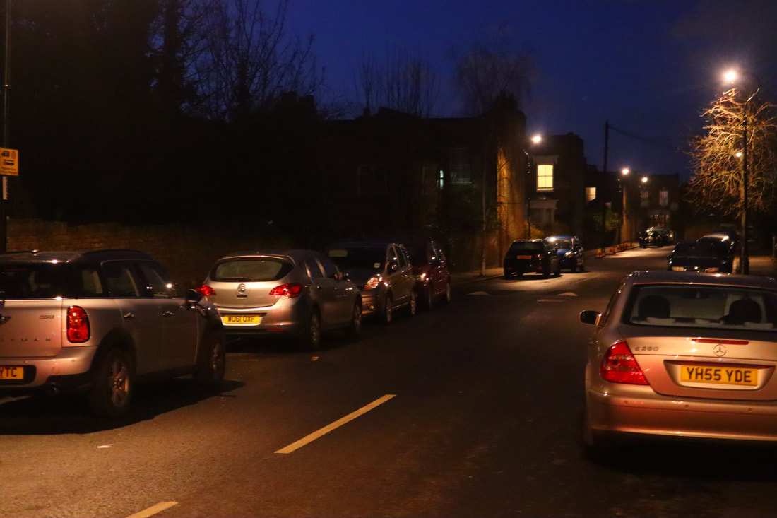
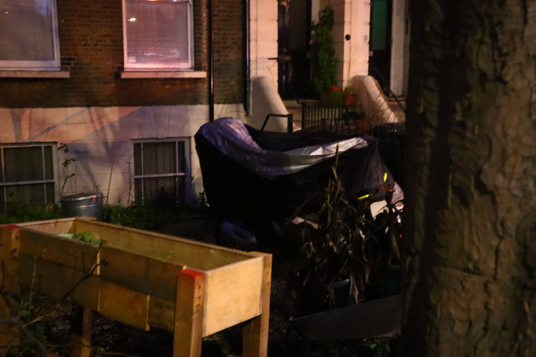
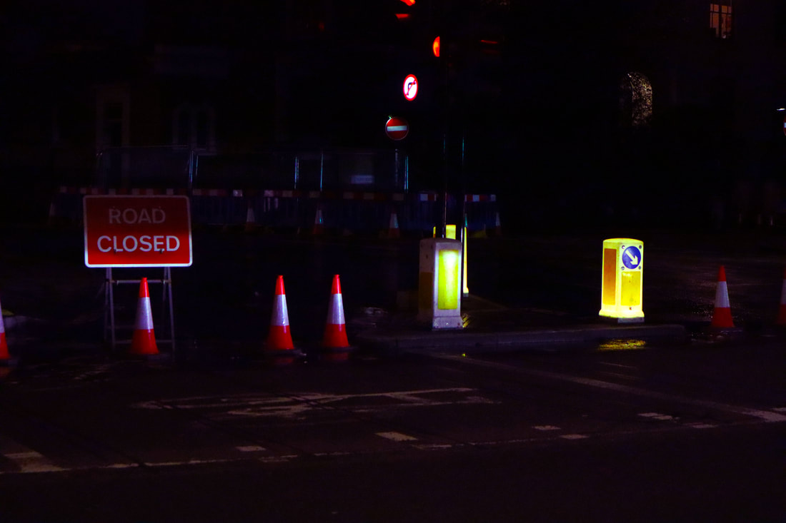
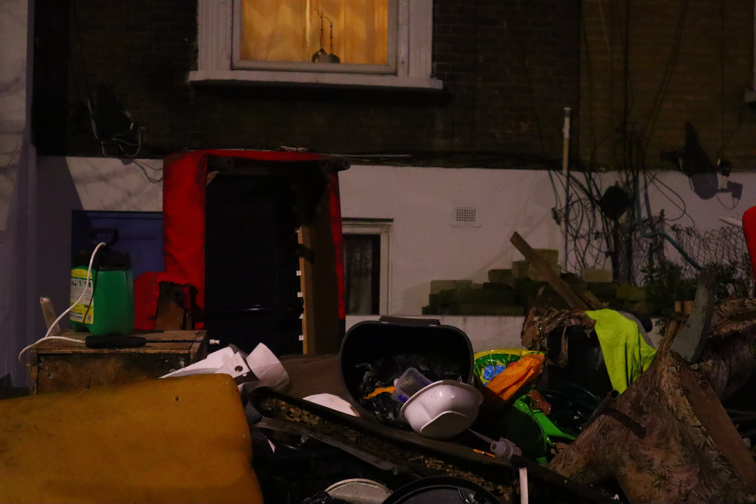
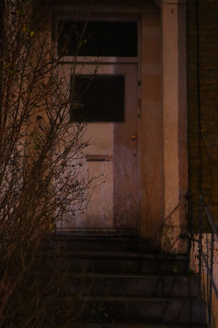
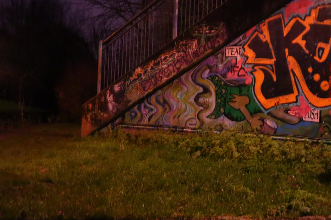
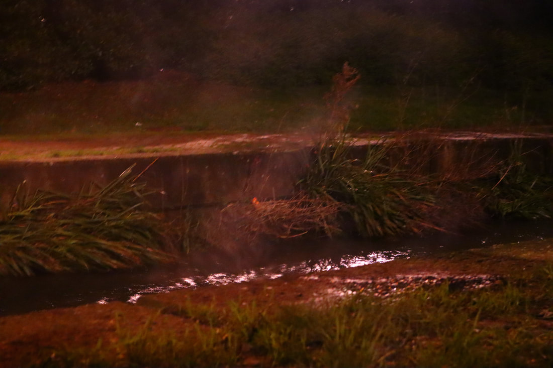
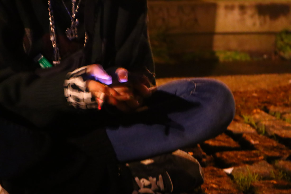
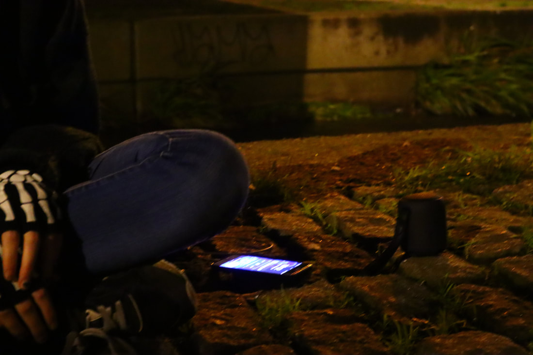
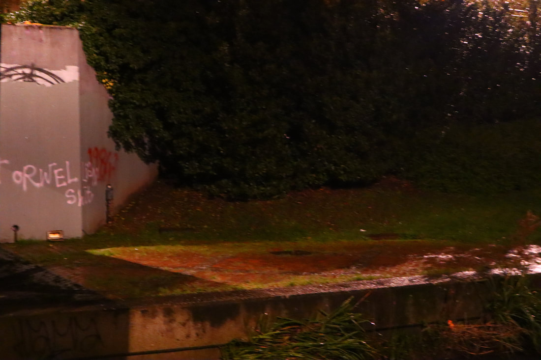
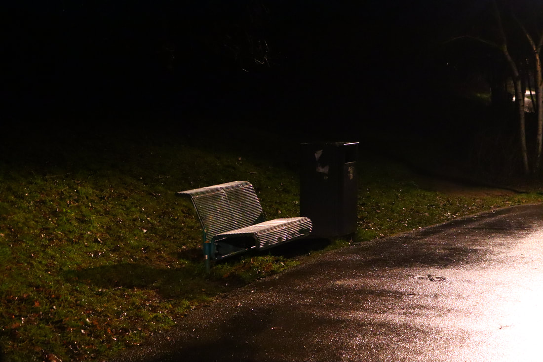
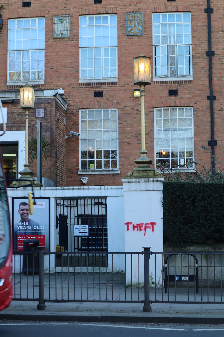
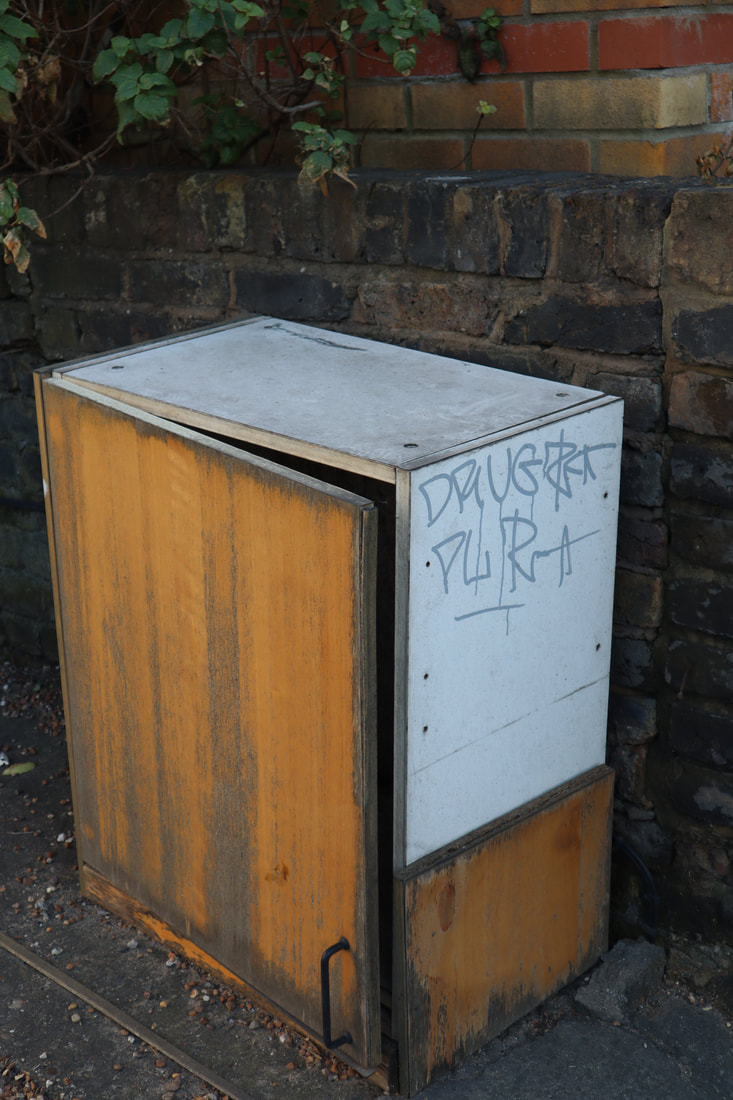
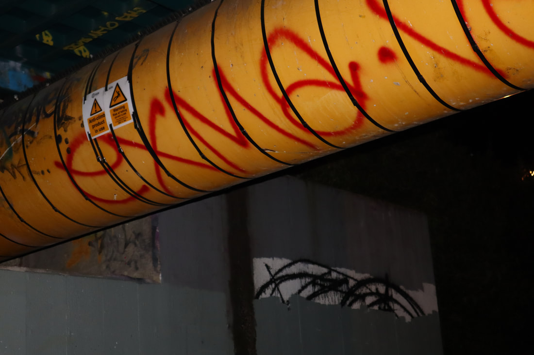
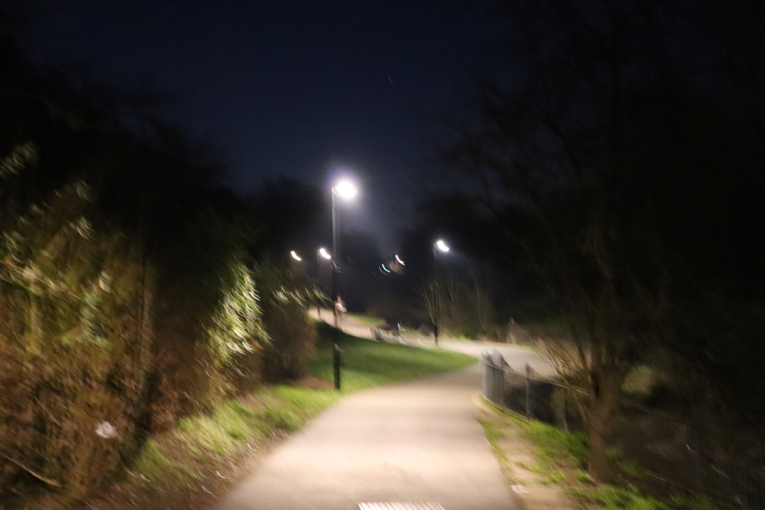
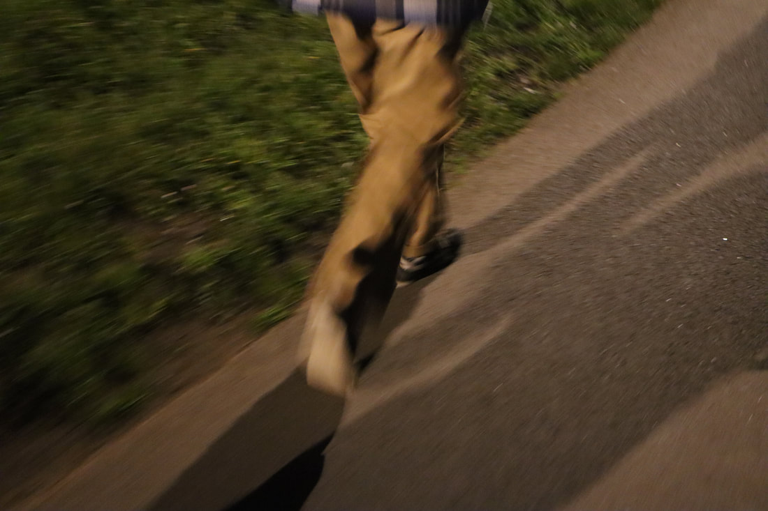
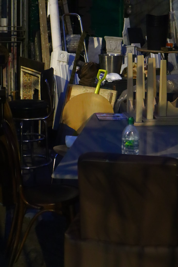
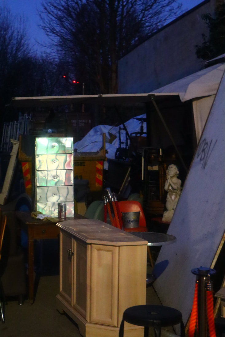
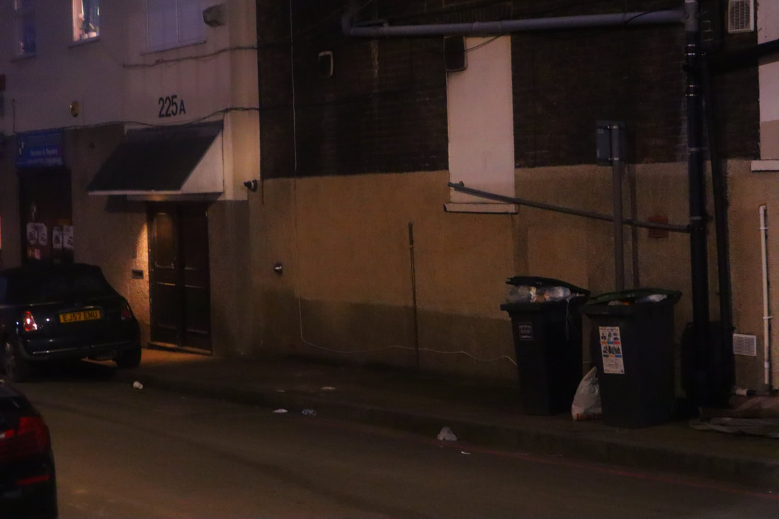
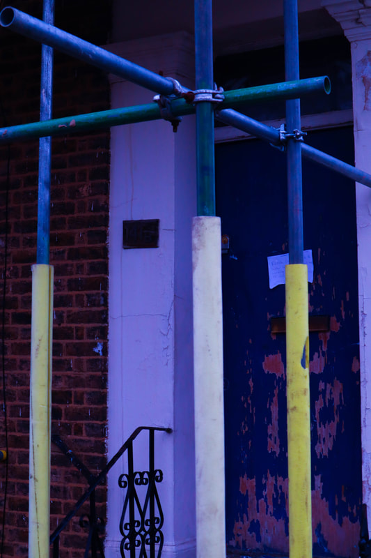
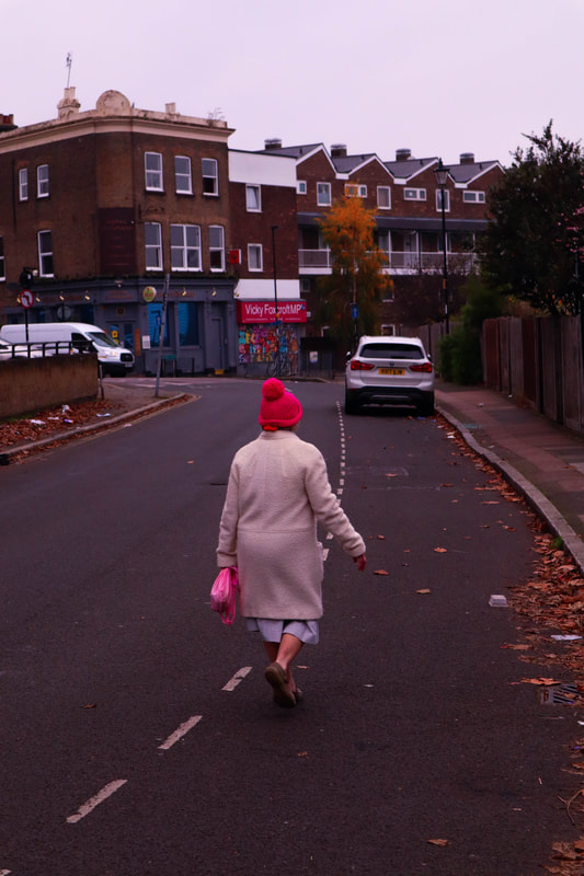
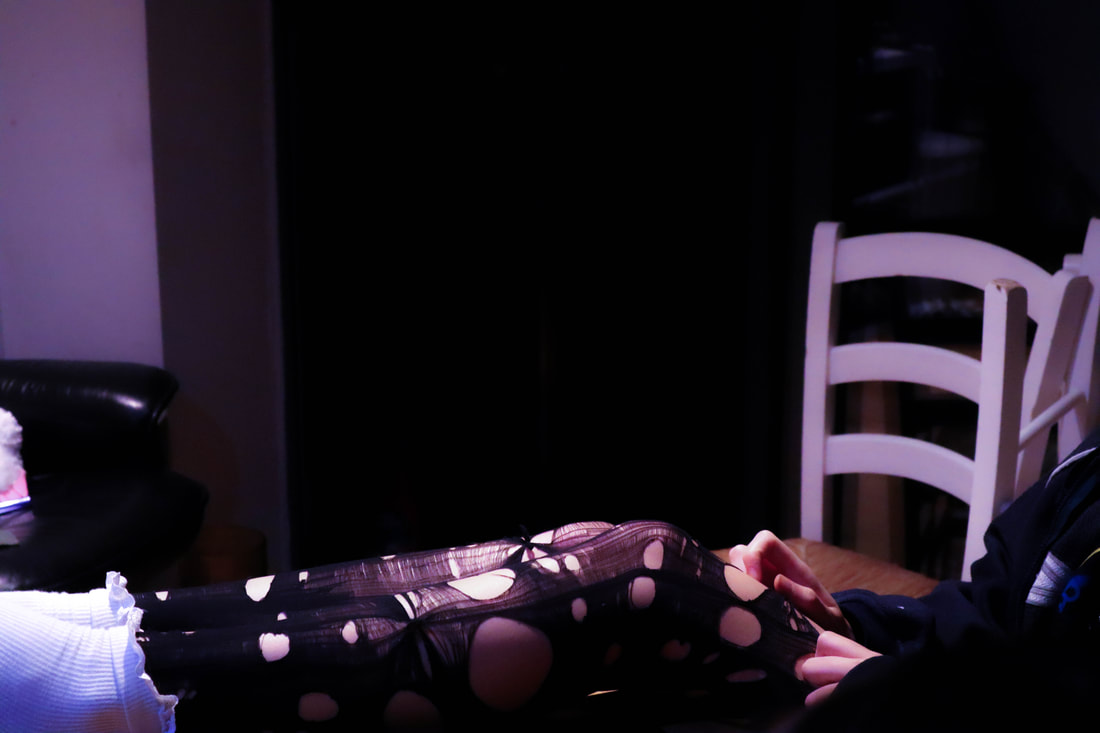
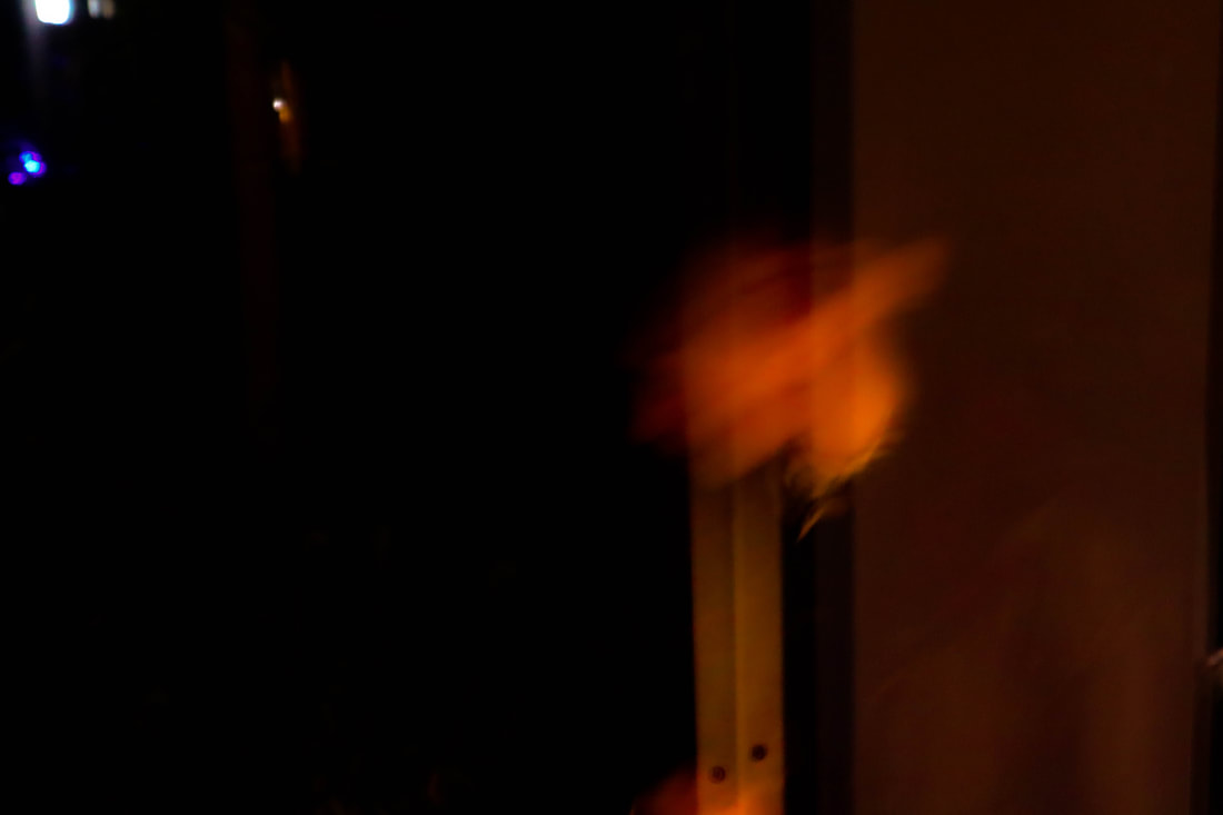
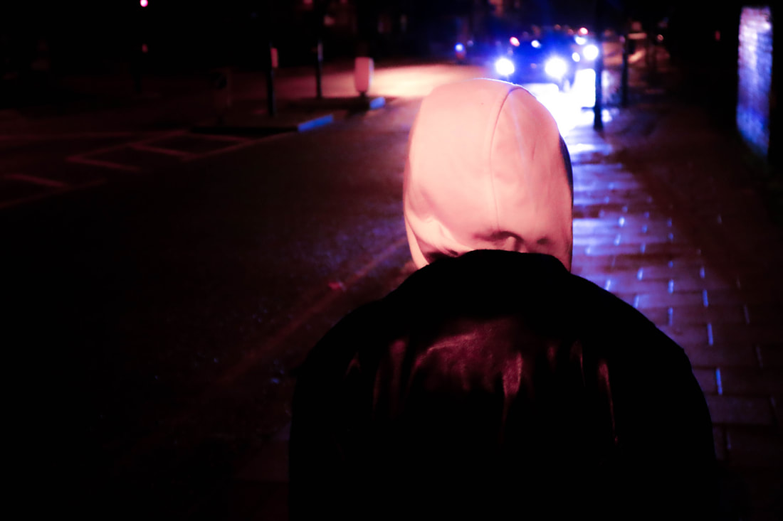
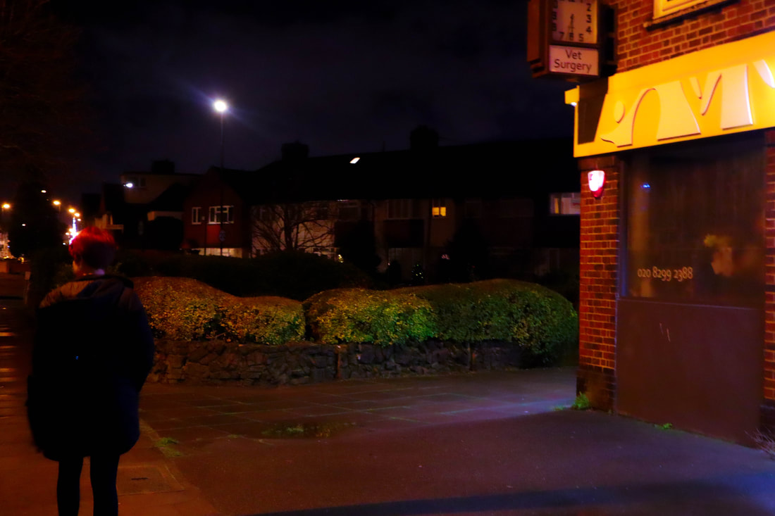
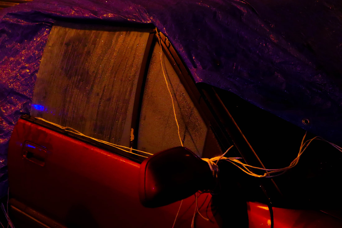
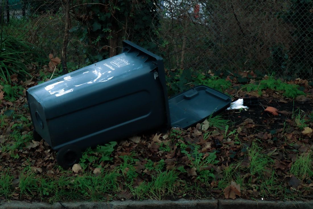
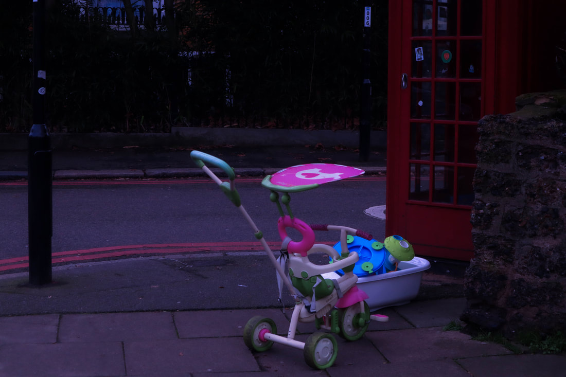
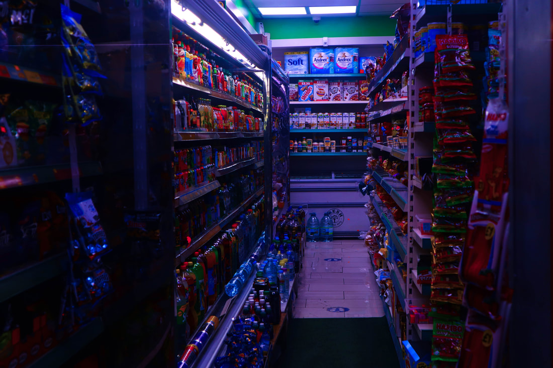
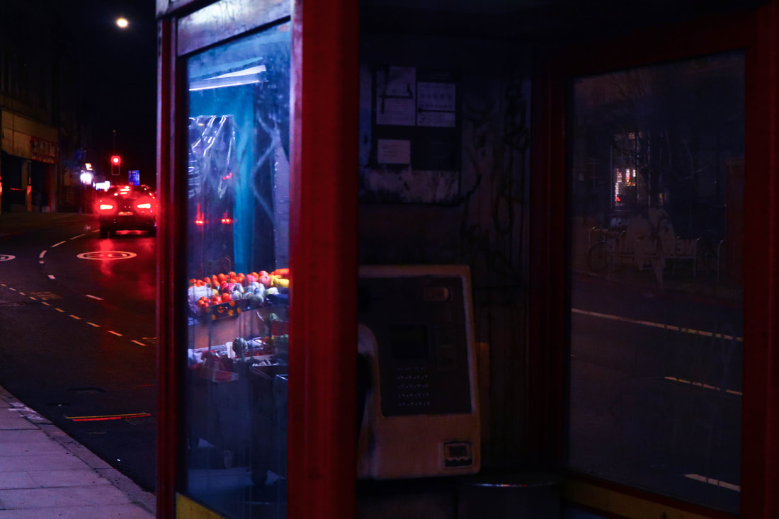
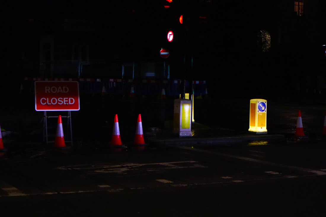
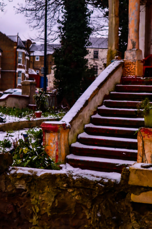
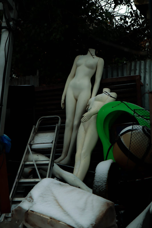
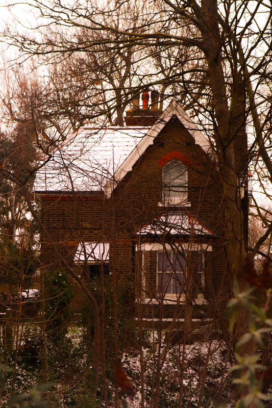
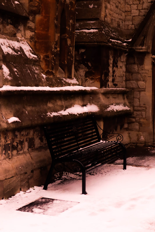
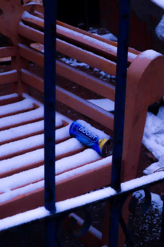
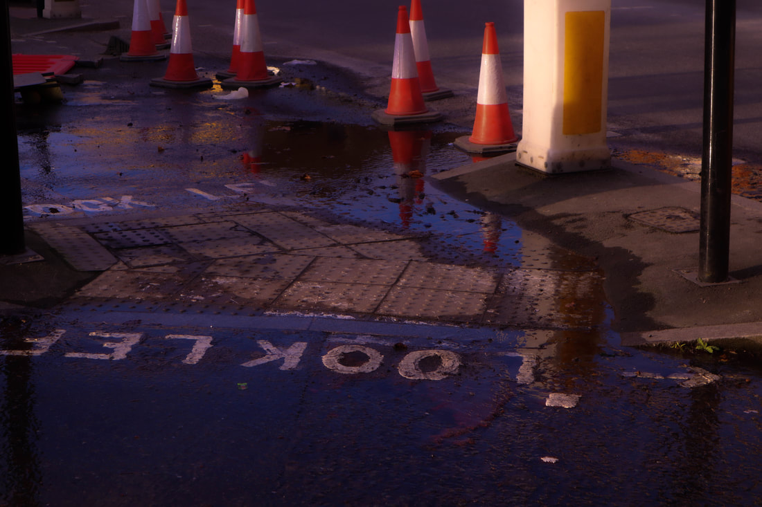
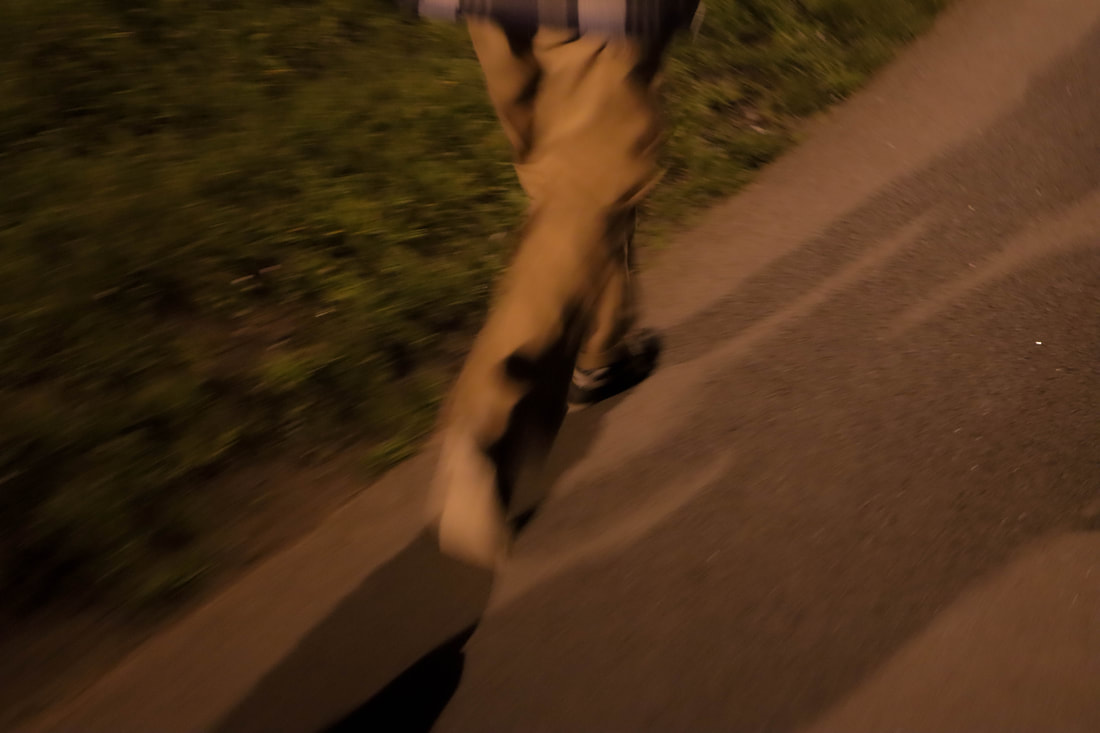
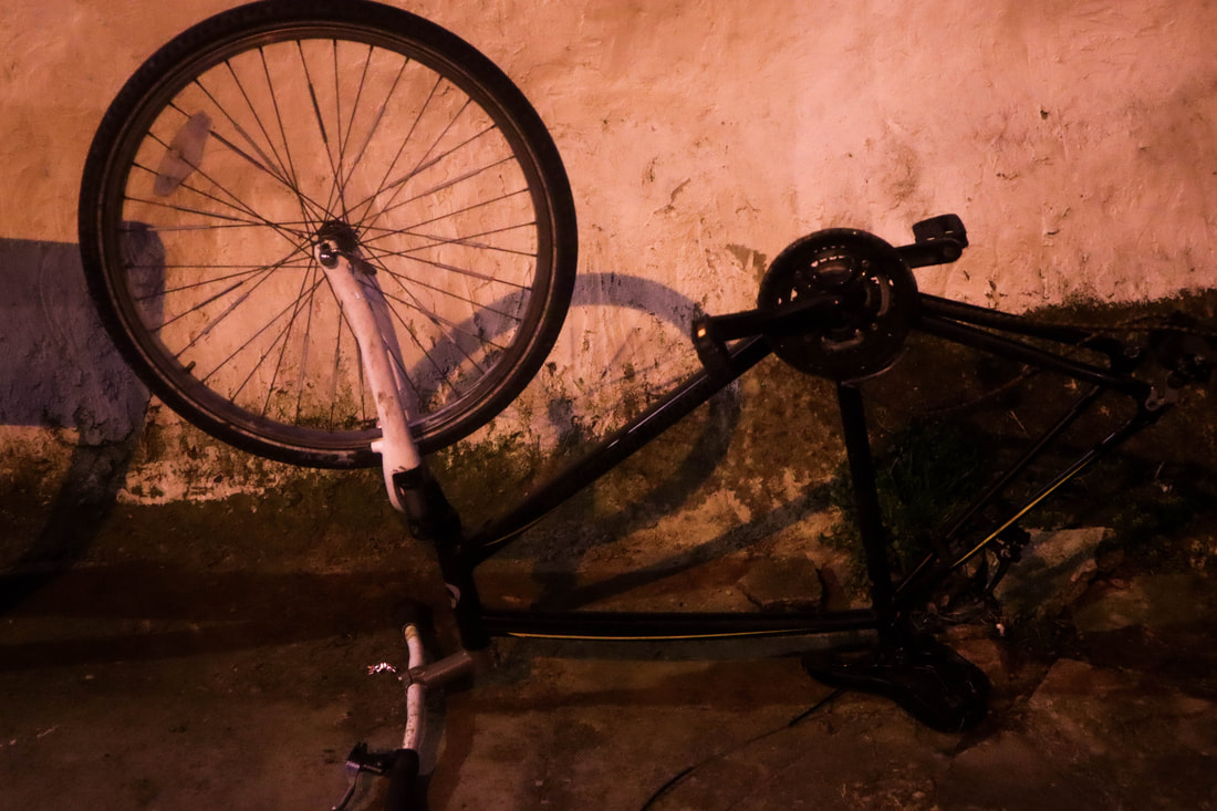
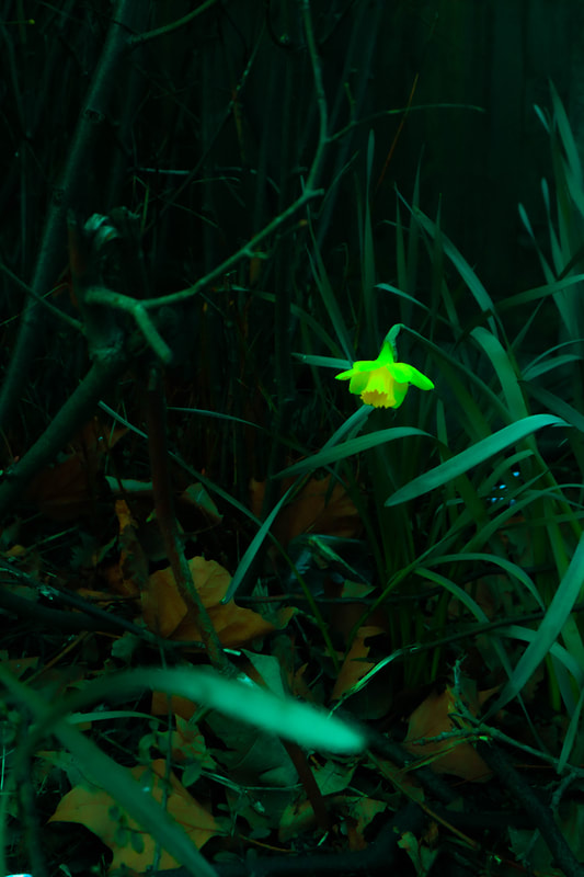
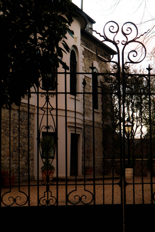
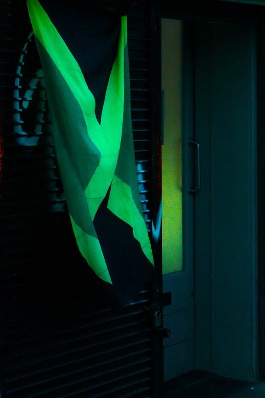
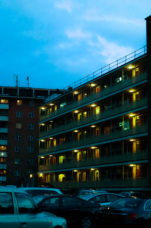
My Own Images
16 November 2020 Shoot:
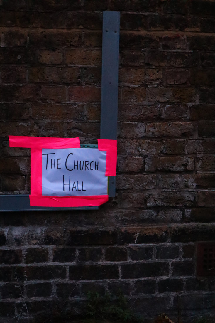
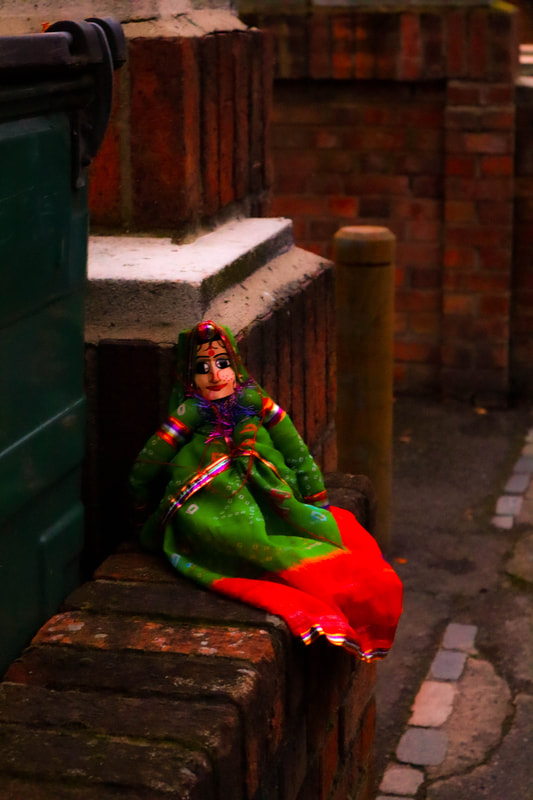
29 November 2020 Shoot
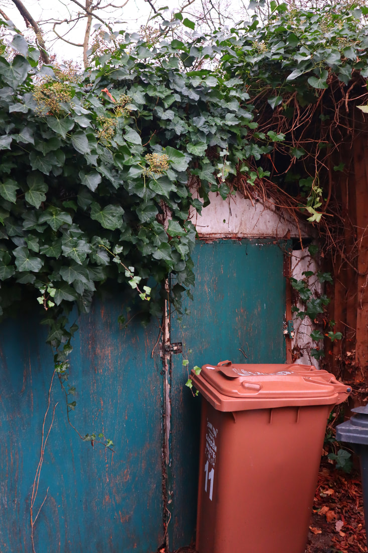
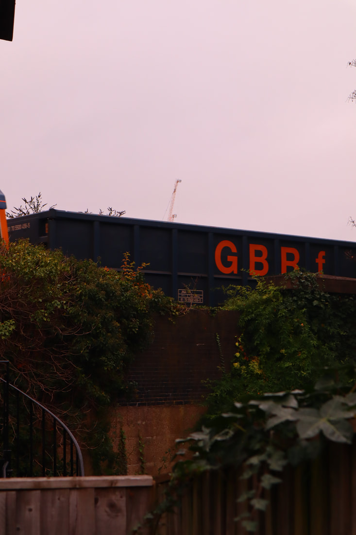


28th december 2020 shoot
20th January 2021 shoot
23rd January 2021 shoot
5th feburary 2021 shoot
27th Feburary shoot
19th March shoot
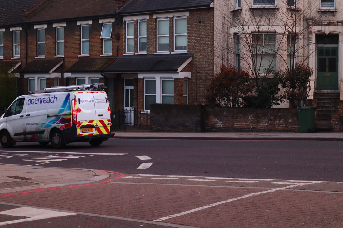
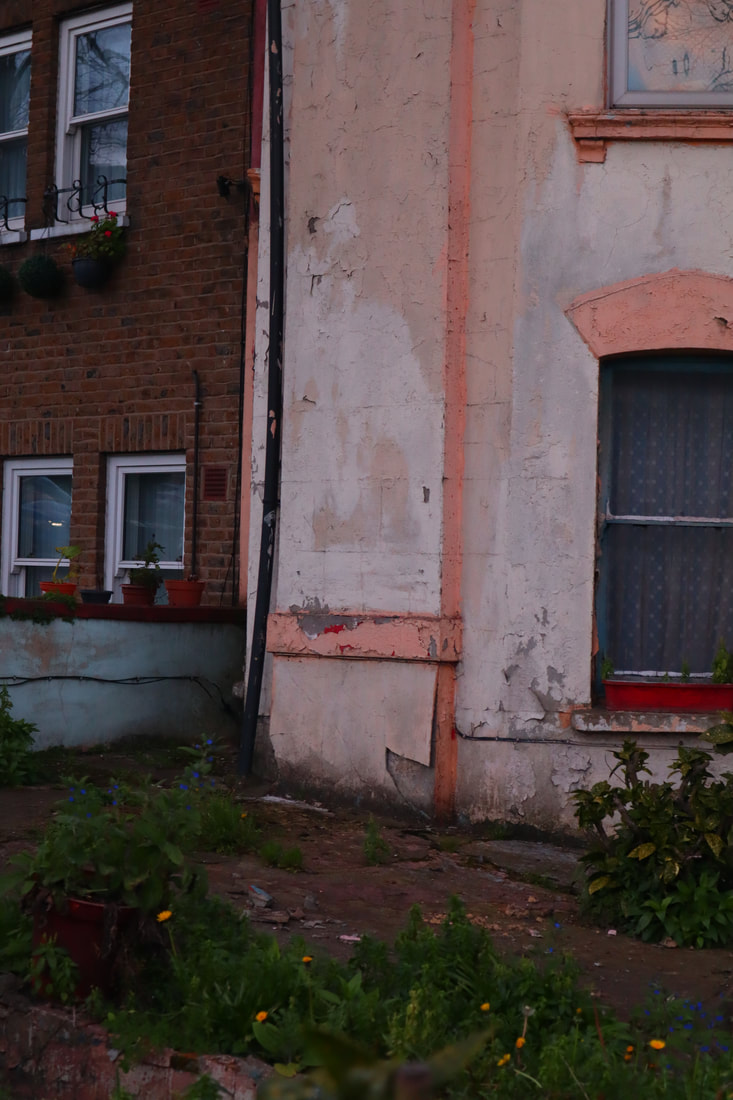
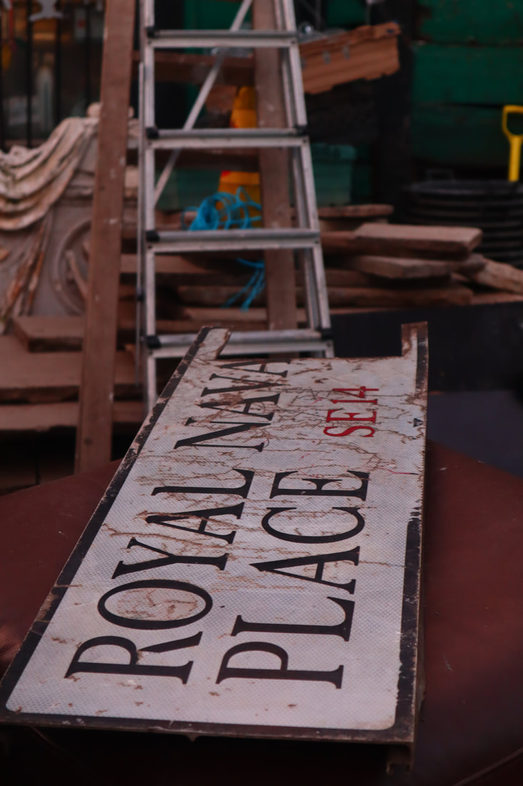
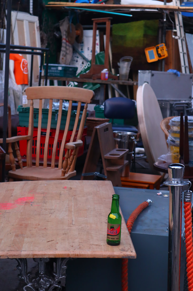
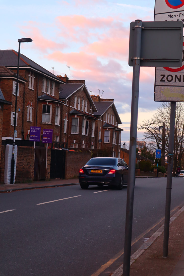
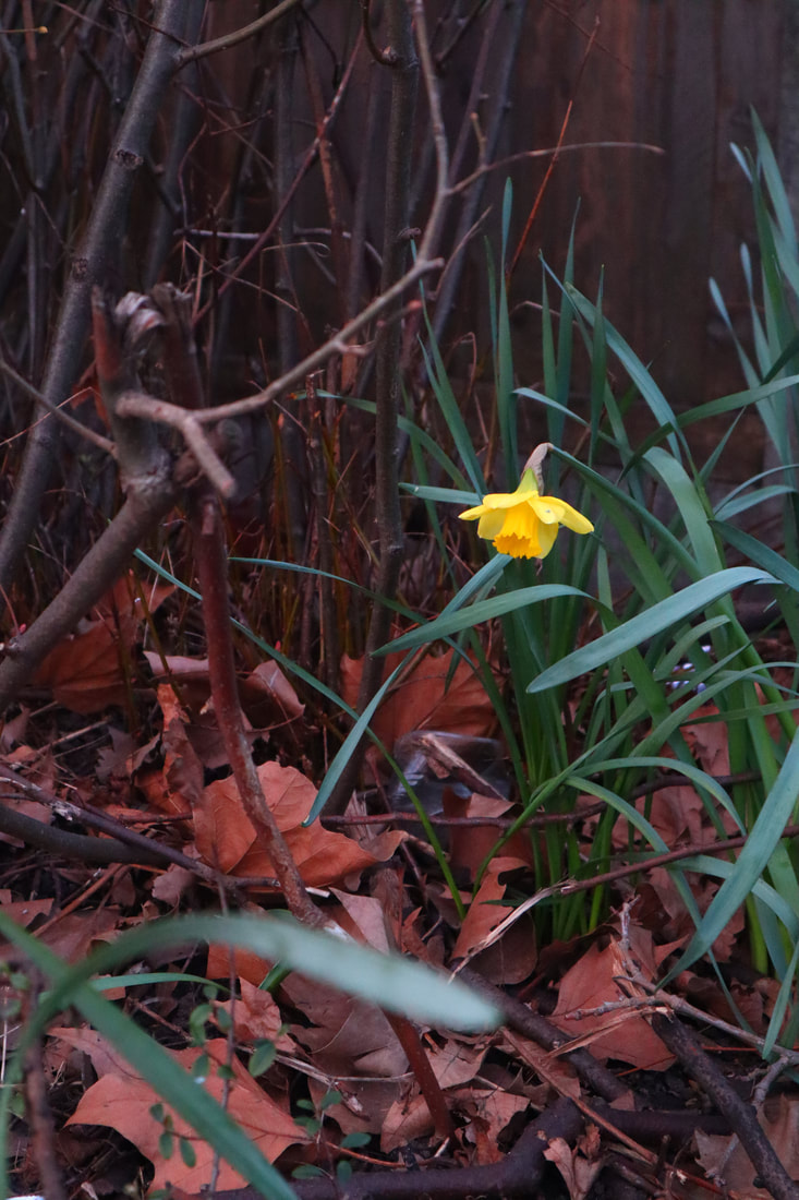
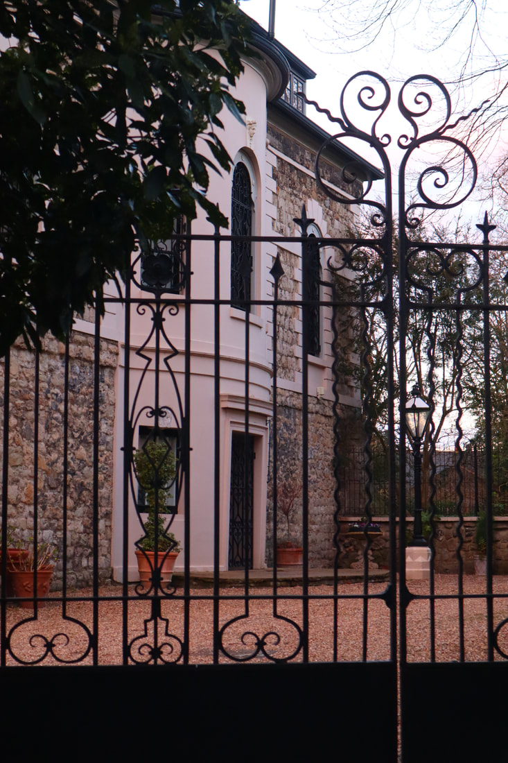
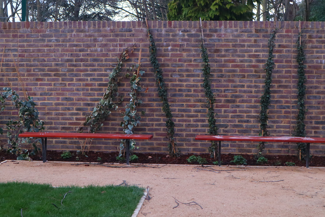
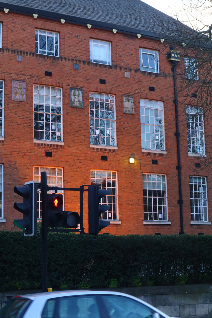
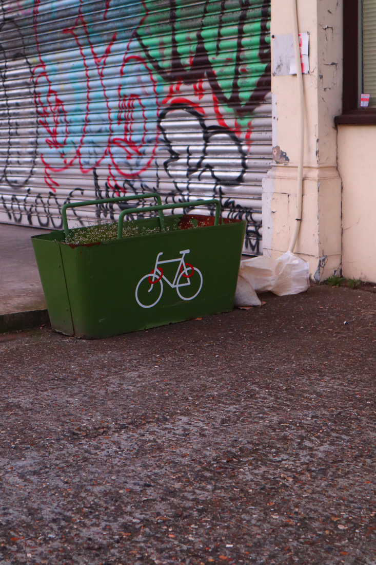
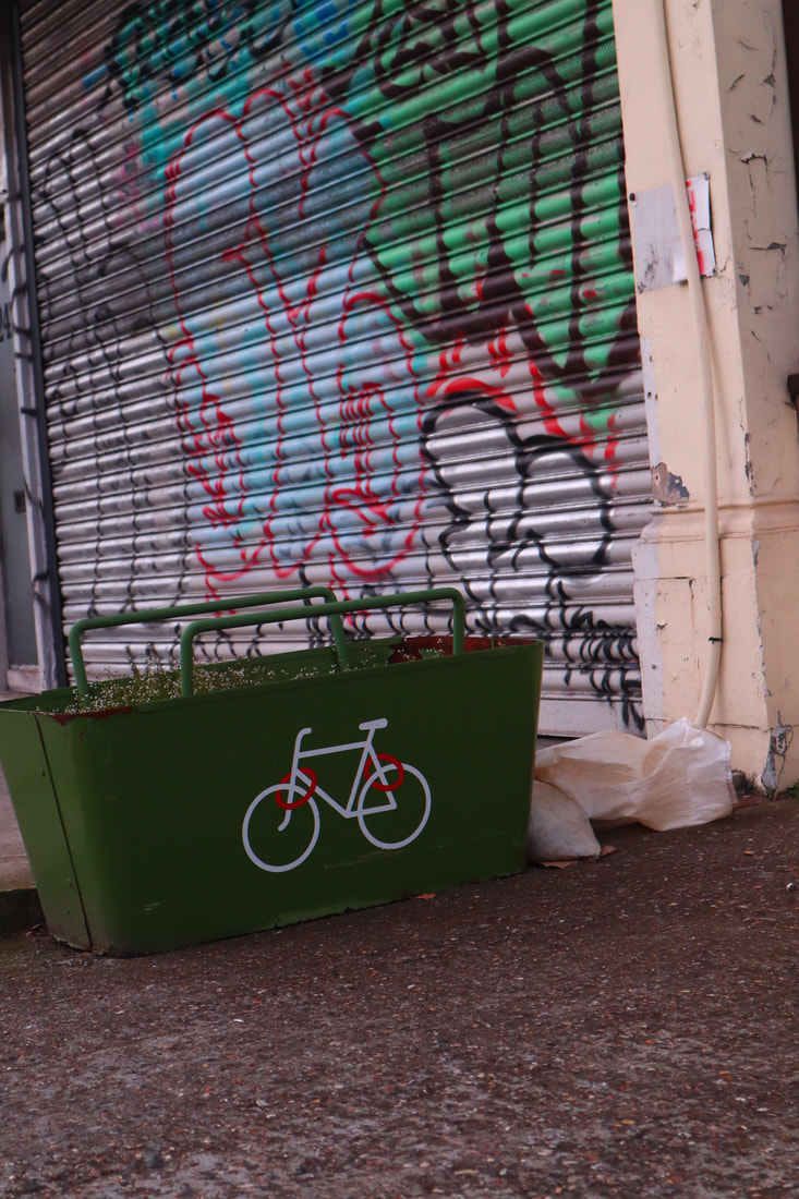
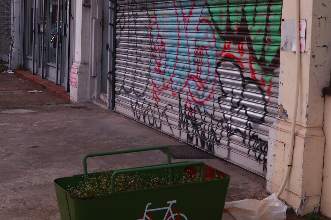
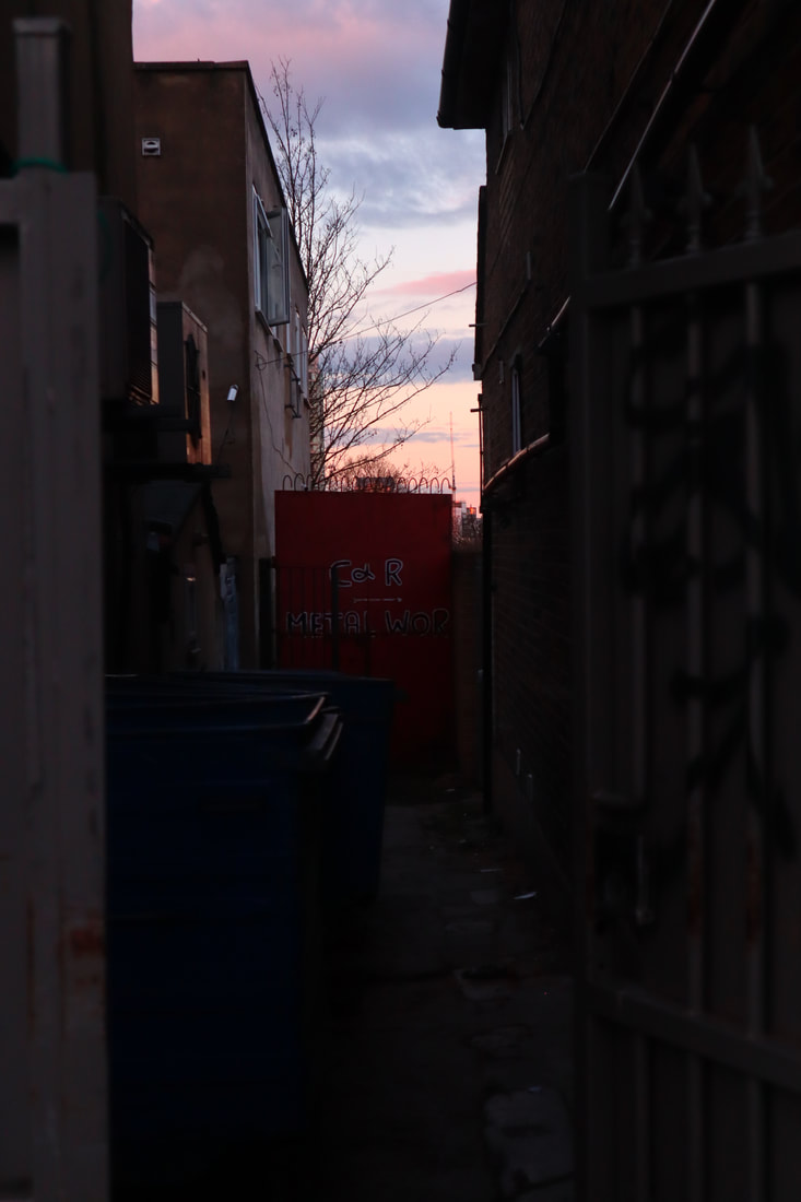
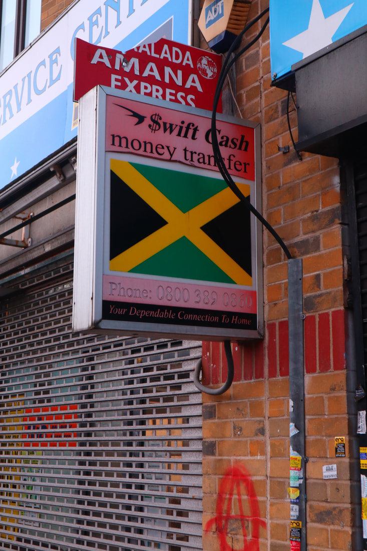
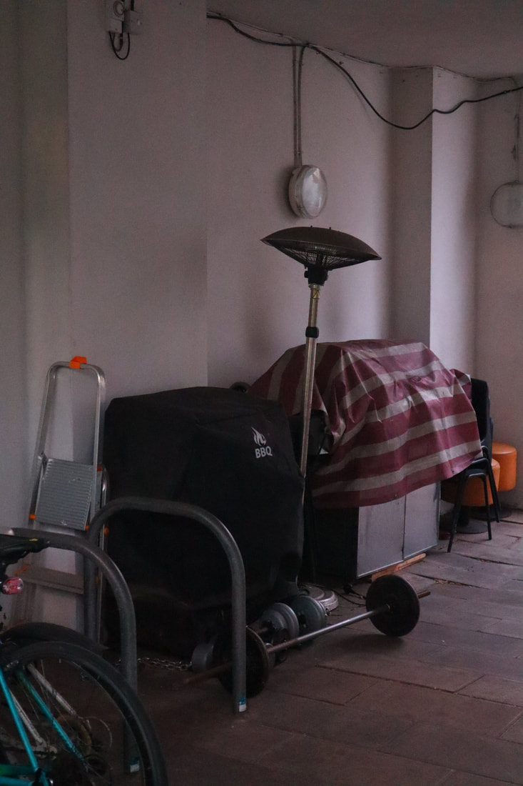
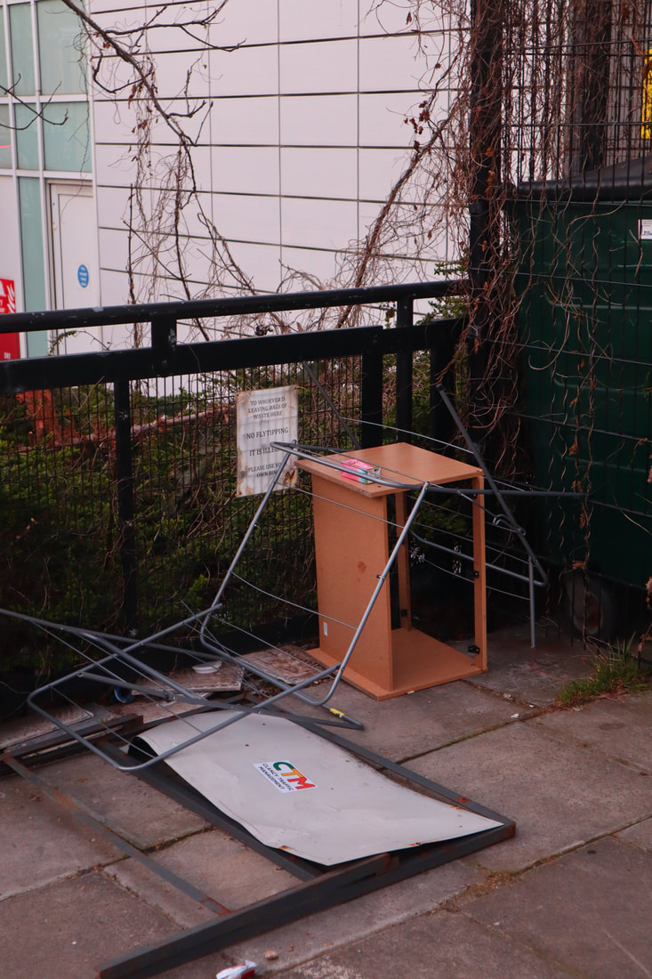
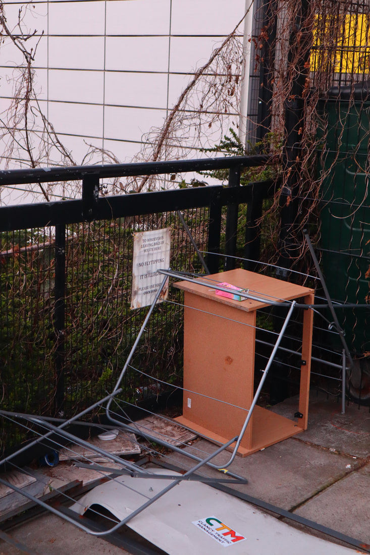
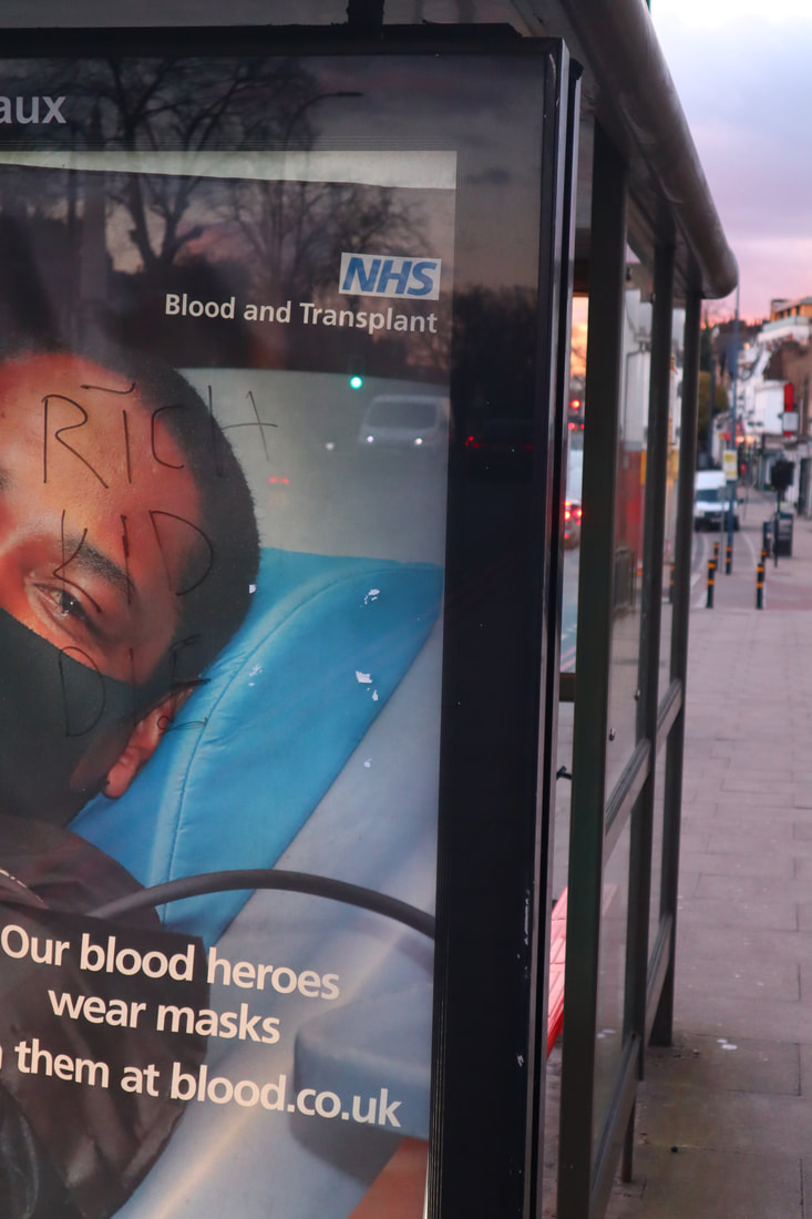
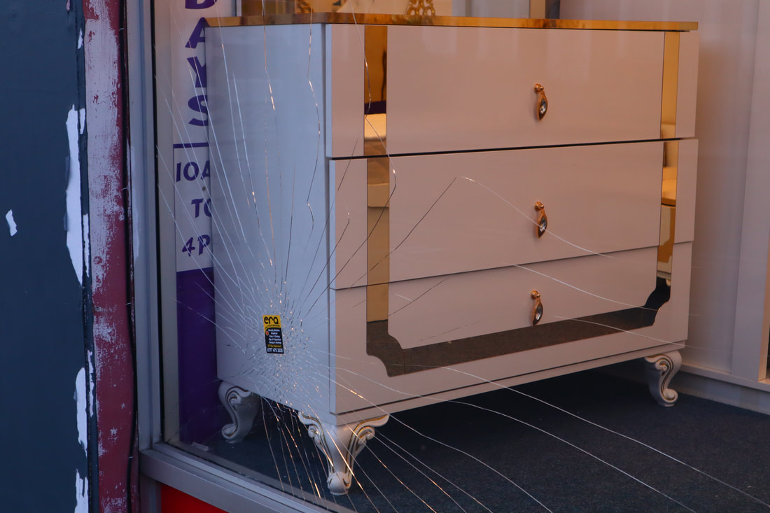
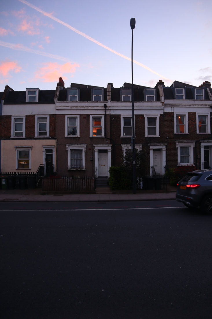

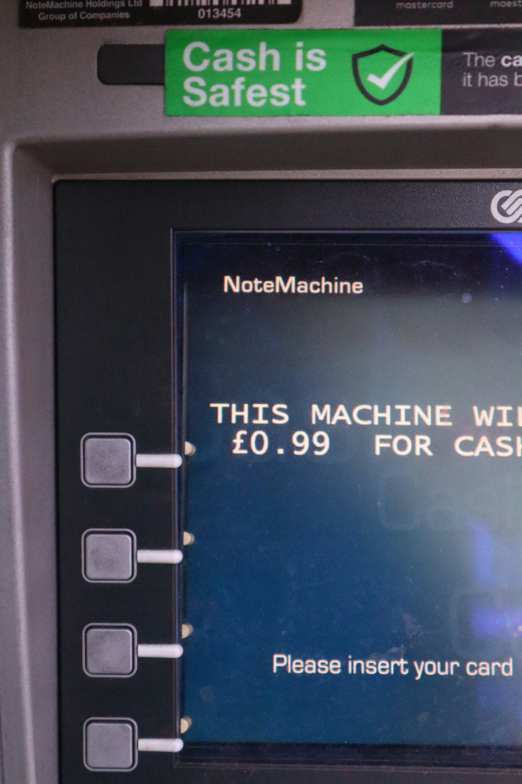
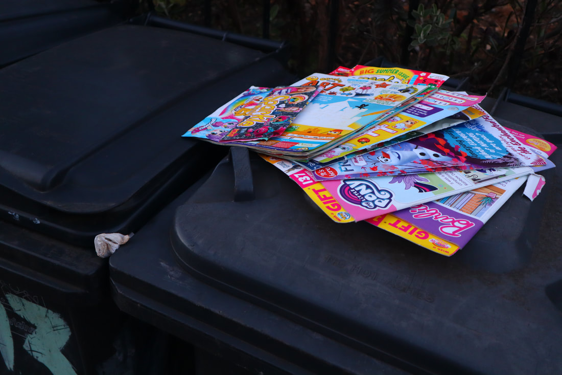
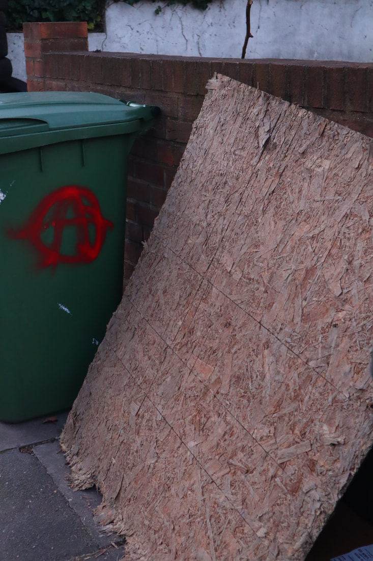
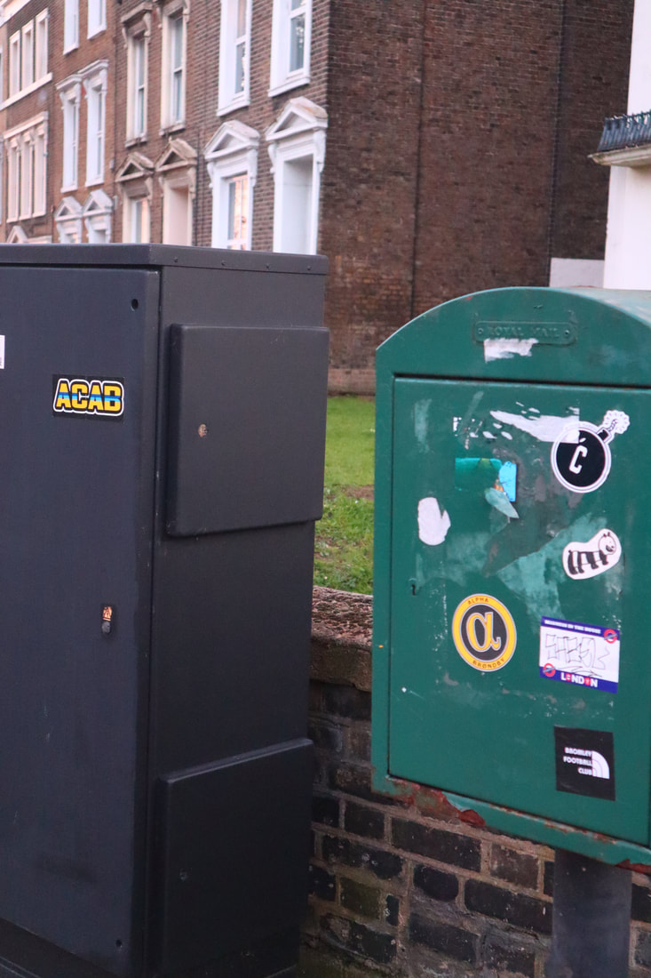
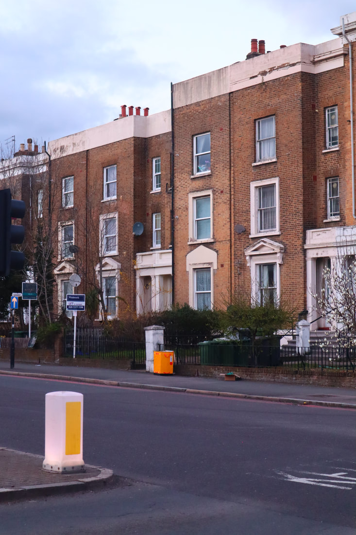
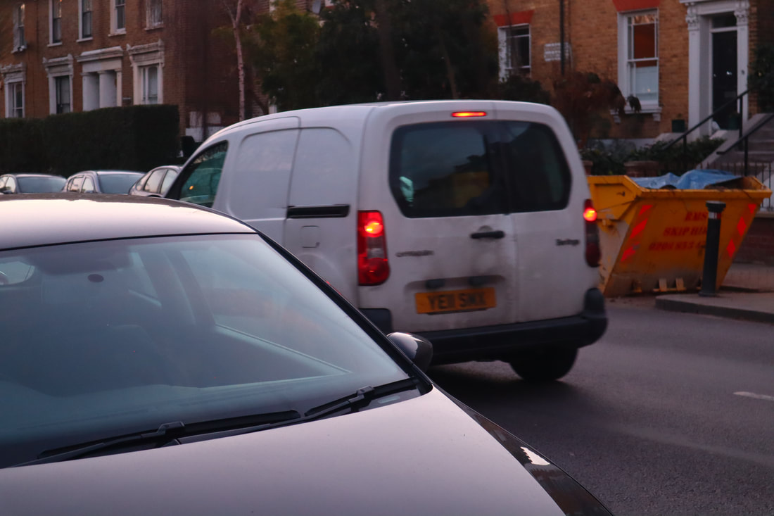
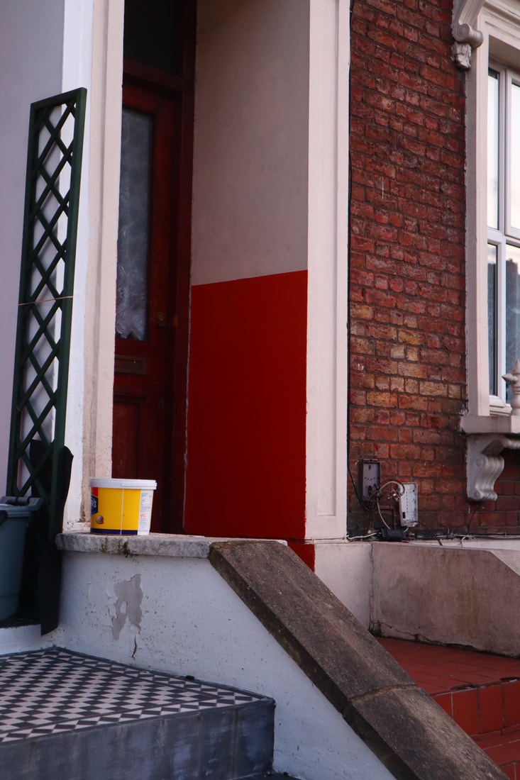
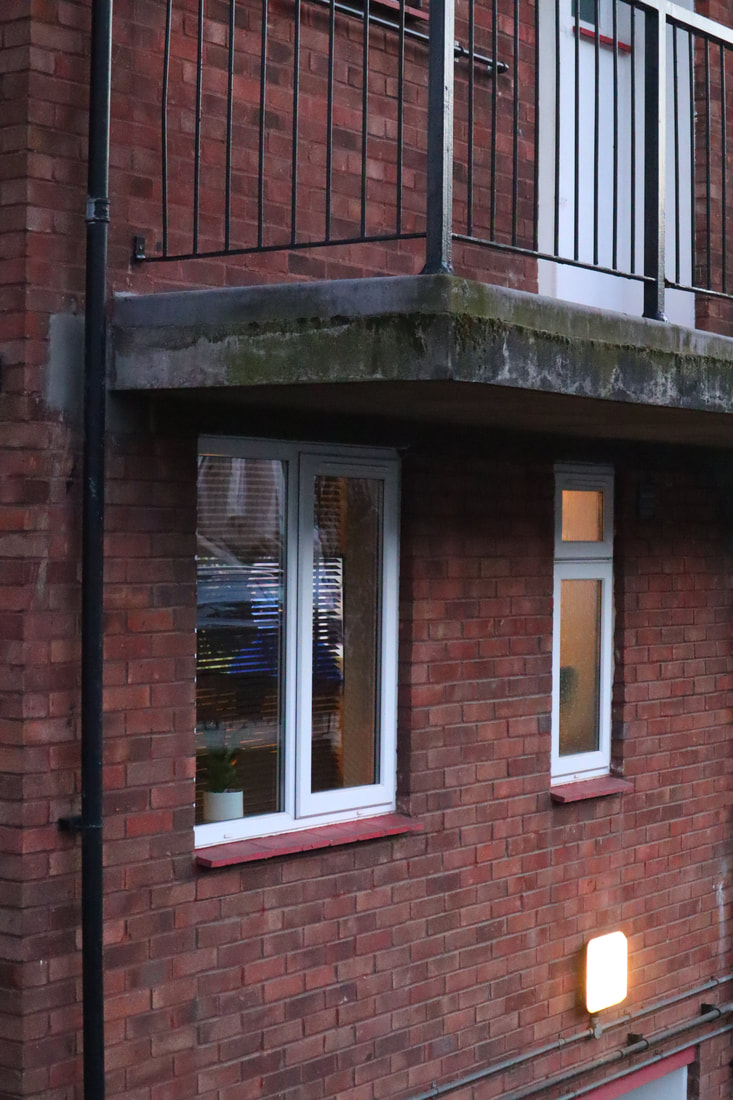
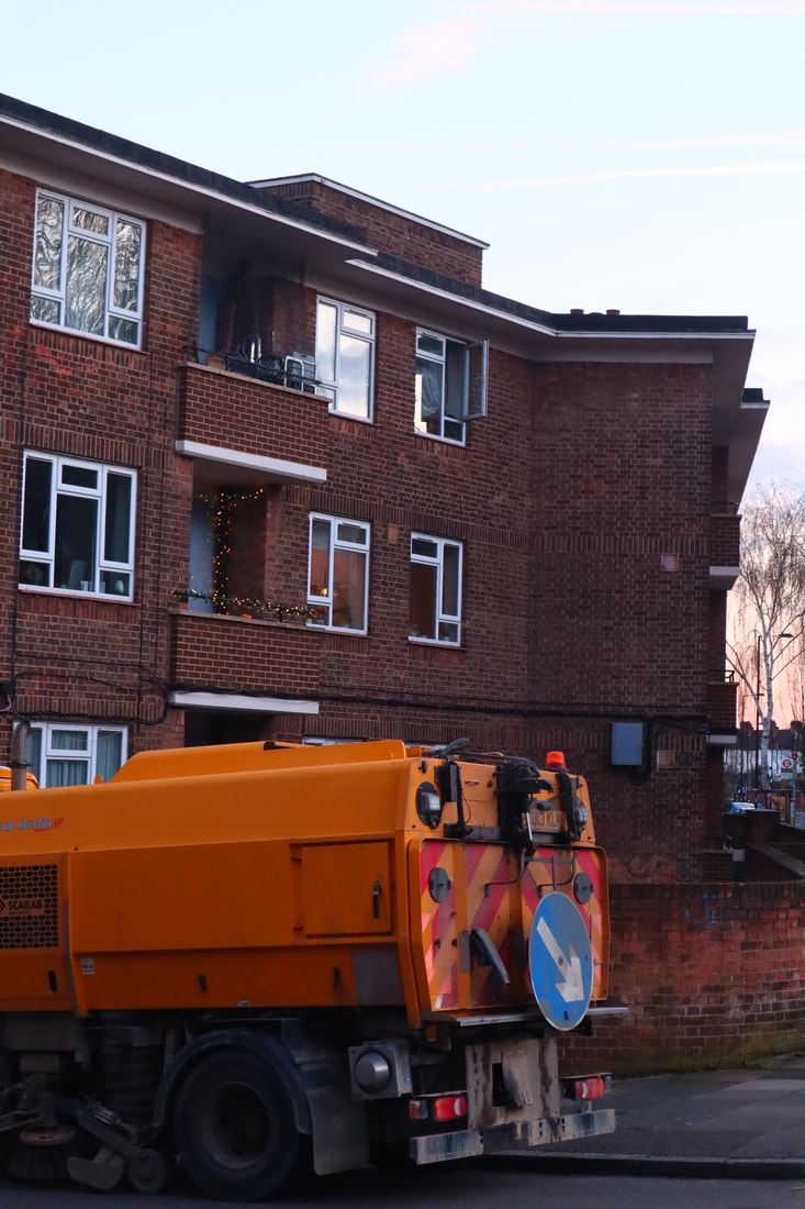
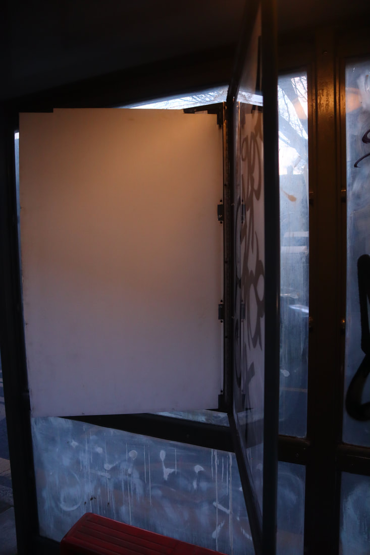
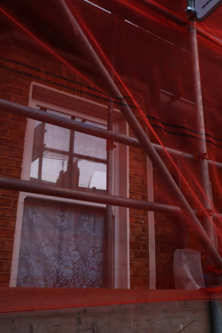
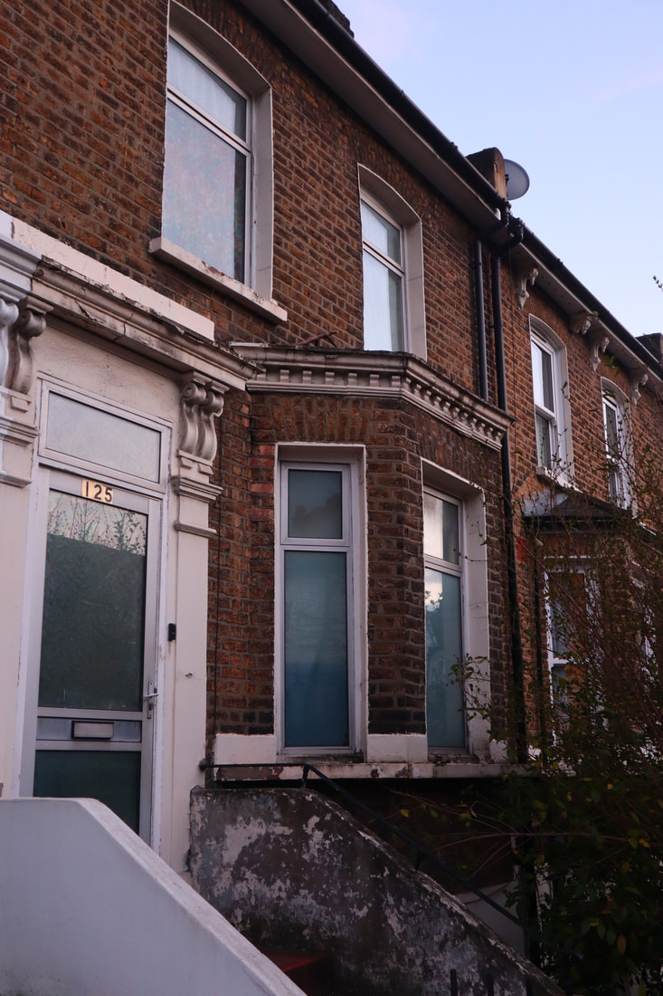
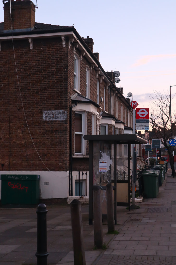
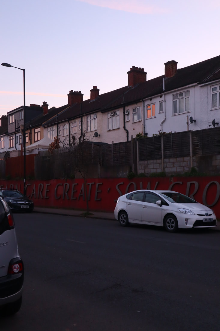
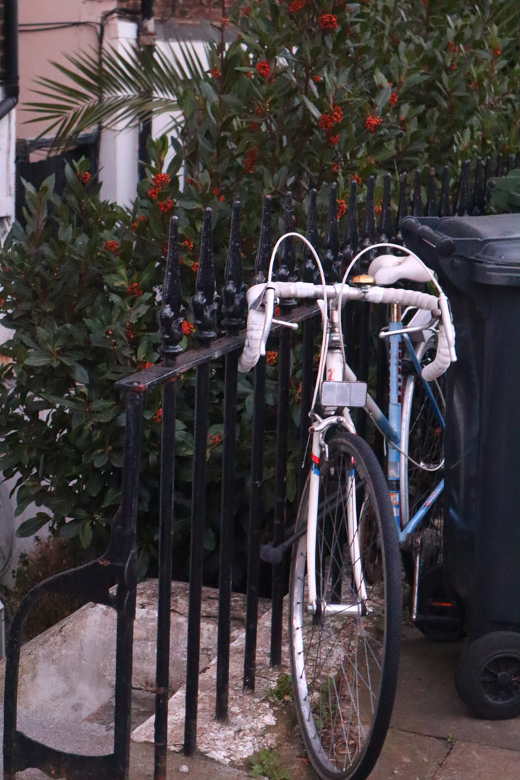
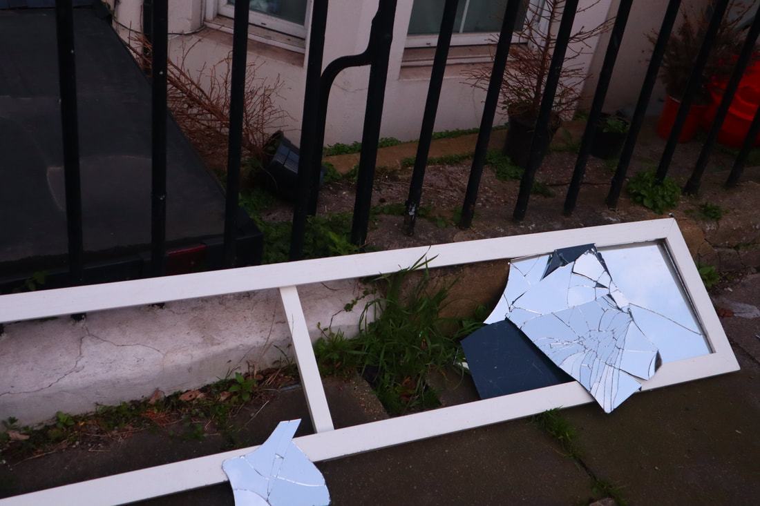
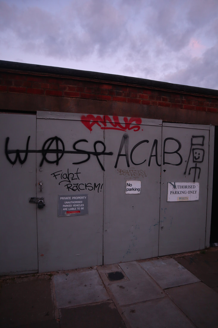
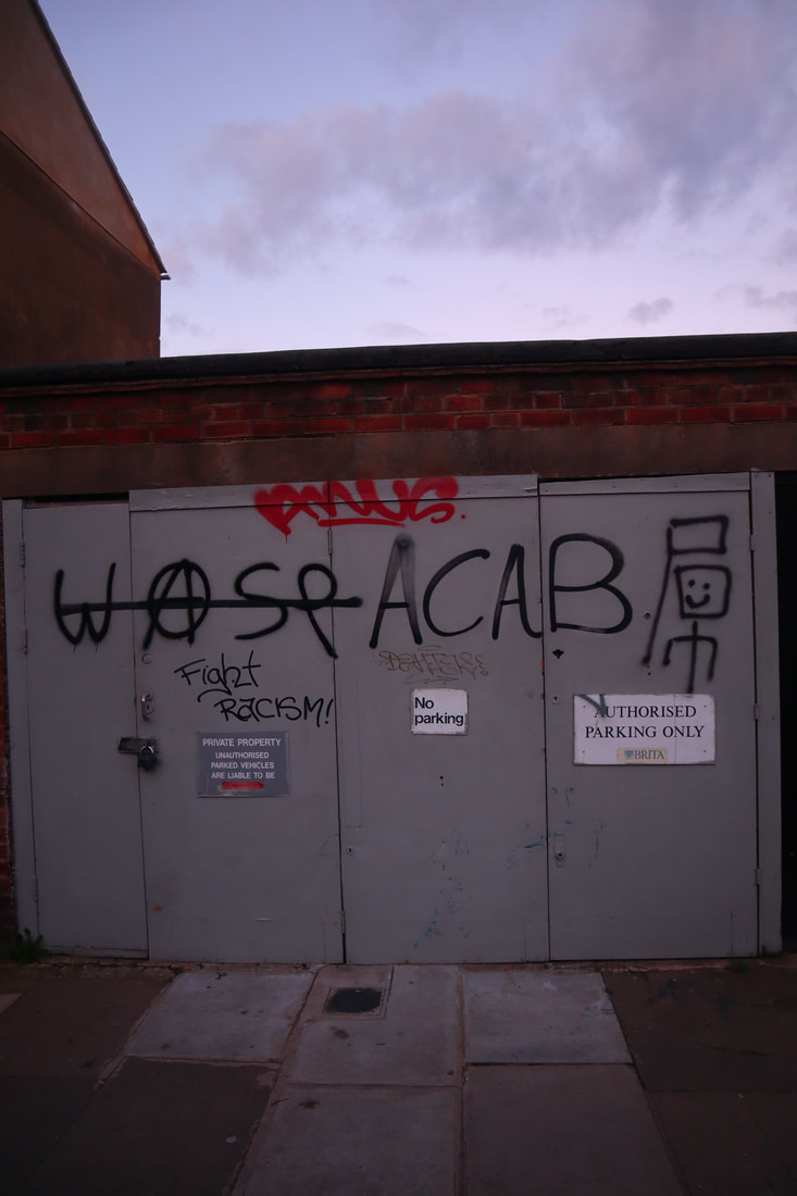
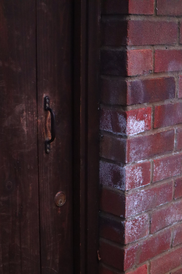
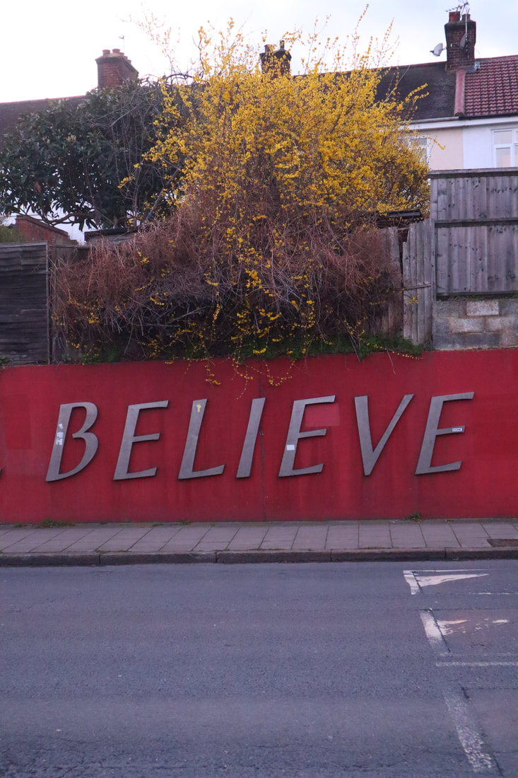
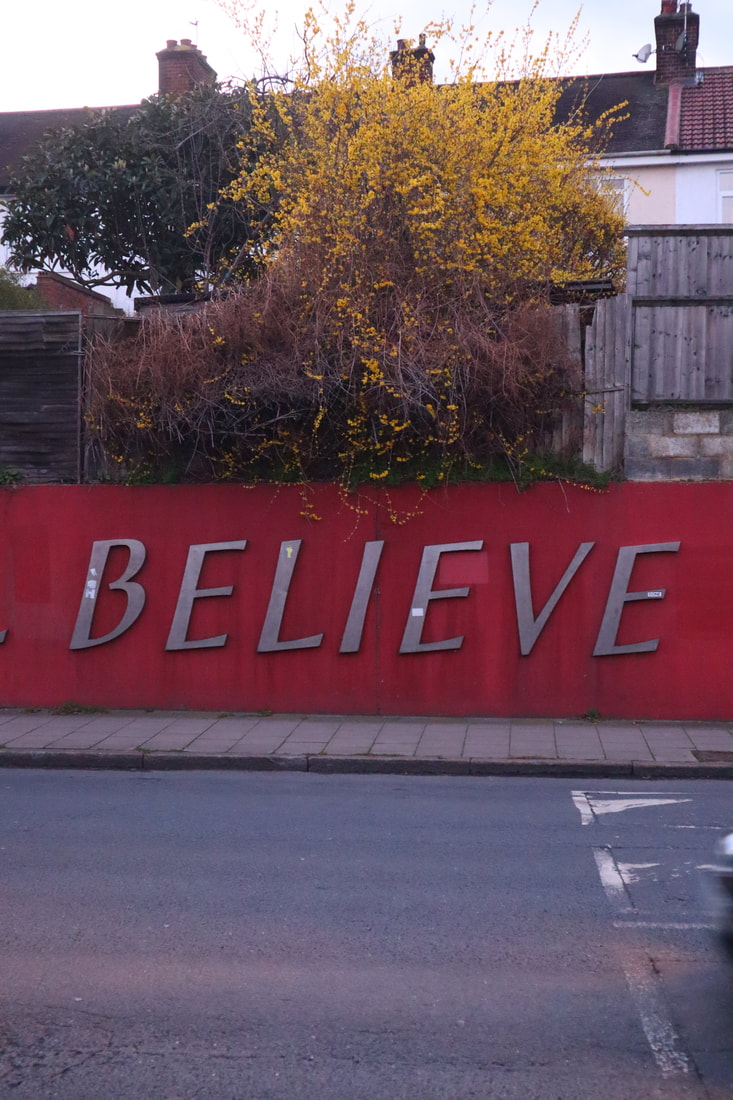
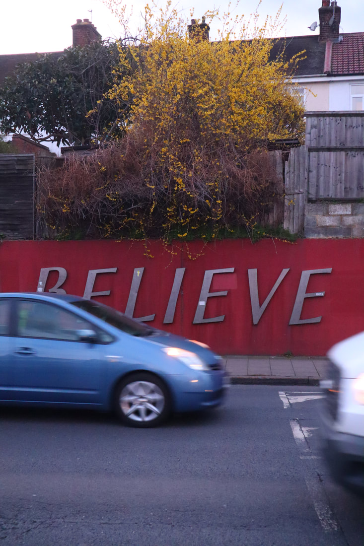
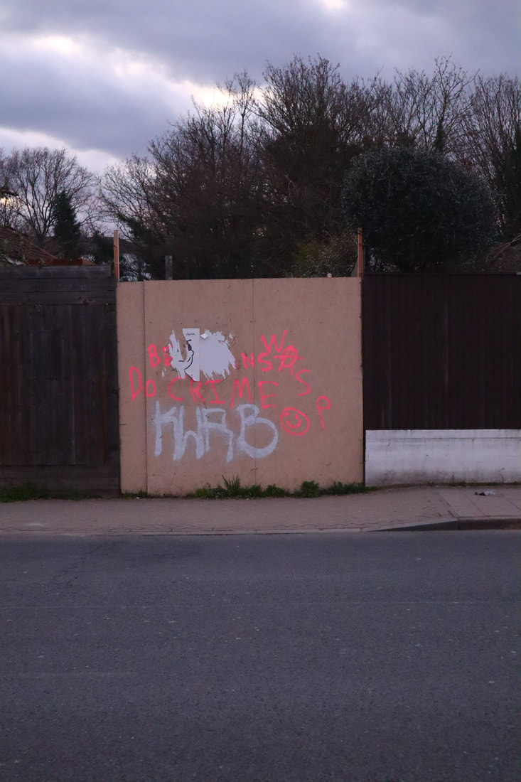
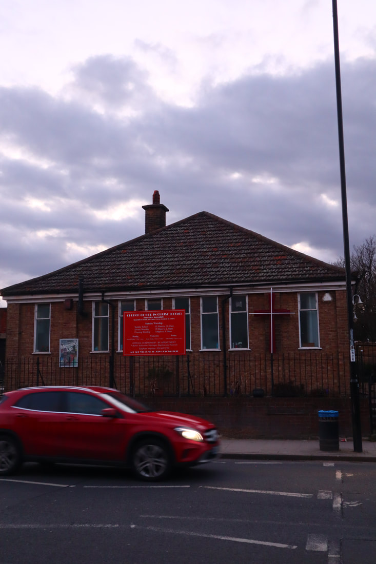
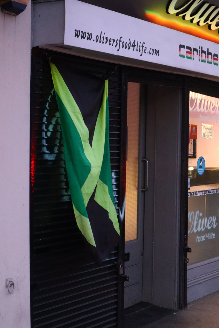
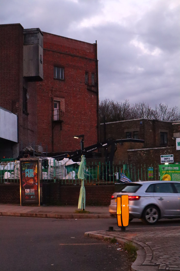
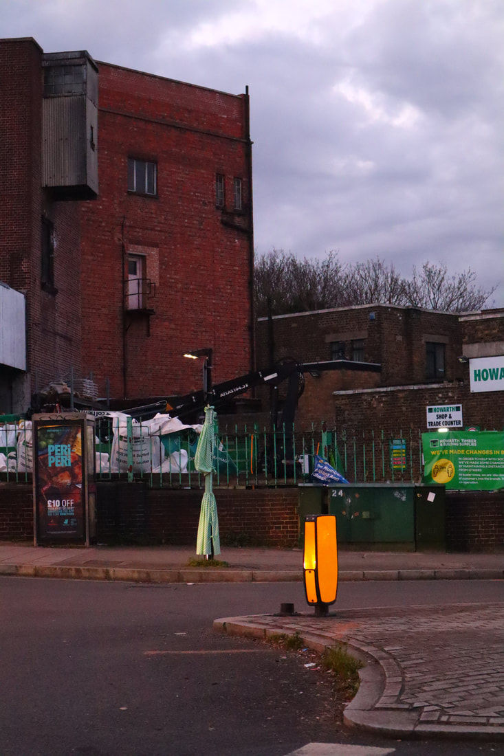
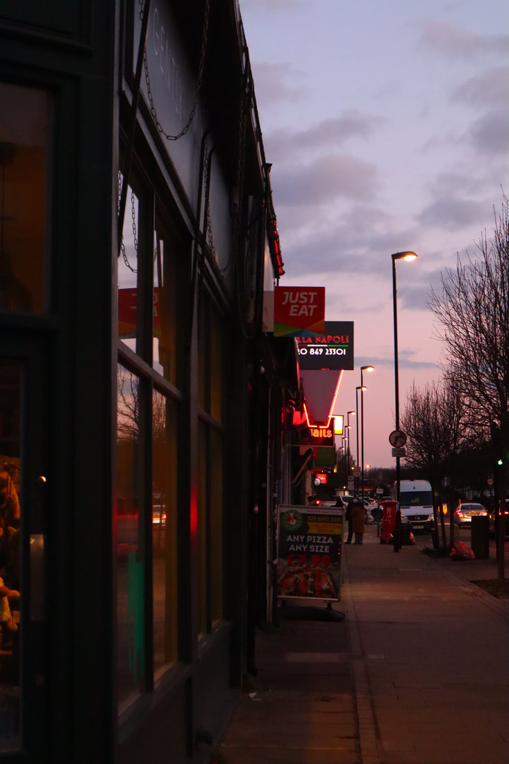
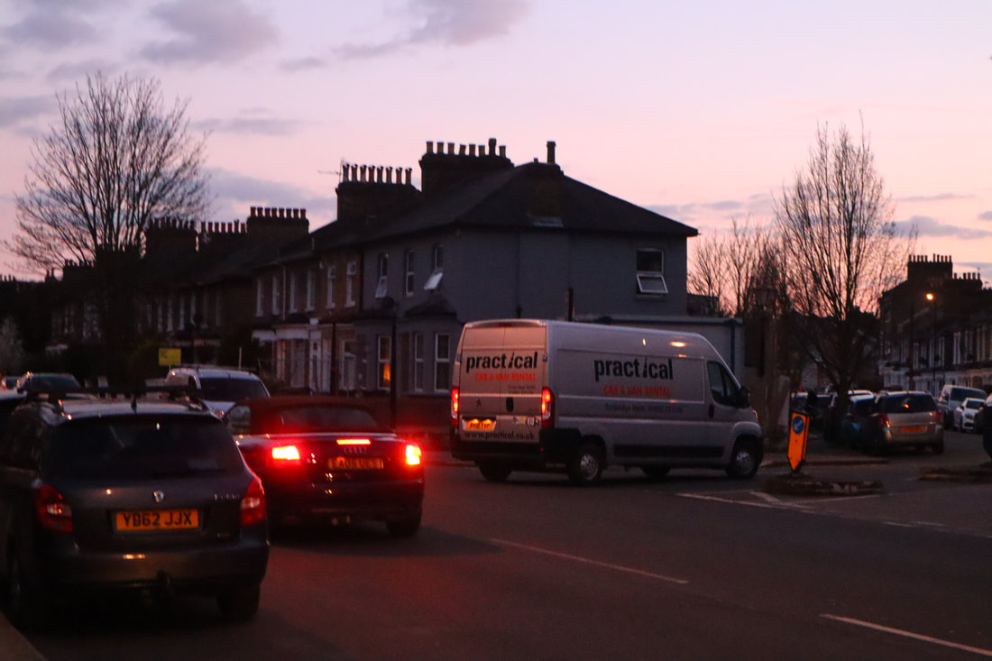
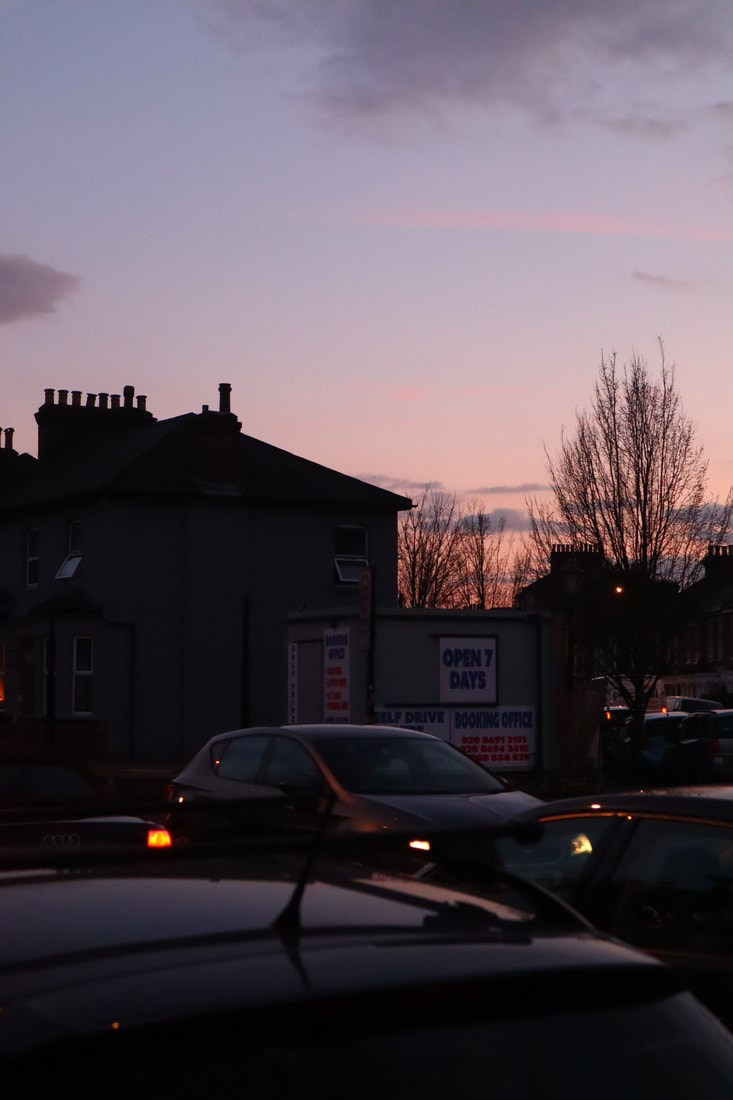
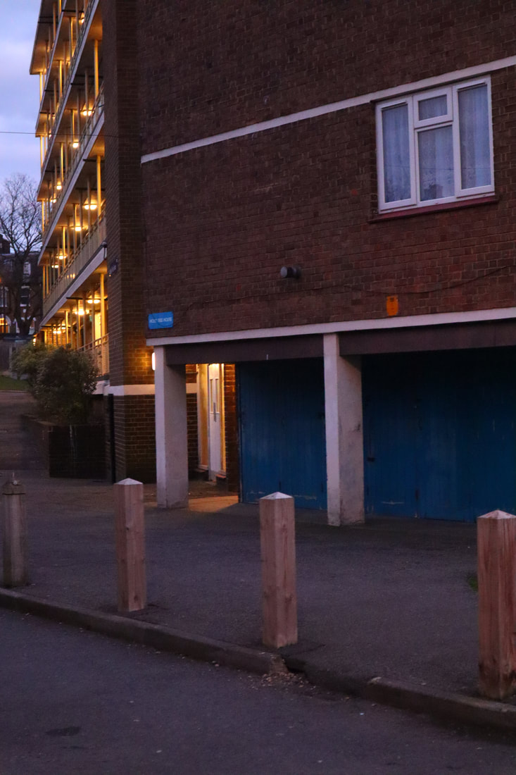
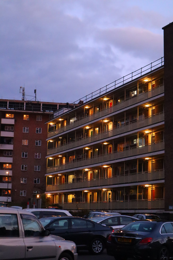
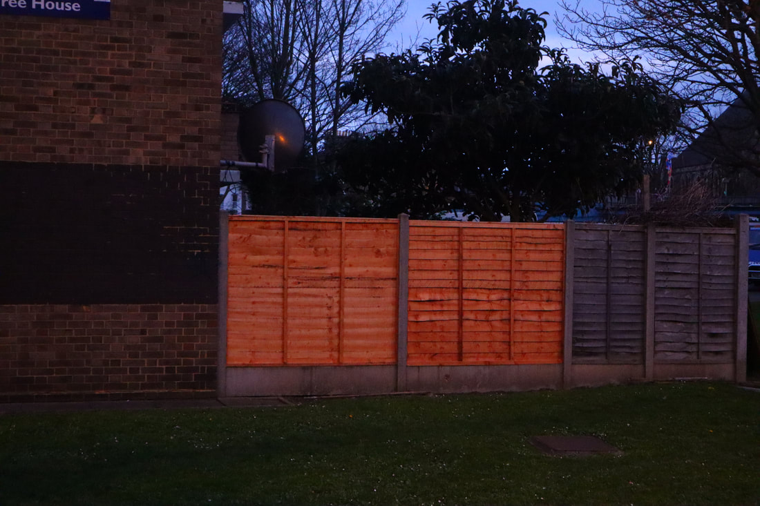
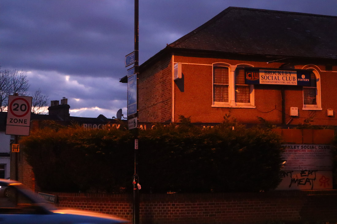
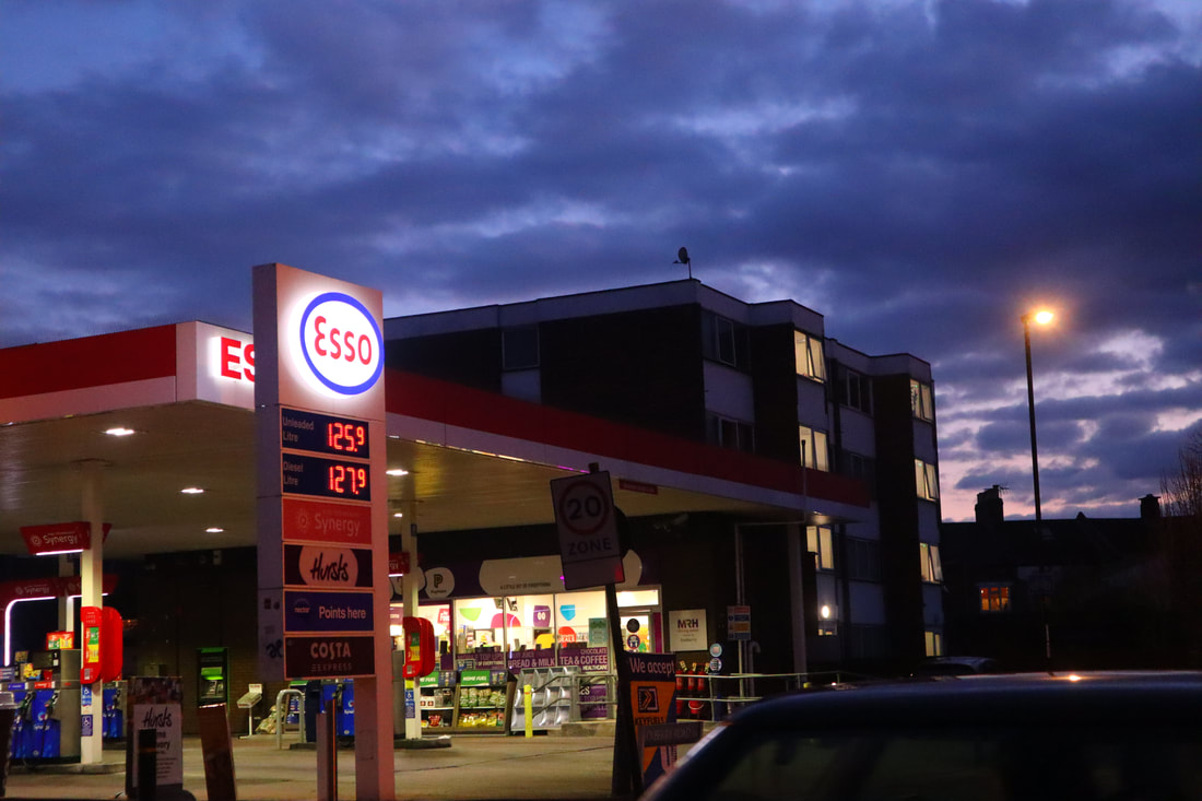
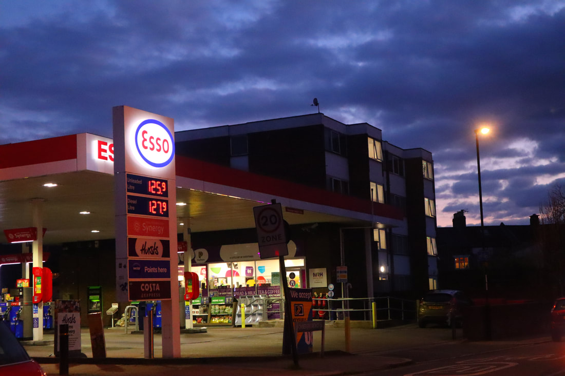
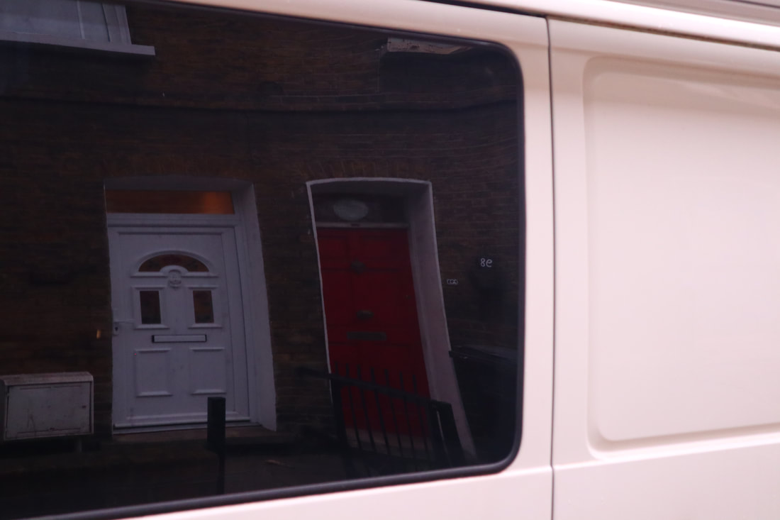
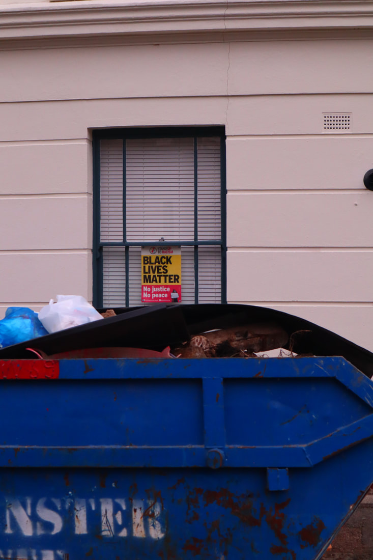
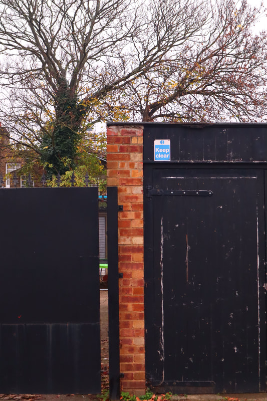
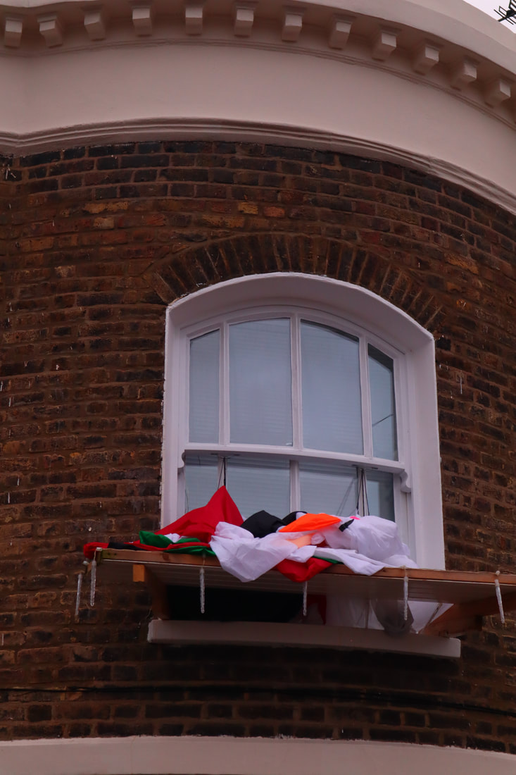
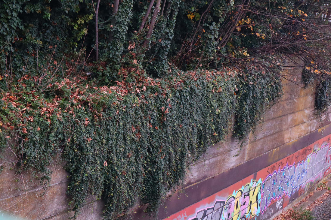
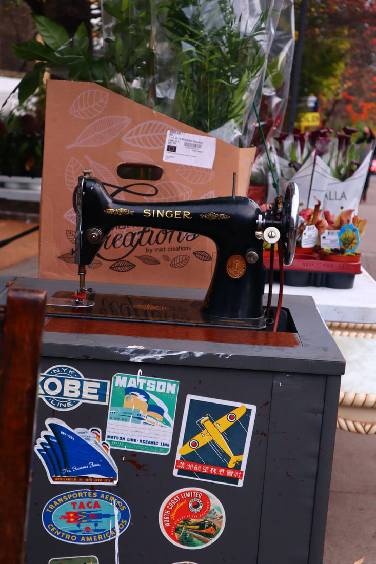
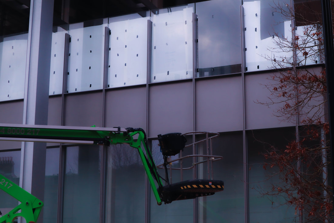
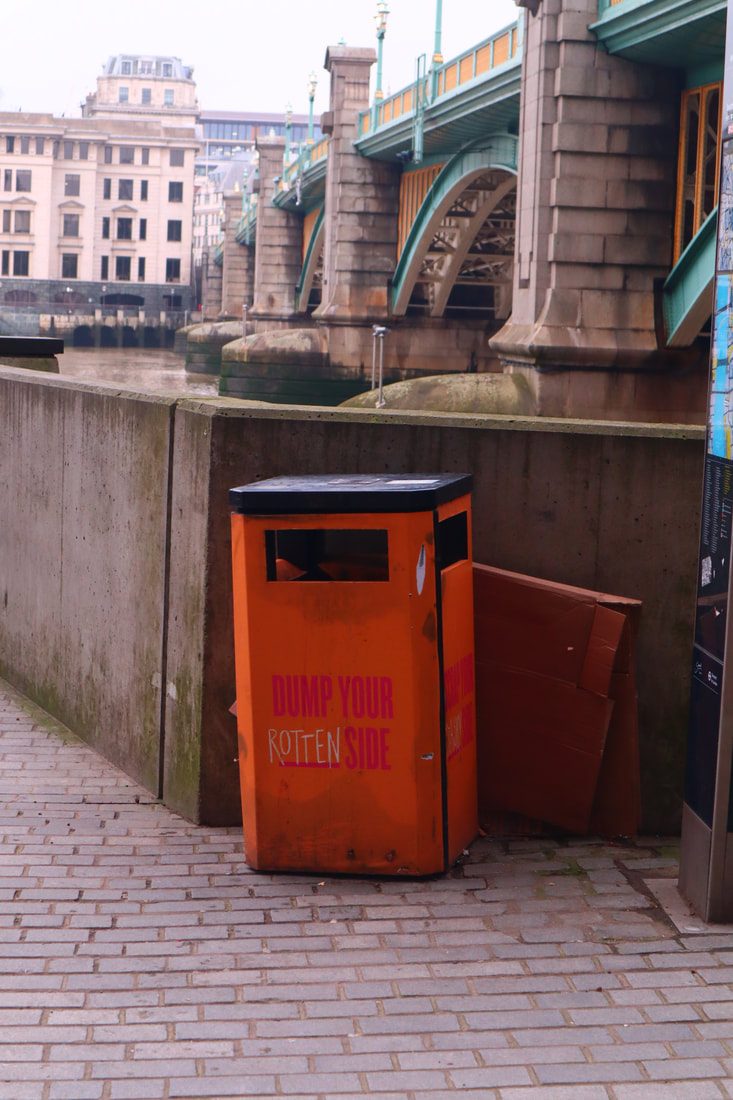
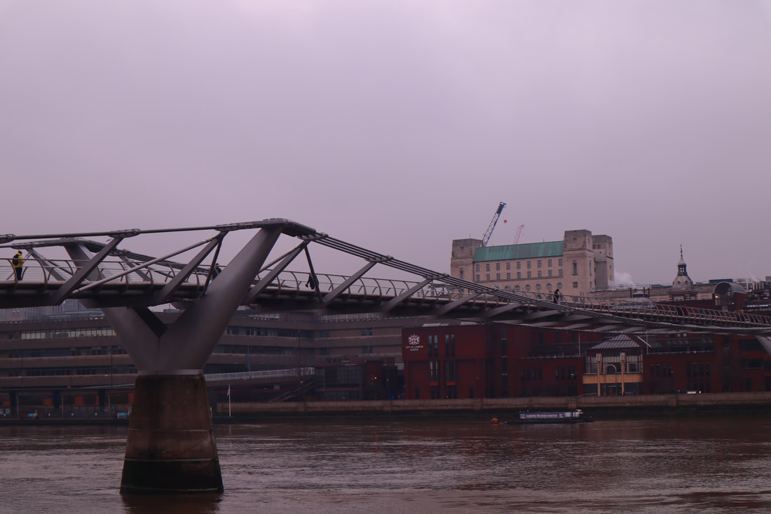
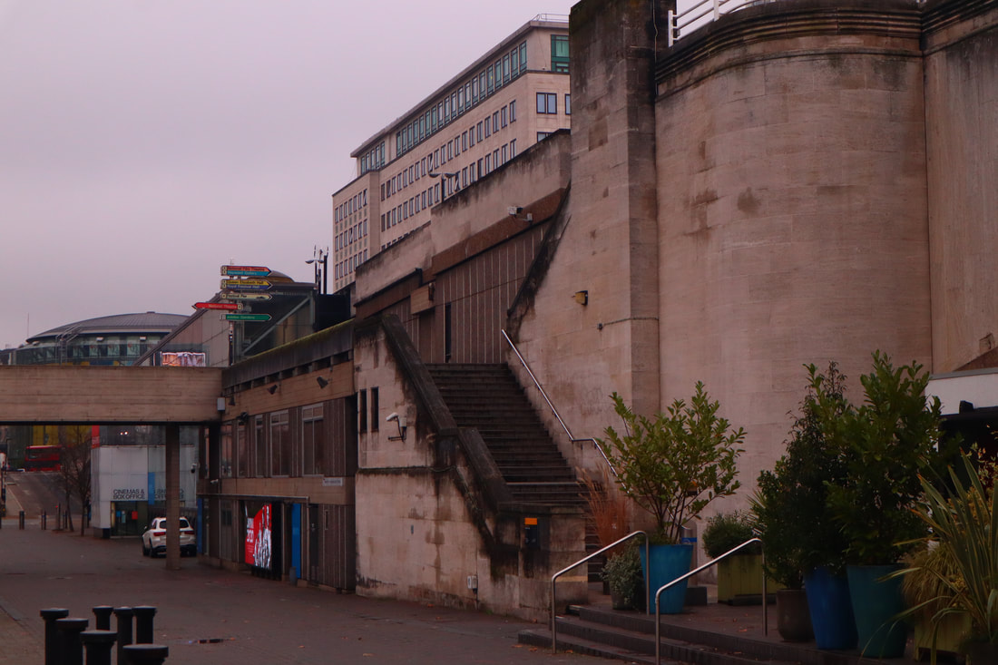
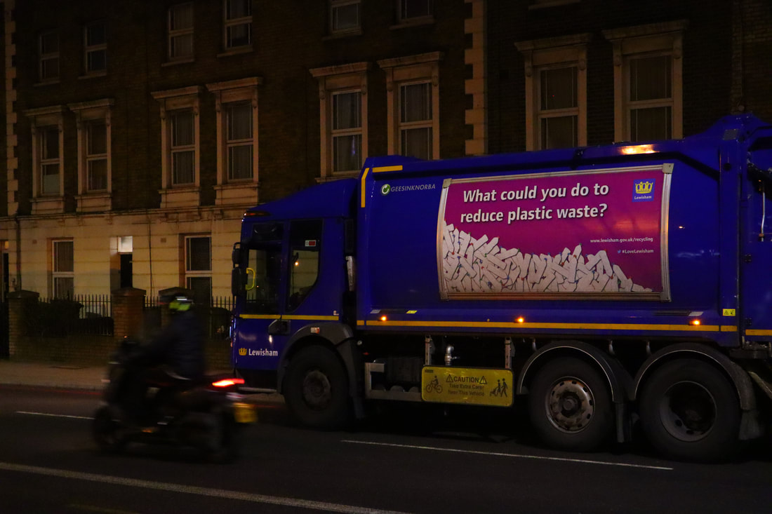
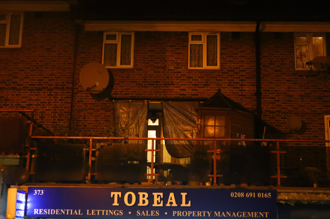
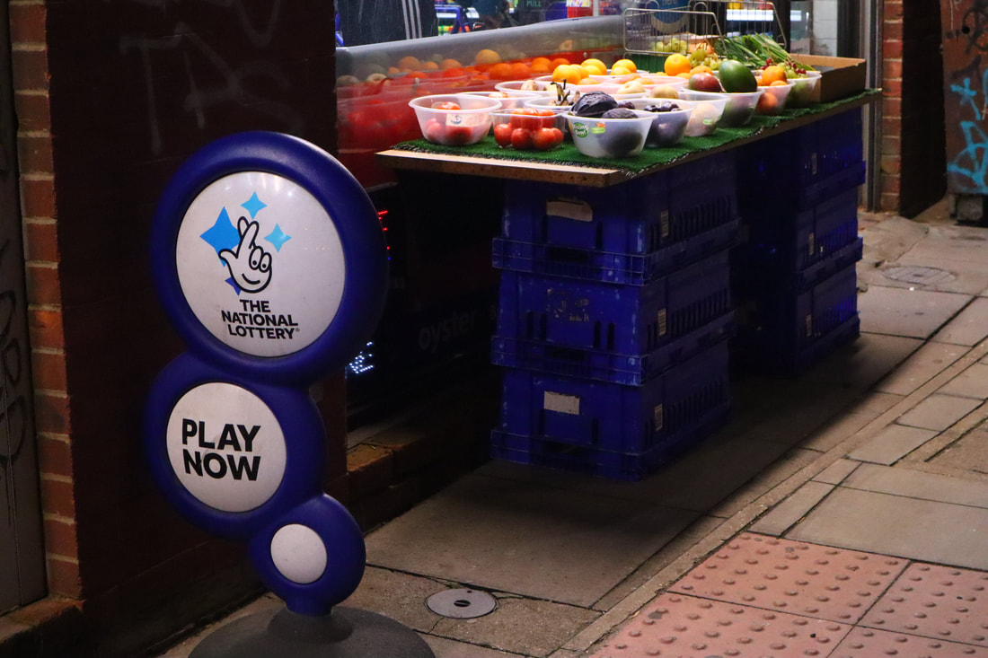
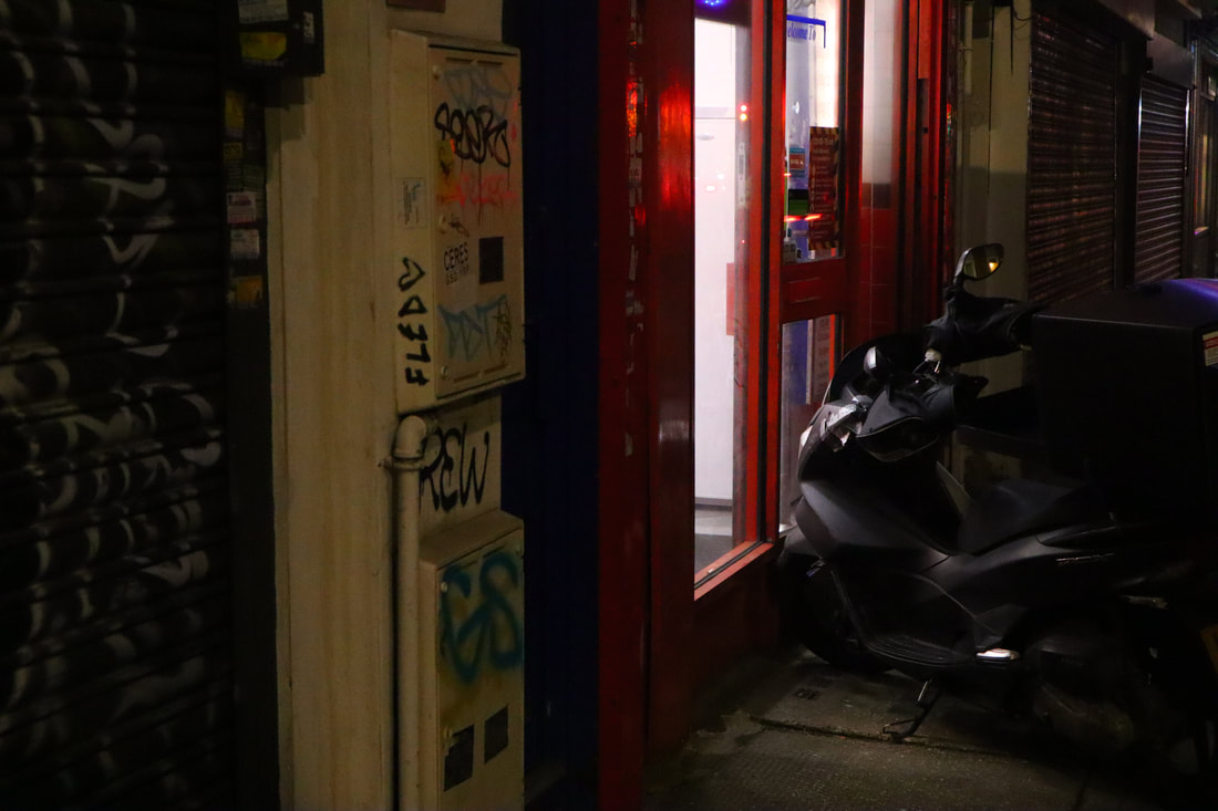
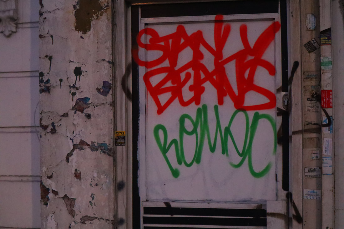
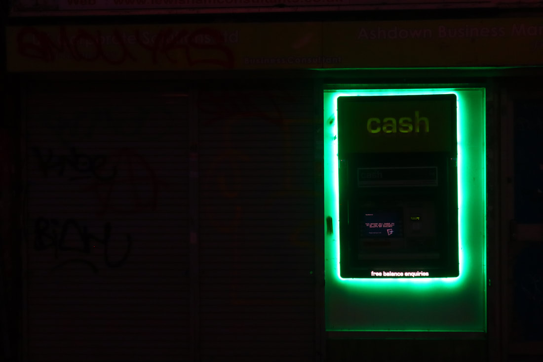
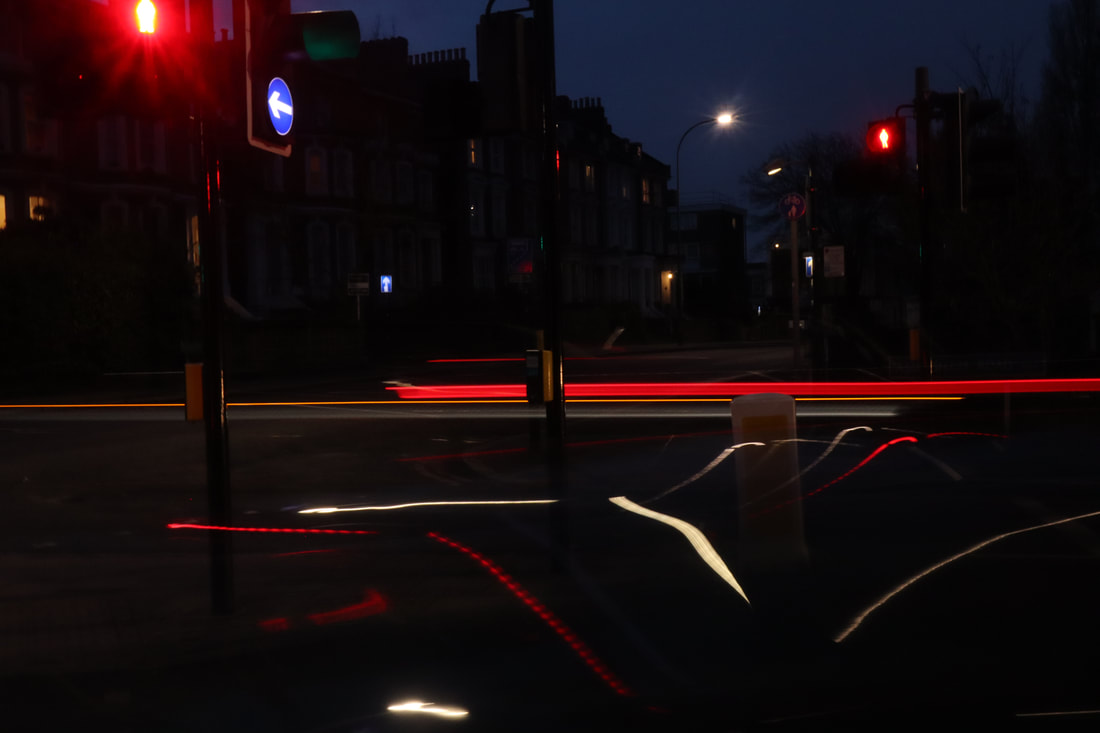
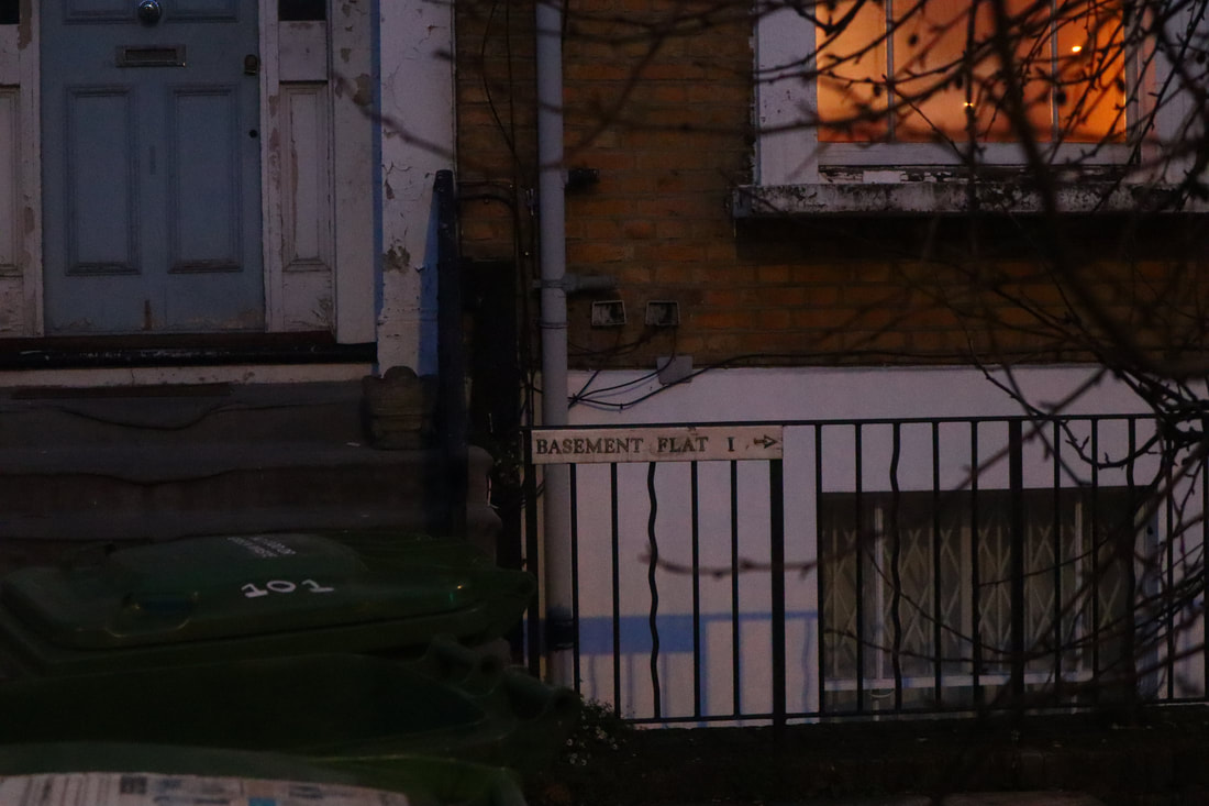
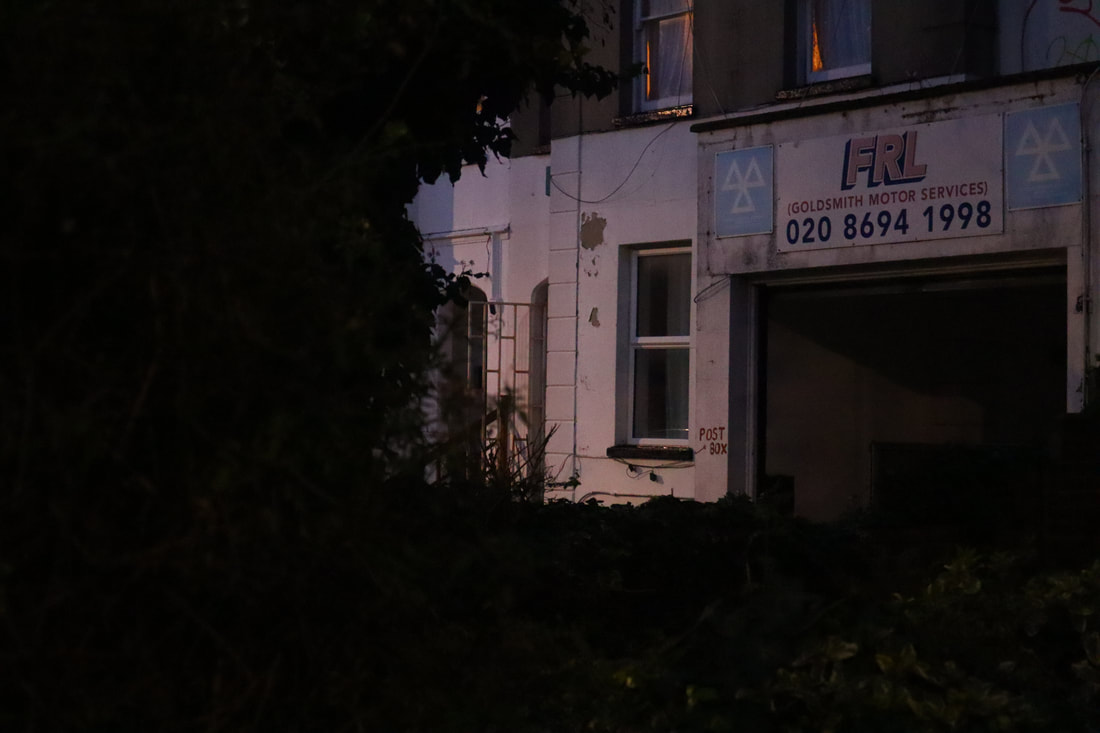
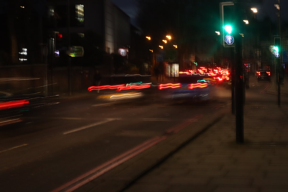
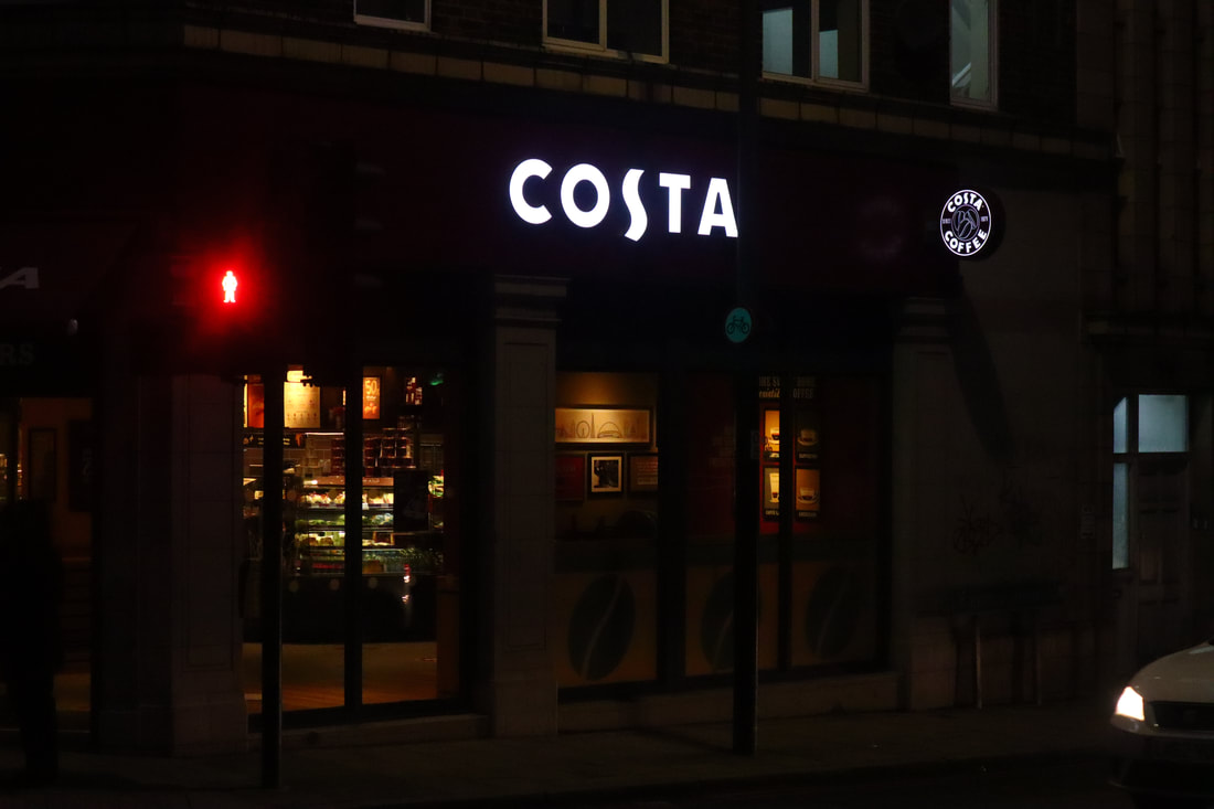
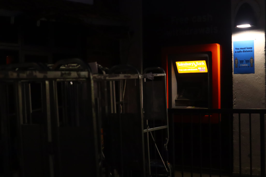
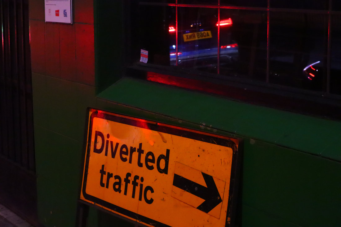
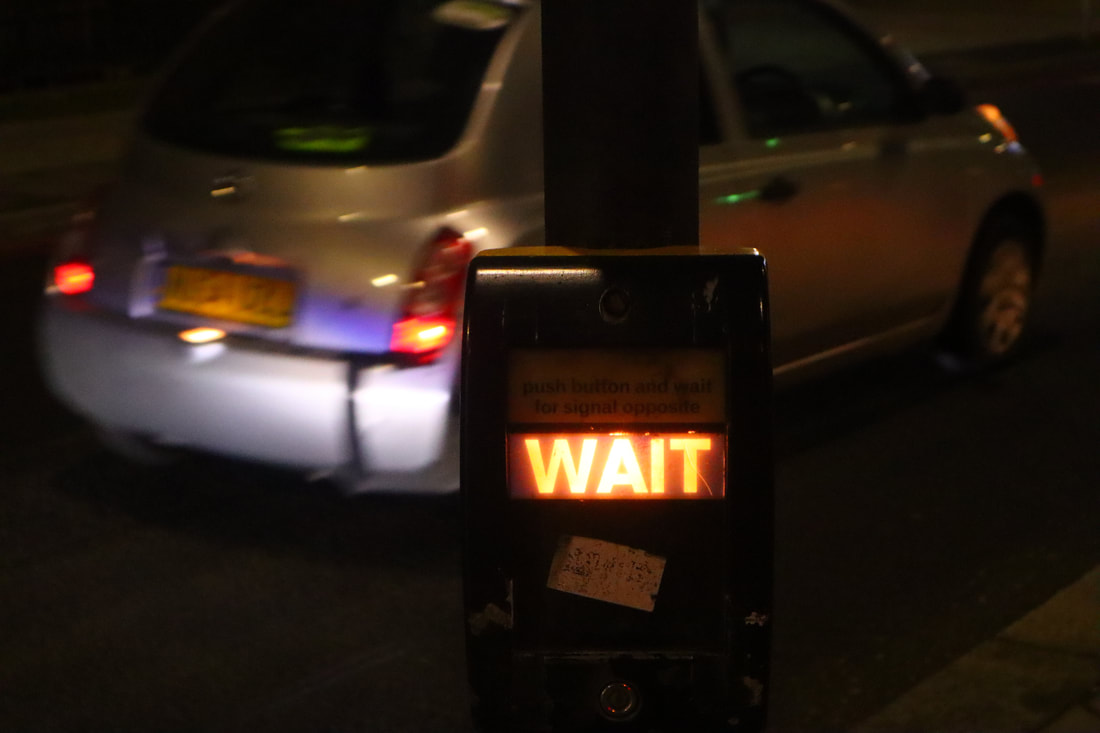
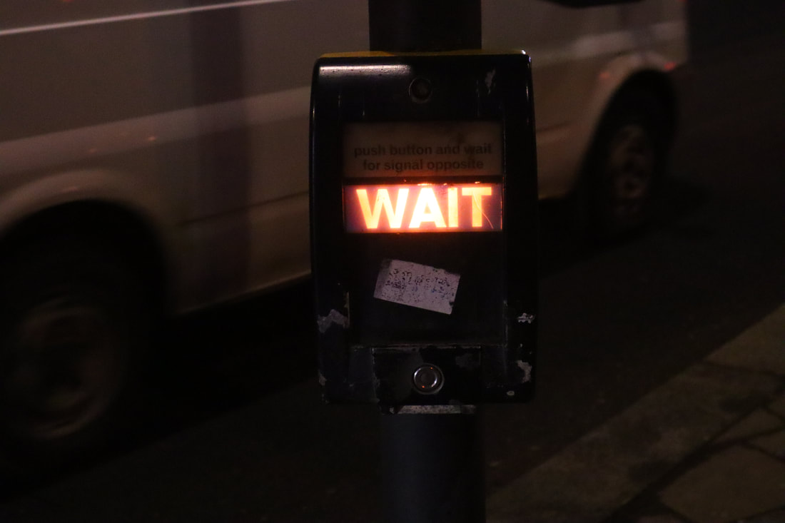
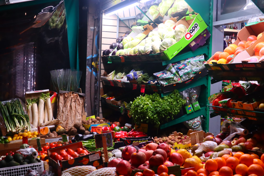
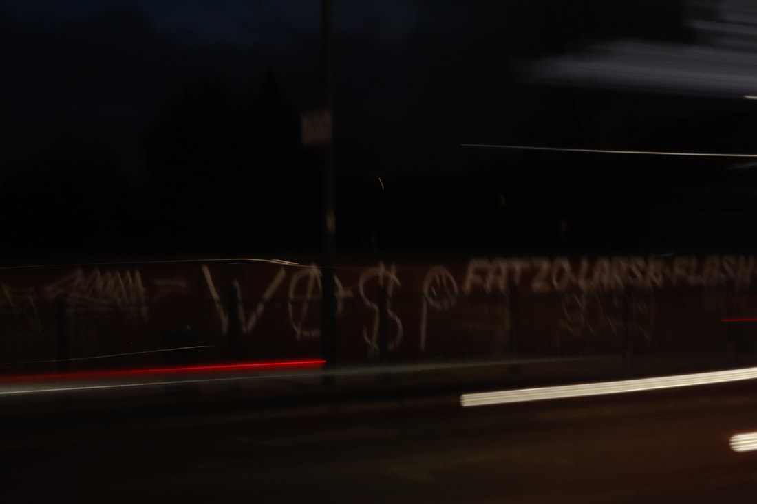
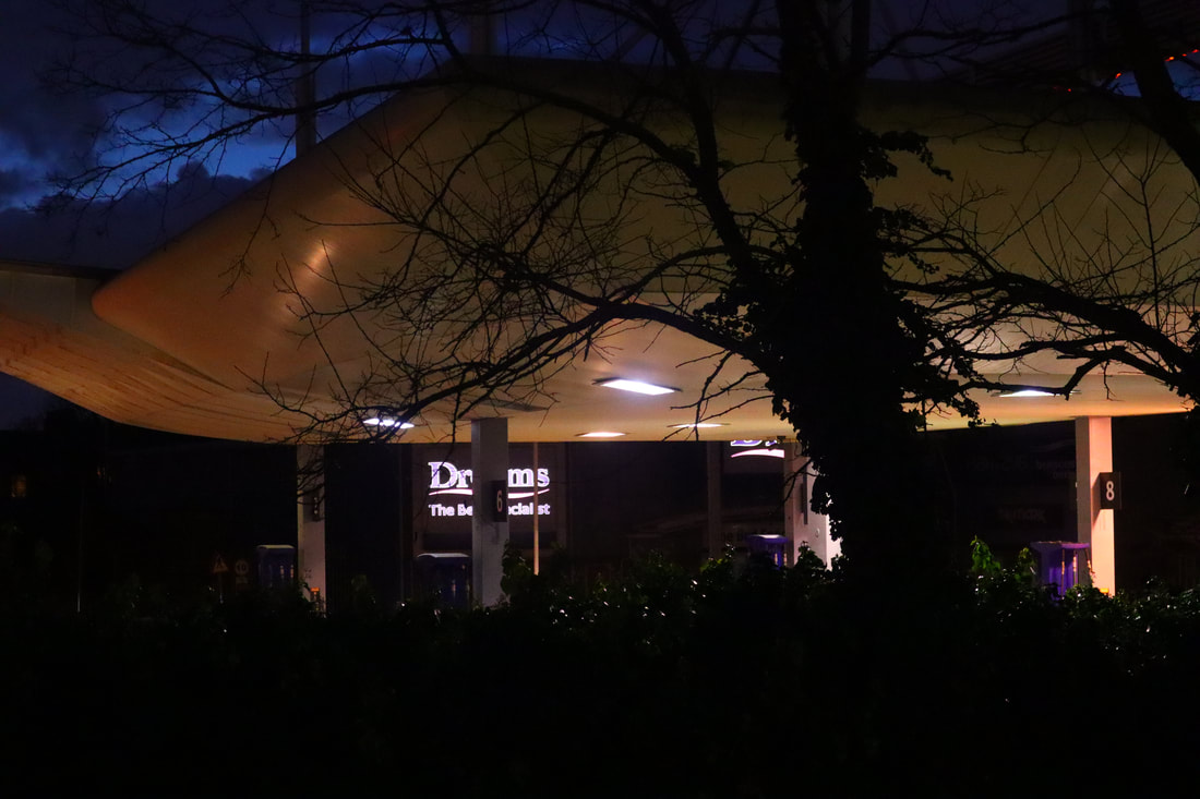
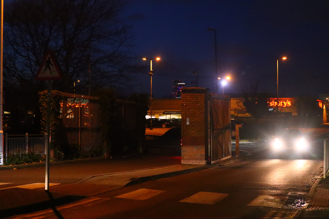
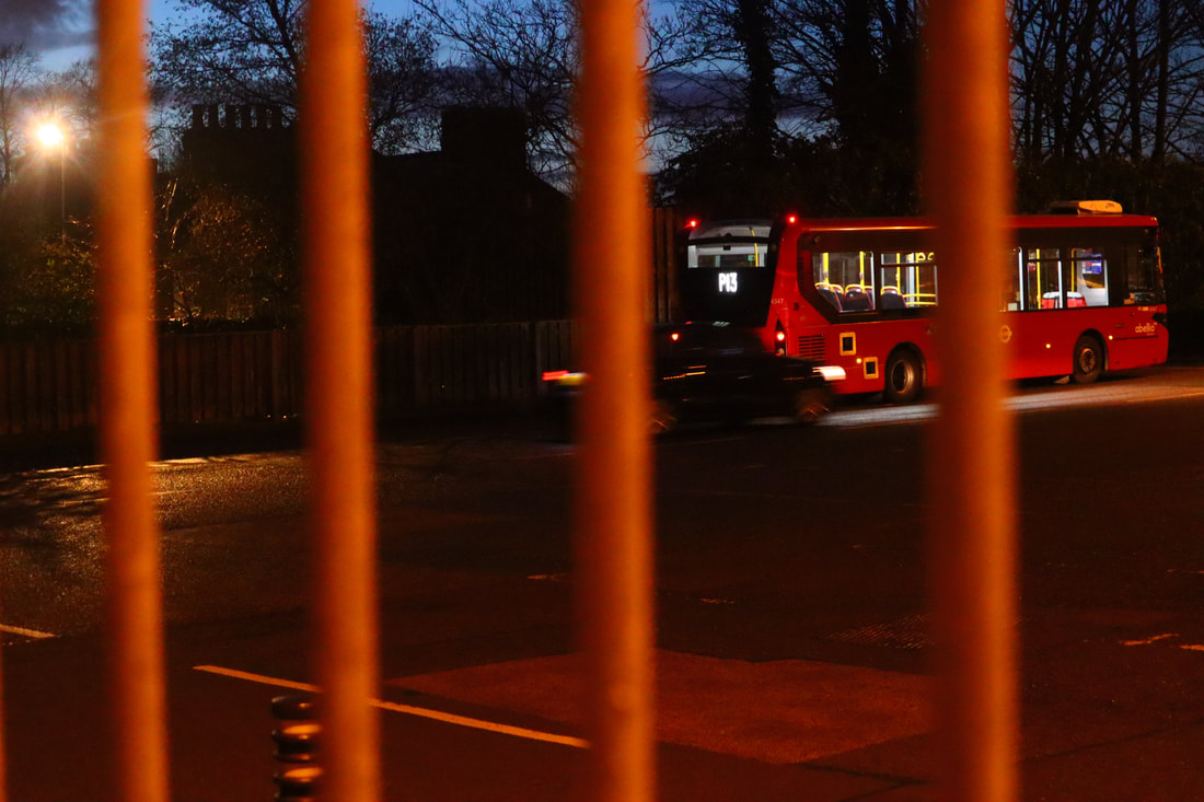
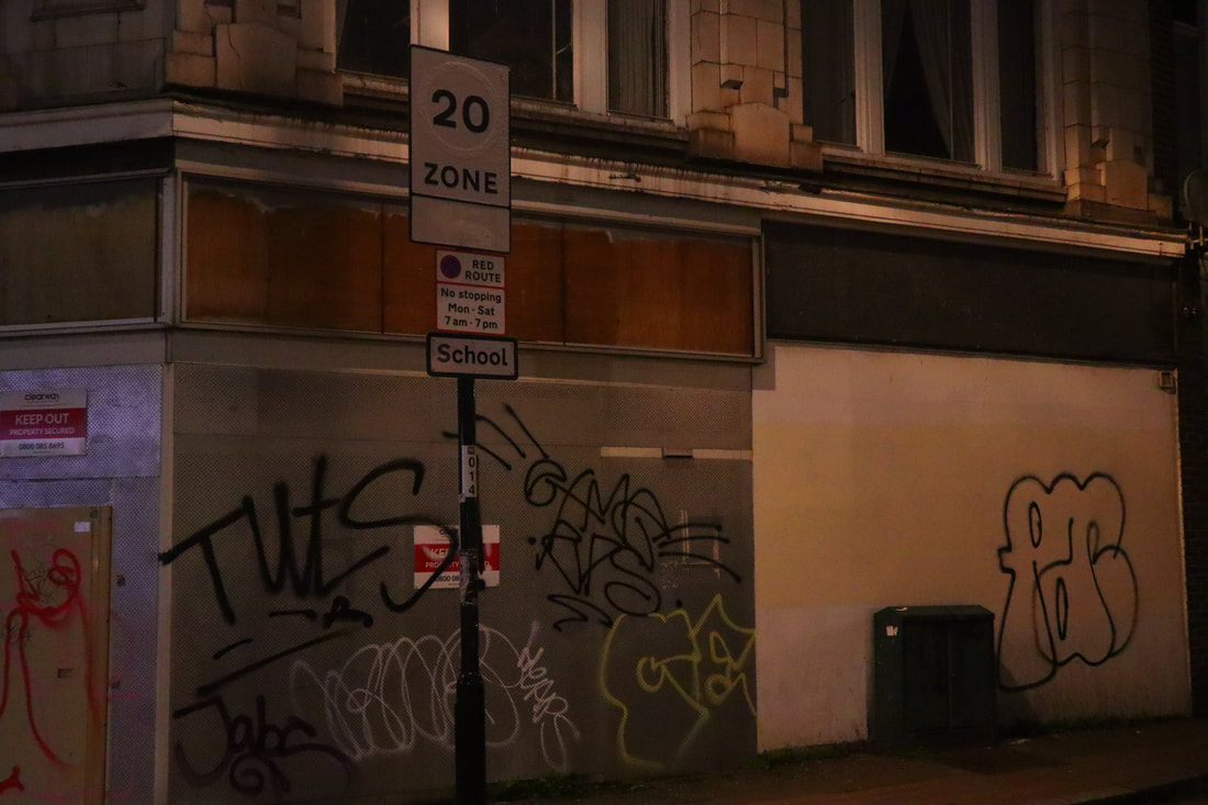
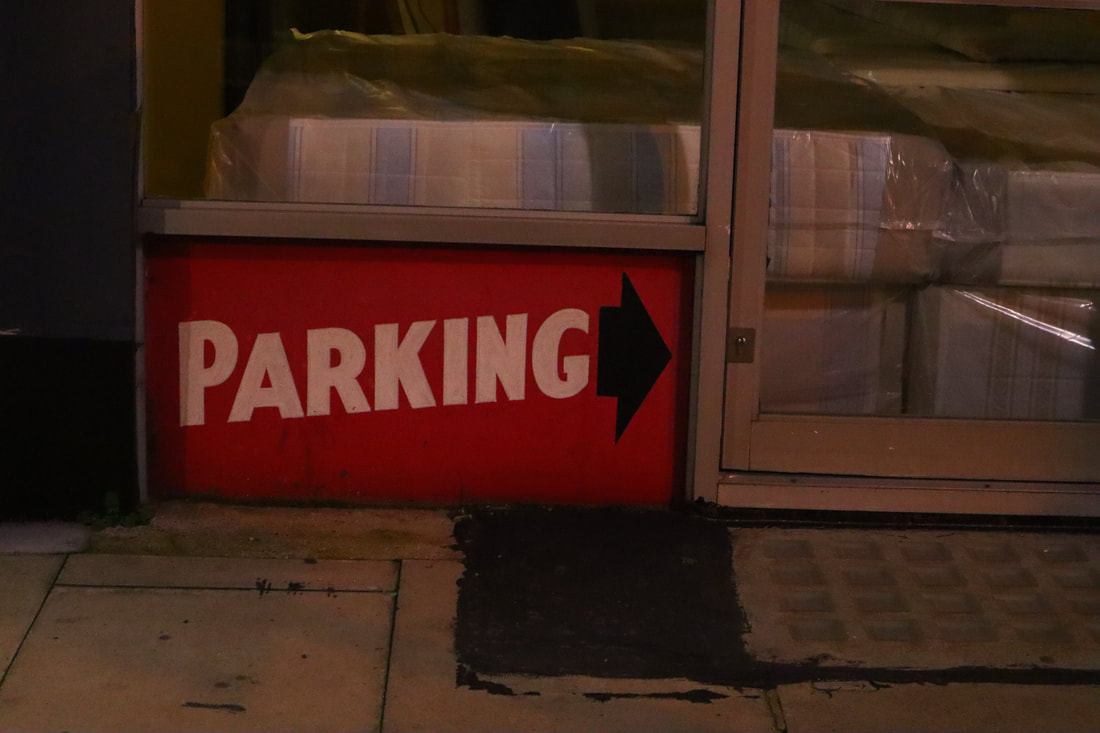
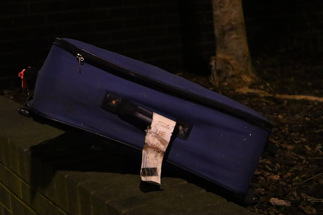
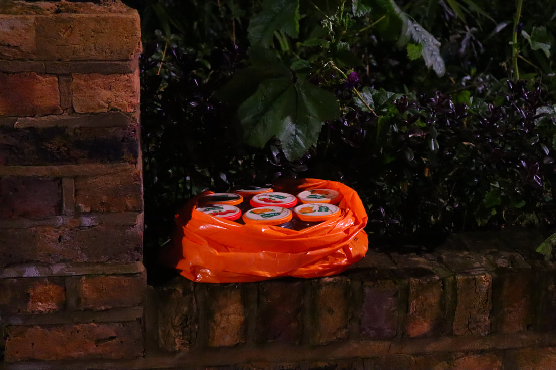
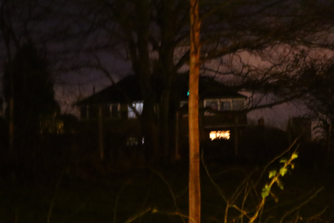
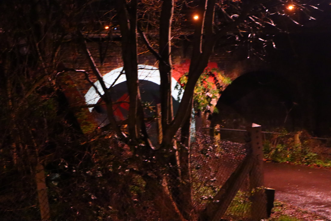
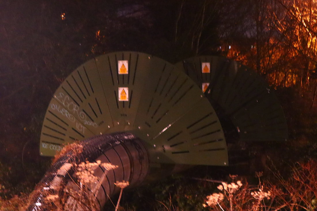
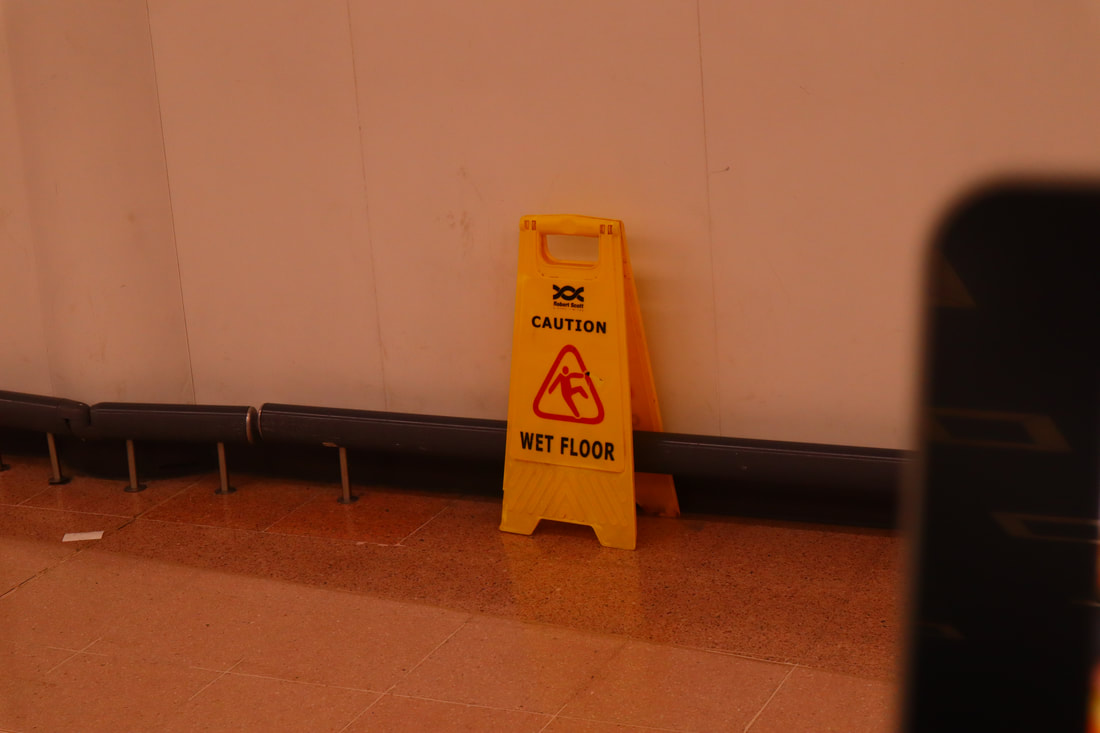
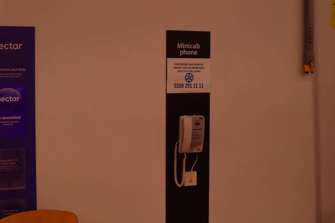
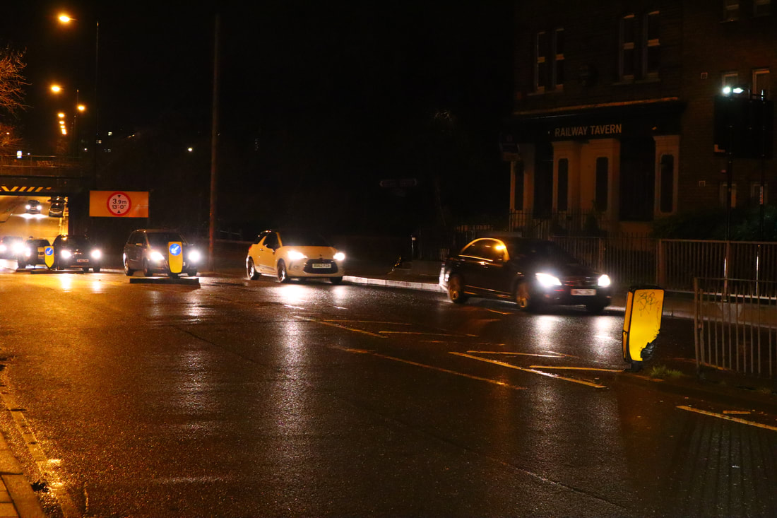
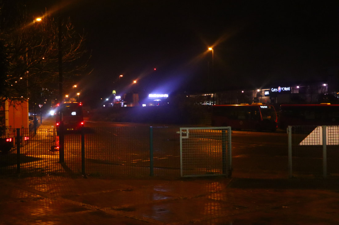
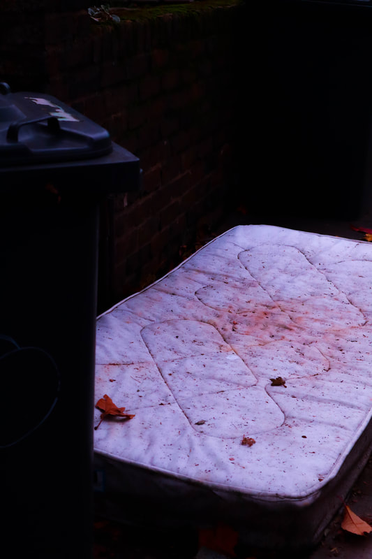
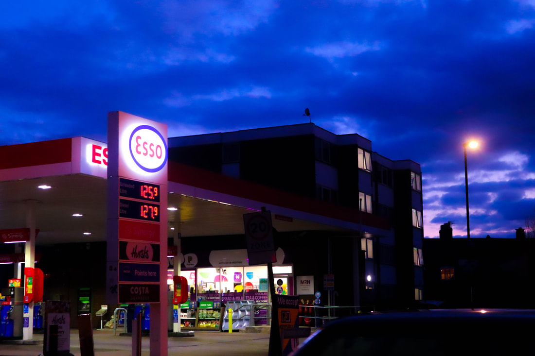
The above images were taken as part of this investigation. These span a 5 month period covering November of 2020 to March 2021. In the editing processes I cut the number of images to be a part of my final pieces down from over 100 to around 25-30. I then will cut this number down more in order to create a finalised final set of images.
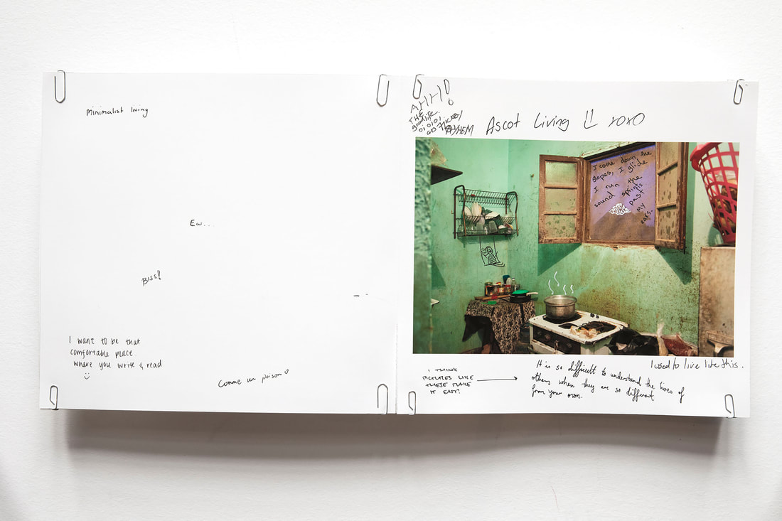
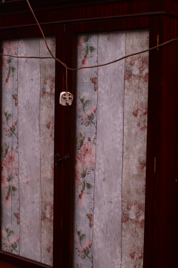
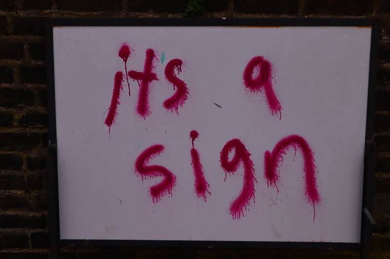
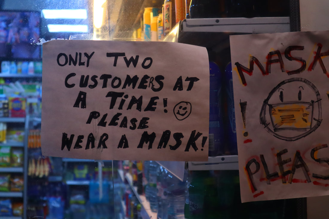
Edited images to gain responses to


Response Process:
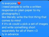
In order to gain responses from the people who would potentially be viewing my work, I decided to reach out to my friends and people who followed me on social media with the message to the right of this text.
Before reaching out to these people, I created 5 sets of images and placed either 5 or 6 images inside of these folders. I did this to make it easier for the respondent and to potentially assign people a specific set of images to view and respond to. I didn't end up assigning people sets however, I did notice that most of the respondents gravitated to the images in set 1 or set 5. This was interesting to me because I had placed them into these sets at random and some of my respondents were reading the sets as journeys that were being displayed via the specific images that were displayed in that format to them.
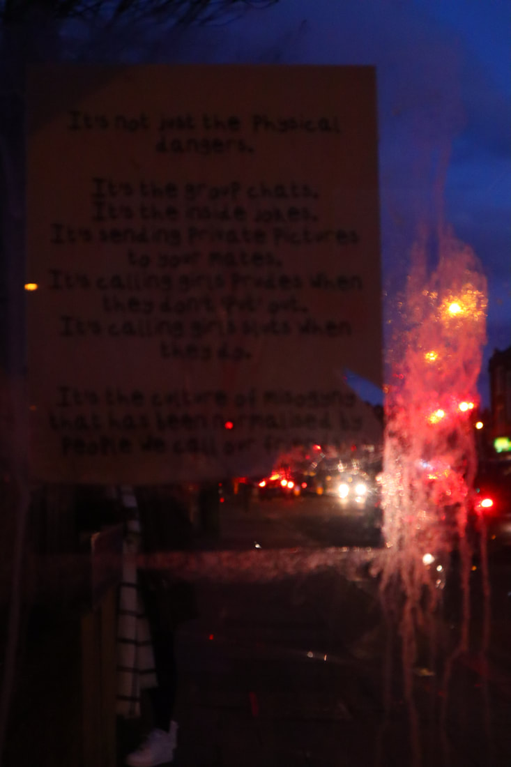
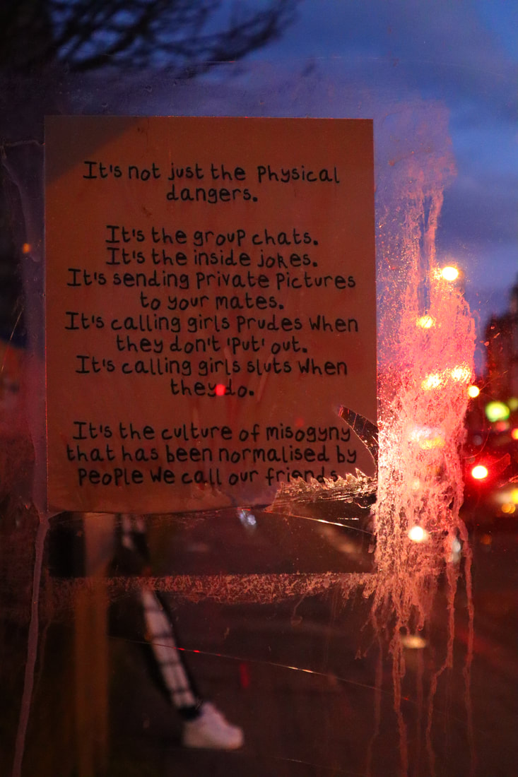
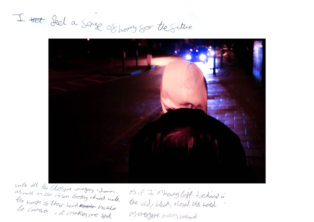
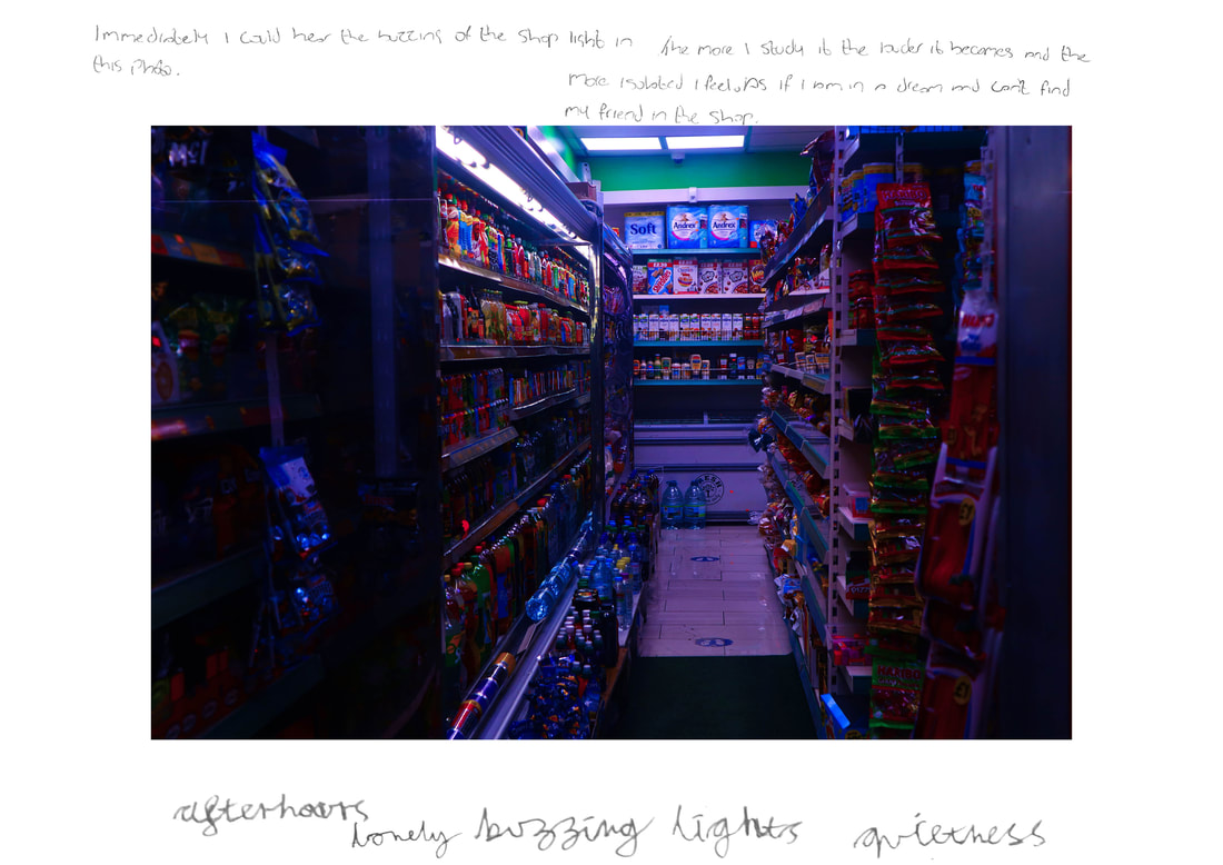
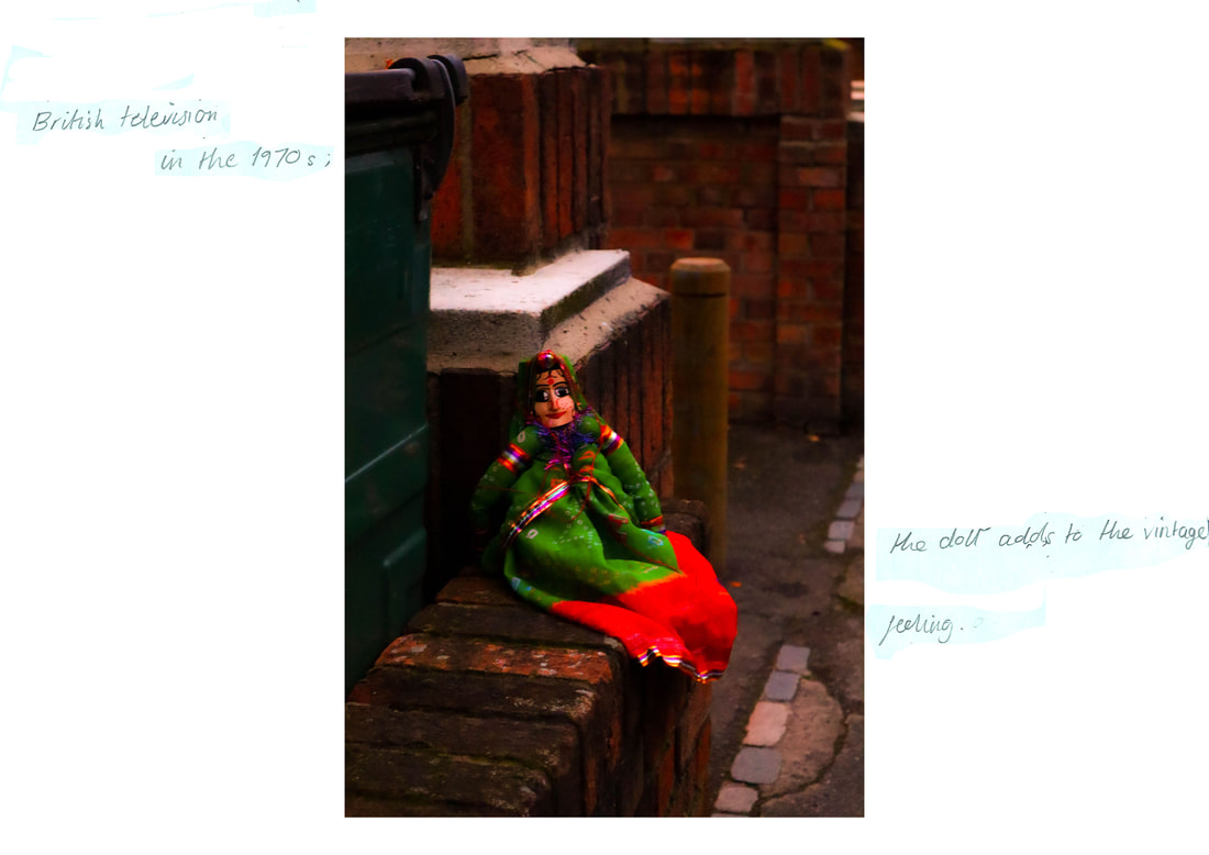
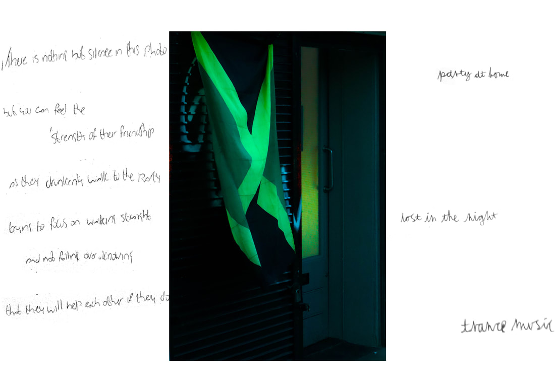
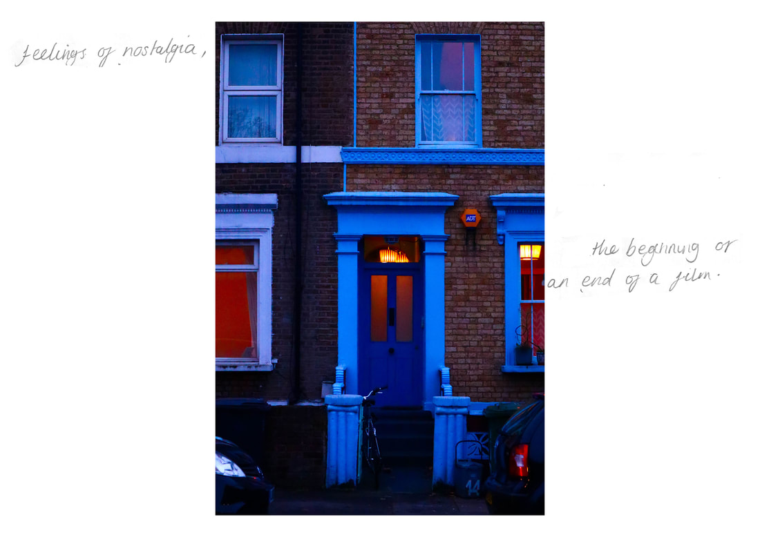
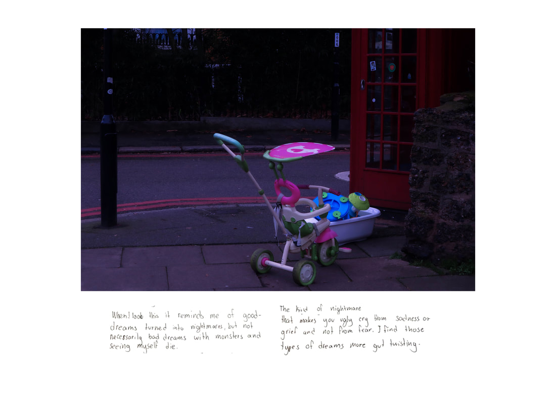
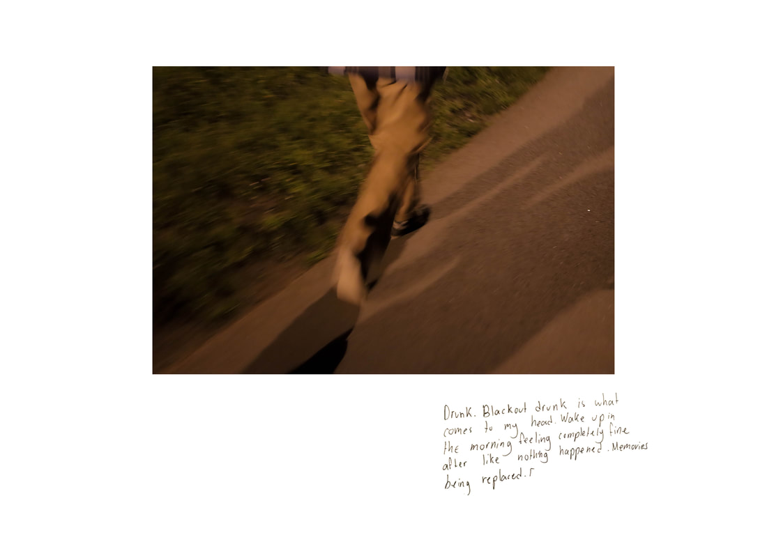
Using Adobe photoshop, I created a document, which was sized as a plain a4 sheet of paper. I placed these handwritten notes onto the document with the corresponding image being placed in the centre of the document. In order to make the notes look as though they were written directly onto the images, I used the exposure tool on Photoshop to raise the exposure until the paper in the background of the writing was a pure white. I then applied a black and white filter to the writing before saving the image.
In order to gain responses from the people who would potentially be viewing my work, I decided to reach out to my friends and people who followed me on social media with the message to the right of this text.
Before reaching out to these people, I created 5 sets of images and placed either 5 or 6 images inside of these folders. I did this to make it easier for the respondent and to potentially assign people a specific set of images to view and respond to. I didn't end up assigning people sets however, I did notice that most of the respondents gravitated to the images in set 1 or set 5. This was interesting to me because I had placed them into these sets at random and some of my respondents were reading the sets as journeys that were being displayed via the specific images that were displayed in that format to them.
Using Adobe photoshop, I created a document, which was sized as a plain a4 sheet of paper. I placed these handwritten notes onto the document with the corresponding image being placed in the centre of the document. In order to make the notes look as though they were written directly onto the images, I used the exposure tool on Photoshop to raise the exposure until the paper in the background of the writing was a pure white. I then applied a black and white filter to the writing before saving the image.
Annotated Images.
Final Piece ( Installation)
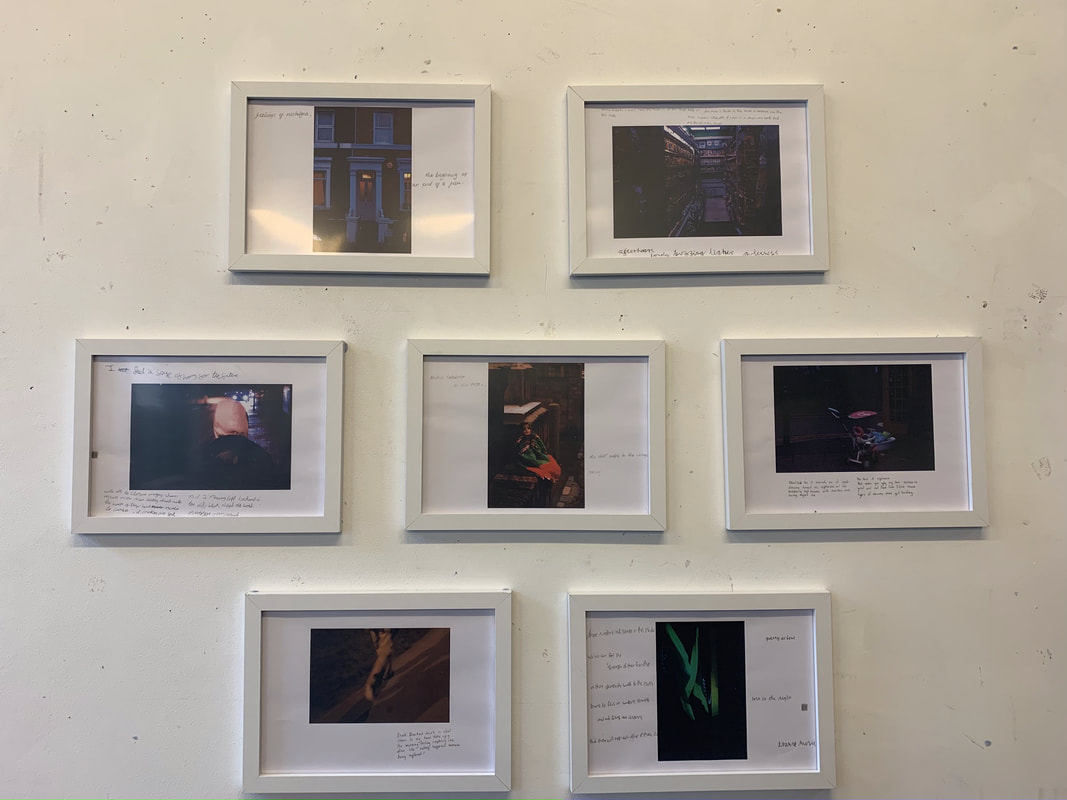
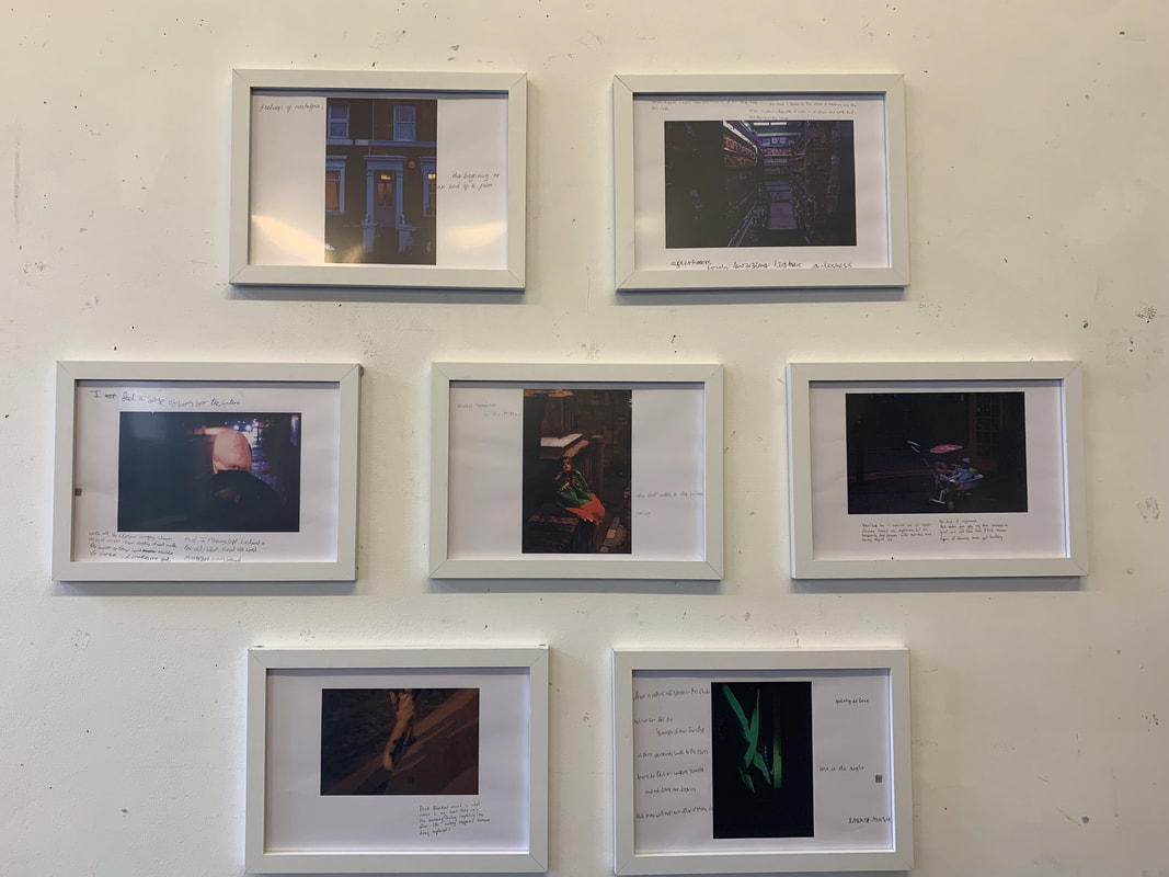
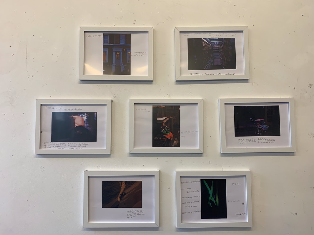
I have decided to showcase the work for this Investigation as an Installation, as if it was in an art gallery.
I chose to do this because displaying my work in this way limits the way in which the viewer can access my work, this is evident due to the fact that there is writing on the framed images, reading these may make the viewer want to add to this however they are unable to.
I also did not want the images to look very 'Professional', in the sense that most framed images in an installation would. I believe that this is an effective way of showcasing my work because it allows the viewer to have a level of interaction with my work however it does . not allow them to manipulate my work in the way that they may want to upon seeing it.
I could have improved this by making the images bigger, for example printing them in A3 rather than A4. this would make it easier for the audience to read and interact with the work on display as the text surrounding the images would be bigger and possibly more legible. Initially I wanted to have the blank images mounted alongside these so that the viewers could make their own annotations, similarly to the respondents.
