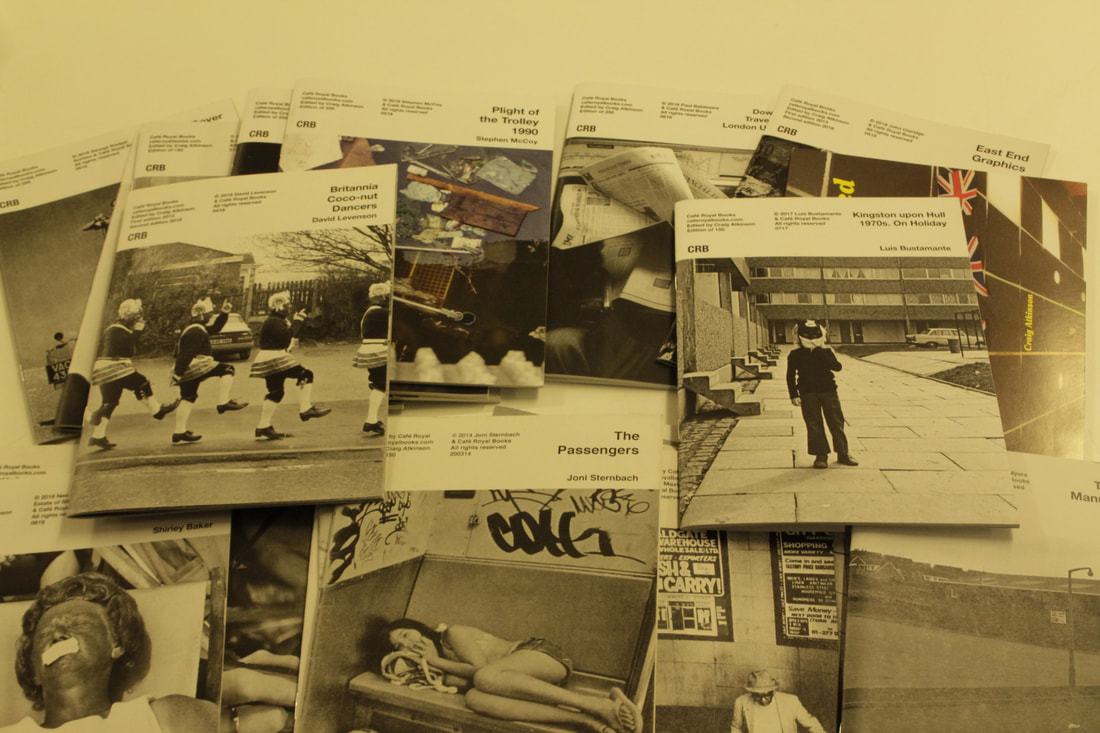
The Personal Investigation (part 1) (The Photobook)
Soviet Montage Theory / Kuleshov Effect
|
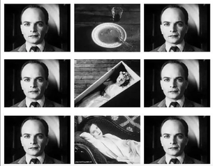
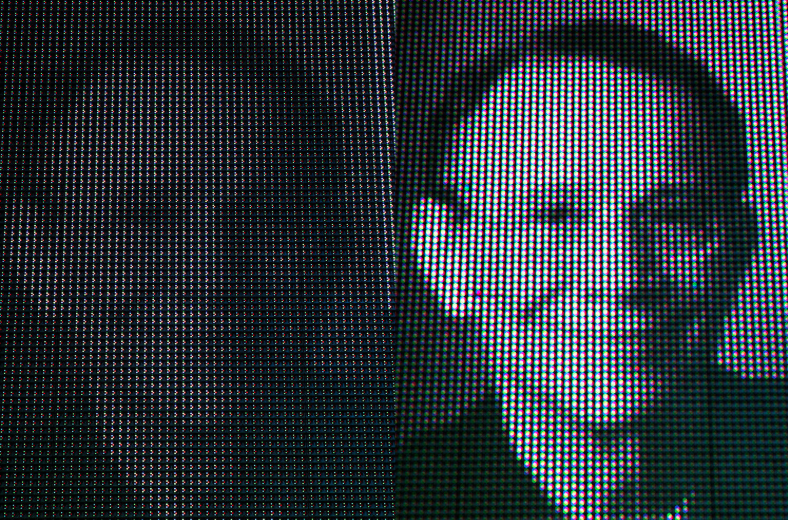
The Kuleshov effect was an editing technique used by Lev Kuleshov, who was a Soviet filmmaker in the 1920's. the Kuleshov effect shows how emotion can be manipulated by using a different shot in relation to a central shot. the most famous version of this editing technique is the version where the central shot is of a man, and the changing shots are of a bowl of soup, a child in a coffin and a woman laying on a couch. This technique is mainly used in film, however it can be used in a similar way in photography to create a diptych.
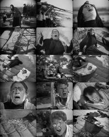
The theory of montage is accredited to Sergei Eisenstein who created the film Battleship Potempkin, which houses the famous Odessa Steps Sequence, a classic example of early Soviet montage. This is also an example of a metric montage as it follows a specific number of frames by the amount of time each frame would be on screen for, the shots involving death would be short but frequent, this was done to keep the audience sensitised to the material that they were being shown. |
Two Frame Films & Diptychs :
|
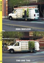
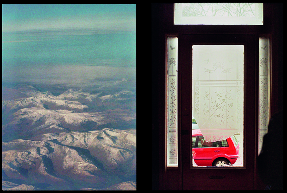
Two and Two - John Maclean:
This selection of work by Maclean involved him taking two pictures of one subject. the majority of these images have been taken from different angles or were conducted at different times, each with the other image in mind. |
|
|
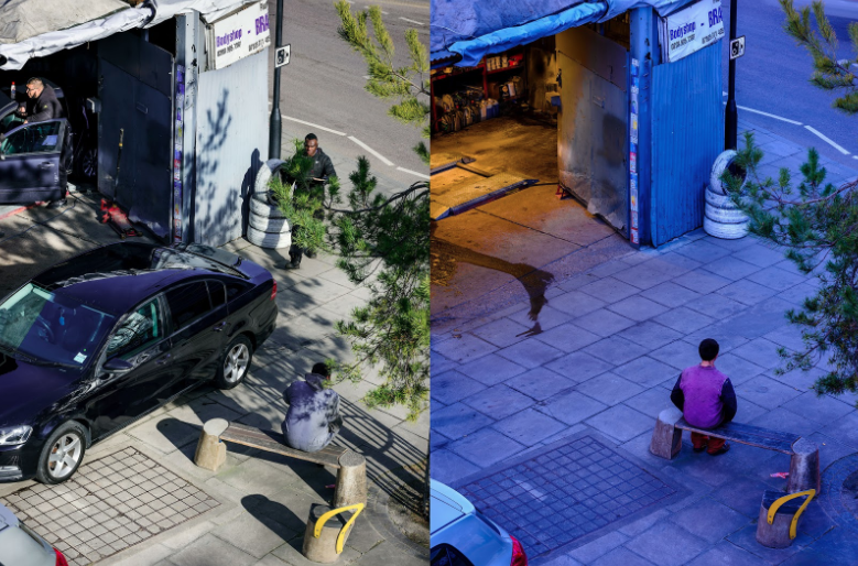
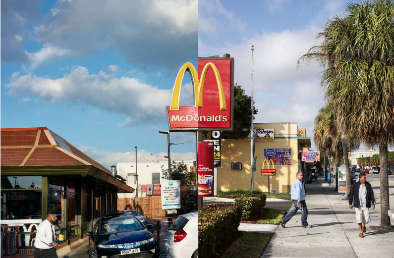
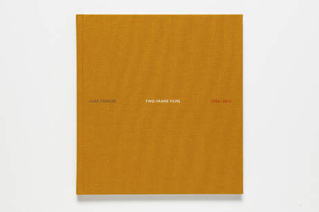
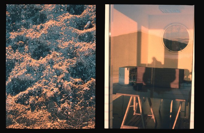
Two Frame Films - Luke Fowler
in 2006, filmmaker Luke Fowler decided to explore the fine invisible line between film and photography using a borrowed half frame camera (Olympus Pen F) which exposes two images in one single frame, resulting in 72 individual images on a regular 36 still roll of 35mm film, to document this experimentation. after developing the first role of film he was impressed by the role of chance in the created diptychs so he started a six year project using this technique of creating diptychs. the images in the photo book related to this project are aesthetically similar to film stills, partially because they were taken on film. |
|
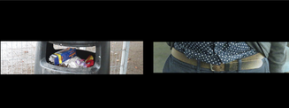
we experimented with diptychs by using a list of items that the class had come up with , alongside a random number generator. this allowed us to have less control over the outcomes of our diptych experiments. below is mine , i got the tasks of ' an overflowing bin ' and ' someones belt'.
The First Photobooks
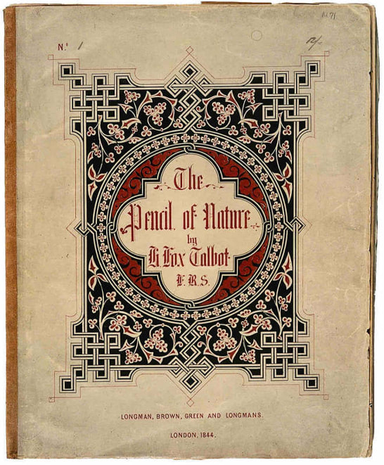
Pencil Of Nature - William Henry Fox Talbot (1844)
|
|
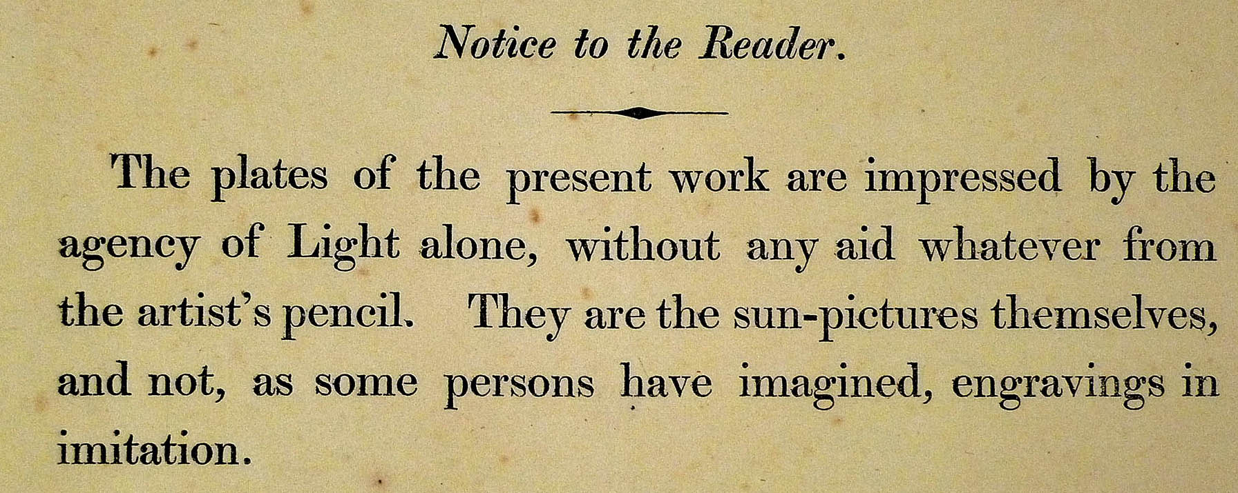
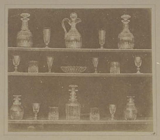
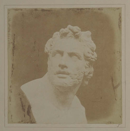
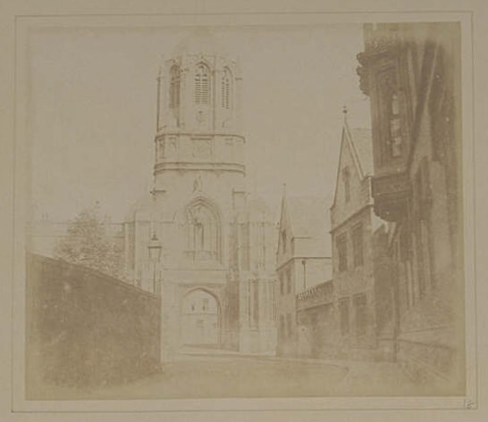
commonly hailed as the first published photobook, this book was published in several incremants from 1844 to 1846. this is a publishing method that is similar to how zines would be published in the modern photography era.
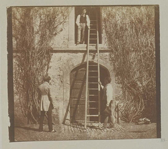
images in this book include lots of architectural photography and still life images. due to the long expose time needed to create an image in this era of photography, there is only one image featuring people in this book, the image is entitled the ladder as there is a ladder in the central section of the picture. this book features short passages of text under each image, this is to describe the scene and give the audience insight into how the image was taken. the images had been published unbound with the expectation that the buyer would bind the book themself. |
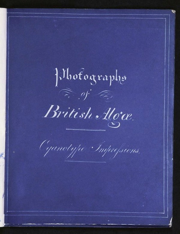
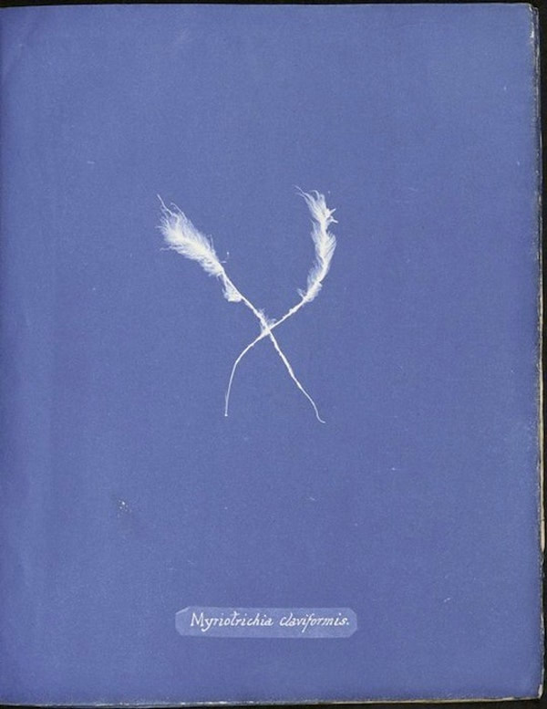
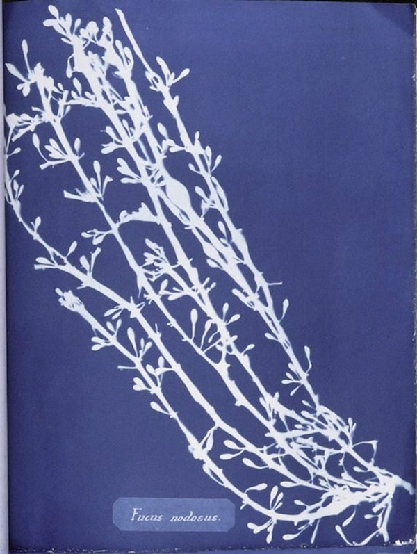
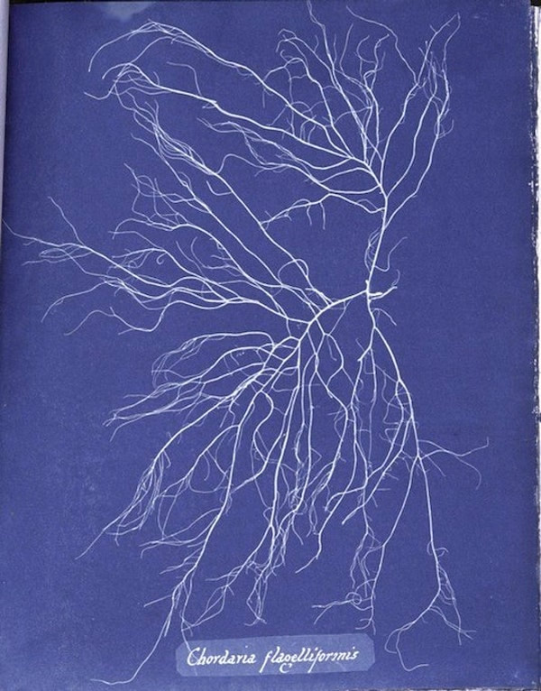
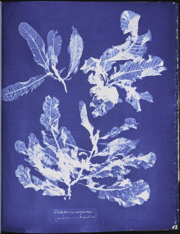
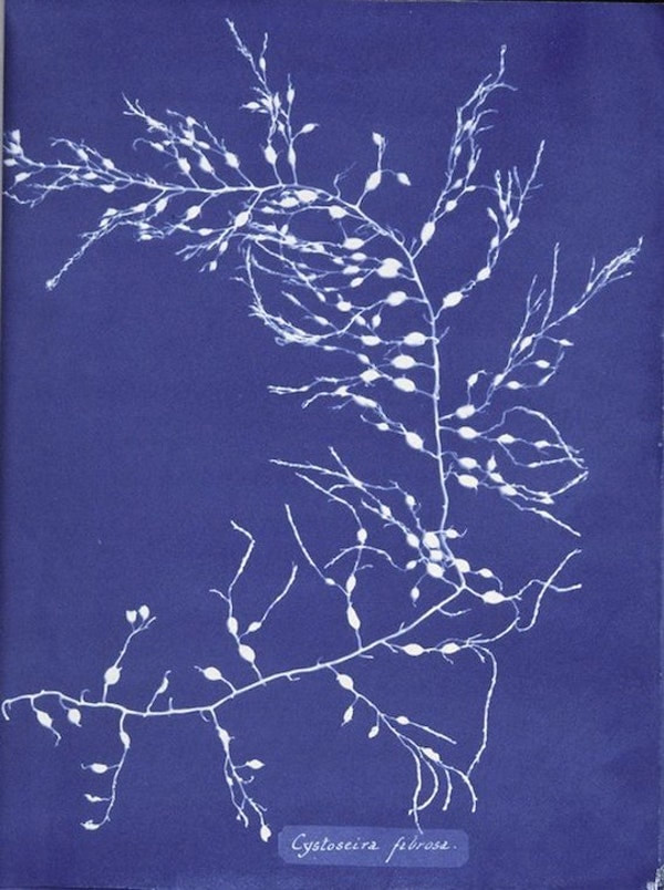
Cyanotypes of British Algae - Anna Atkins (1843)
|
Anna Atkins was an english botanist and possibly the first female photographer. Her book of cyanotypes featuring algae from the British isles was a departure from the ways of plain description and artists sketched impressions being used to document information about botanical objects.
there are only 13-20 copies of this handmade, self published book in existence, Anna had only intended this to be seen by friends , other botanists and the library that she had donated the book and it's latter volumes to. |
|
history of the photobook
the first photobook , was self published in 1843 by botanist Anna Atkins, it featured strains of algae that she had come across , the purpose of which being, to help the botanist community identify different strains of algae with ease. she had learned cyanotyping, the technique used to create this book from her friend John Herschel, who had invented it the previous year, which involved exposing light sensitive paper to natural light while the object that is being photographed is on top of it.
the following year William Henry Fox Talbot began to commercially publish his book project, The Pencil Of Nature. the images in this book were examples of calotypes, the first form of negative/positive printing in photography which was pioneered by Fox Talbot. the images were published in six instalments, originally there were many more instalments planned to be printed for this book however, due to the commercial failure of this book he was forced to finish the project at this point.
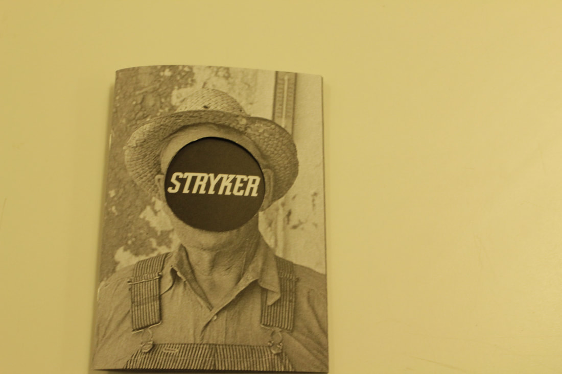
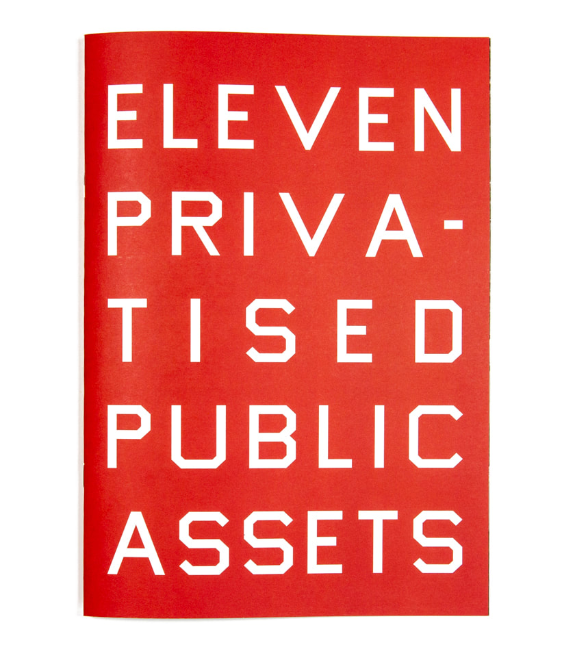
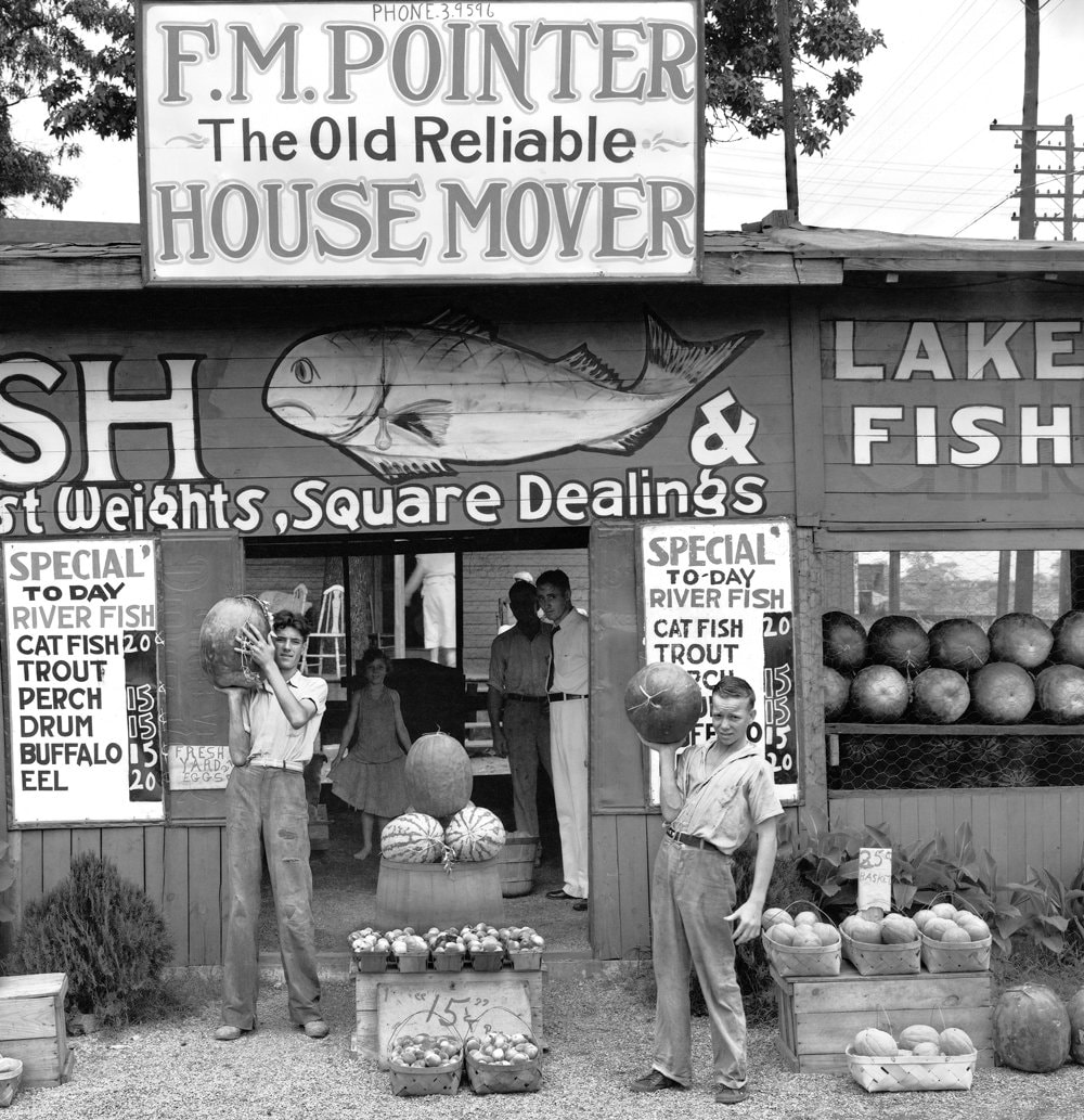
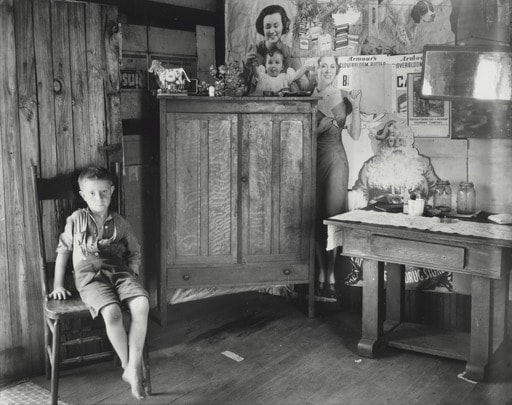
Photobooks then shifted from a means to document information to a means of Government propaganda and drawing attention to personal issues in the 1900's. an example of this is the work of the Farm Security Administration , managed by Rob Stryker.
he hired photographers such as Ben Shahn, Walker Evans & Dorothea Lange and assigned them to places in Depression era America with strict briefs on what themes that they were to photograph. he was also known to destroy the rejected negatives by punching holes into them, the accepted images were often published in magazines. though it wasn't directly a photobook this project contributed to multiple photobooks by the photographers involved.
towards the latter half of the century photobooks became more personalised, the emergence of publishing companies allowed photographers to release books about things that mattered to them. an example of this is The Ballad of Sexual Dependency by Nan Goldin , this book shows pictures taken over a number of years that focus on LGBT culture in the early 80's and the hard drug use around her. this was published by the aperture foundation, a non profit arts institution known for publishing photobooks from the mid 1960's.
In the modern era of photography , photobooks have had a resurgence due to the rise of the internet. this makes it easier than ever to create , publish and sell photobooks. the self publishing route is extremely common as it allows the photographer more control over the final outcome of their photobook as they dont have to gain the approval of a third party publishing company and will not be made to alter images.
the following year William Henry Fox Talbot began to commercially publish his book project, The Pencil Of Nature. the images in this book were examples of calotypes, the first form of negative/positive printing in photography which was pioneered by Fox Talbot. the images were published in six instalments, originally there were many more instalments planned to be printed for this book however, due to the commercial failure of this book he was forced to finish the project at this point.
Photobooks then shifted from a means to document information to a means of Government propaganda and drawing attention to personal issues in the 1900's. an example of this is the work of the Farm Security Administration , managed by Rob Stryker.
he hired photographers such as Ben Shahn, Walker Evans & Dorothea Lange and assigned them to places in Depression era America with strict briefs on what themes that they were to photograph. he was also known to destroy the rejected negatives by punching holes into them, the accepted images were often published in magazines. though it wasn't directly a photobook this project contributed to multiple photobooks by the photographers involved.
towards the latter half of the century photobooks became more personalised, the emergence of publishing companies allowed photographers to release books about things that mattered to them. an example of this is The Ballad of Sexual Dependency by Nan Goldin , this book shows pictures taken over a number of years that focus on LGBT culture in the early 80's and the hard drug use around her. this was published by the aperture foundation, a non profit arts institution known for publishing photobooks from the mid 1960's.
In the modern era of photography , photobooks have had a resurgence due to the rise of the internet. this makes it easier than ever to create , publish and sell photobooks. the self publishing route is extremely common as it allows the photographer more control over the final outcome of their photobook as they dont have to gain the approval of a third party publishing company and will not be made to alter images.
The History of the Zine
|
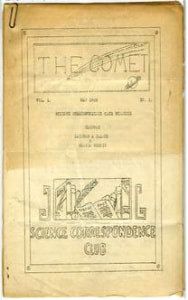
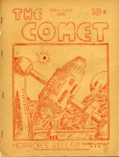
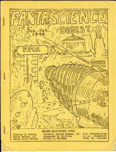
The creation of the zine is often accredited to 1930's sci-fi fan culture, the title of the first Fanzine, as they were then called, is often awarded to 'The Comet' by the Science Correspondence Club in Chicago. This started a trend in the Sci-Fi fan community with the most well renowned fanzine being the ' Fantasy Commentator ' , which ran non continuously from 1943 until 2004. Zines became so important to the Sci-Fi community that even in the 50's there were awards given out for the best fan created zines.
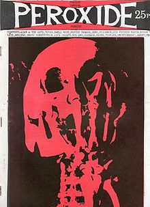
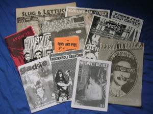
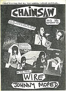
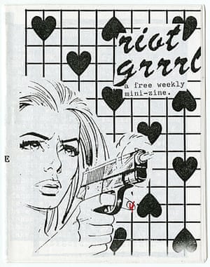
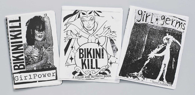
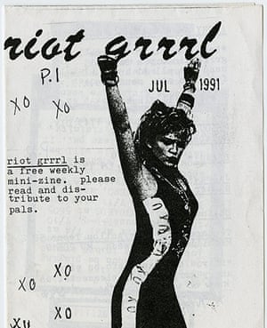
There was a rise in Zine culture when the punk movement started in the 1970's. This was due to the DIY essence of the punk scene where ' if you knew 4 chords you could form a band' became in a sense, ' if you can make a gig poster you can make a zine' . Some of the most popular of these punk era zines were based in the uk, as was the heart of the punk scene, the first being called 'Sniffin Glue' after a lyric from a Ramones song, these had a very DIY feel with pieces being cut from leaflets, other magazines, posters and newspapers, having a similar iconography to the iconic ' Sex Pistols - God Save The Queen' artwork that is so associated with punk style. There was a resurgence in zine culture in the 90's alongside the emergence of riot grrrl culture, which started with a Zine of the same moniker. this took the male dominated punk and grunge scenes and put women mainly at the centre of the alternative scene, with themes of feminism and politics throughout. This led to many women forming punk inspired bands , with some of these having Zines attached to them, such as Bikini Kill , who ran a zine of the same name, with another member of the band running a zine entitled Jigsaw. Zines have seen a reemergence in the modern era, with the cost of publication being low, many photographers and artists are displaying there work in this format, as opposed to a photobook, which could be costly to make and requires a certain amount of images as opposed to a leaflet style zine which could have as little as 5 images. |
|
|
American Photographs - Walker Evans (1938)
American photographs is a photo-book published in 1938 by the photographer Walker Evans, this detailed the effects of the Great Depression on families in rural American areas, to give insight into their lives. This was the first exhibition to feature a solo photographer in the MoMA in New York. He was hired to do work for the Farm Security Administration, under the direction of Rob Stryker, who was known to be a perfectionist in his set brief, which he continued to do until 1938, the year of the book's publication |
|
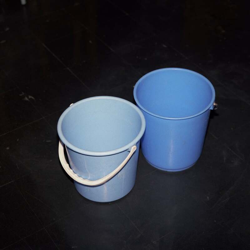
Two Blue Buckets by Peter Fraser (1988)
this book, published in 1988, is home to several of Fraser's projects , "Twelve Day Journey, The Valleys Project, Everyday Icons and Towards an Absolute Zero." these were exhibited spanning the 4 years before its publication and ultimately led to the books existence.
the images in this book don't contain many people, giving the places featured here a lifeless feel, this is similar to what i want to achieve in my own photobook and was a good starting point while getting page design and general inspiration.
Gerontion - Christian Micheal Filardo (2019)
Geronation gets its title from the name of the famed TS Eliot poem that is a monologue that describes the thoughts of an elderly European man after world war one, this is reflected in the book's cover text, which is an extract from the poem: 'Thou hast nor youth nor age, But as it were an, after dinner sleep, Dreaming of, both,' the images in this book were shot on coloured film, which i feel was the best choice for this book as the images have been described as "the mirror to the artists meandering" & 'an account of my gaze and my dreaming'. the photos being shot this way allow the images to achieve a dreamlike aesthetic /feel , that i feel is done effectively in this book. they also have a vintage quality to them that in turn gives them a darker feel . allowing the viewer to interoperate them as an obscure journey in a dreamlike reality or in a nostalgic way.

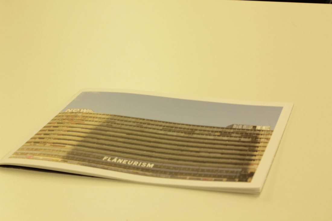
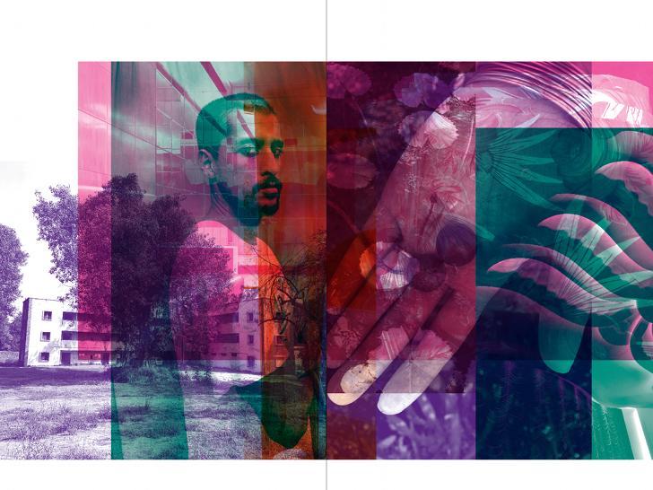
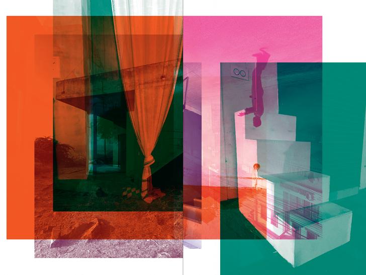
new good luck - Shirana Shabazi (2019)
this photobook features a series of photographs taken by the photographer during a 3 month visit to India, the images are often of people in a landscape or in an space that features interesting architecture.
the layout of the book is quite interesting as it has been deconstructed by light/ colour curves and put back together in a layered way where the edges are placed over the end of the image and you van see the individual colour layer. another way that the layout is interesting is because the title and authors name are not fully printed on the front and back covers. the book also can be read back to front and upside down. this shows an unconventional method of design being used effectively to have the pages and covers of the book layed out in an interesting way, that will catch the audiences eye.
the layout of the book is quite interesting as it has been deconstructed by light/ colour curves and put back together in a layered way where the edges are placed over the end of the image and you van see the individual colour layer. another way that the layout is interesting is because the title and authors name are not fully printed on the front and back covers. the book also can be read back to front and upside down. this shows an unconventional method of design being used effectively to have the pages and covers of the book layed out in an interesting way, that will catch the audiences eye.
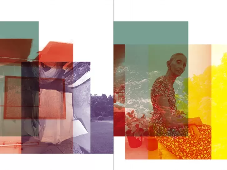
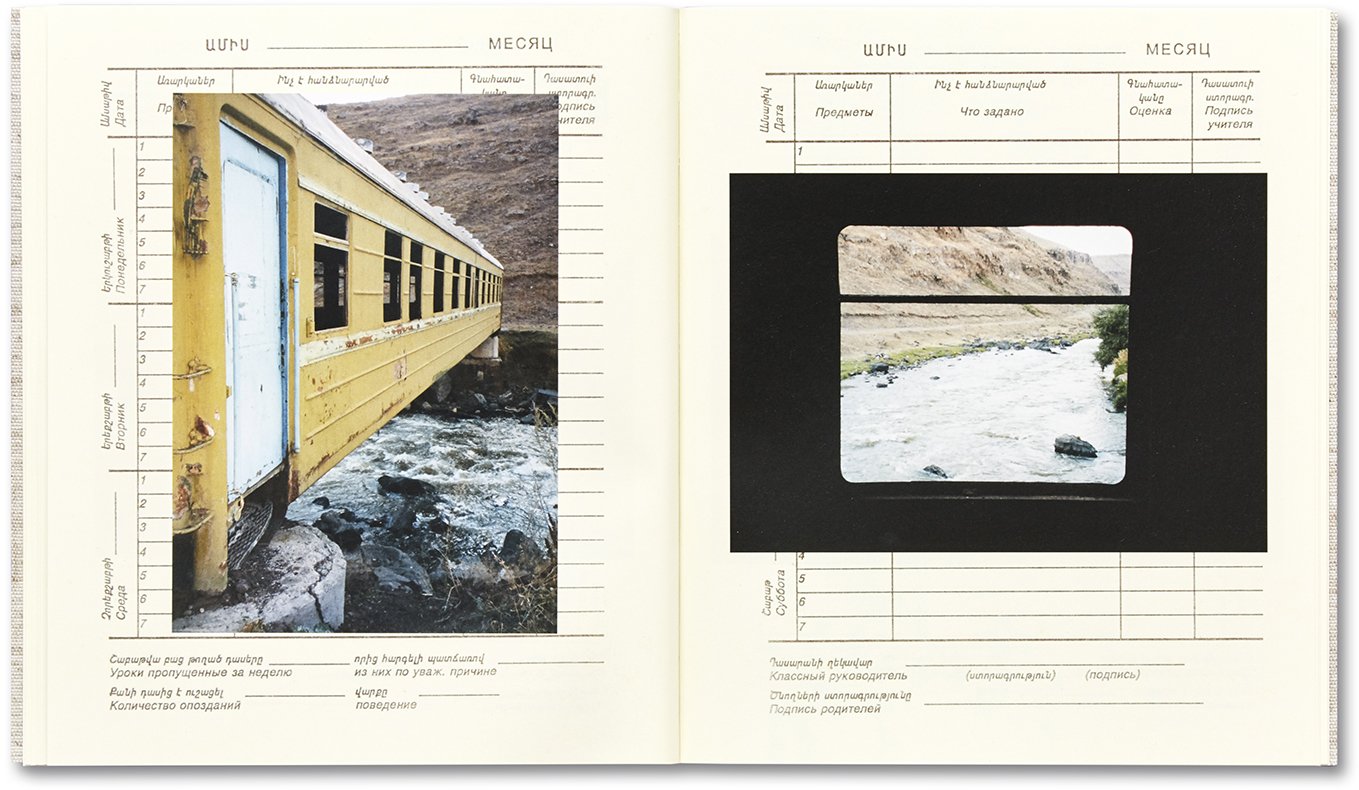
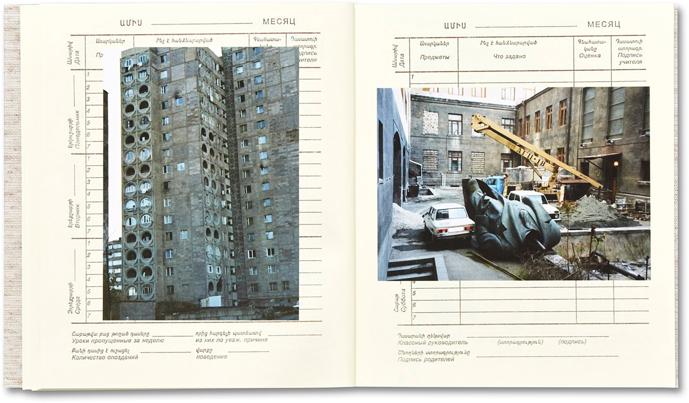
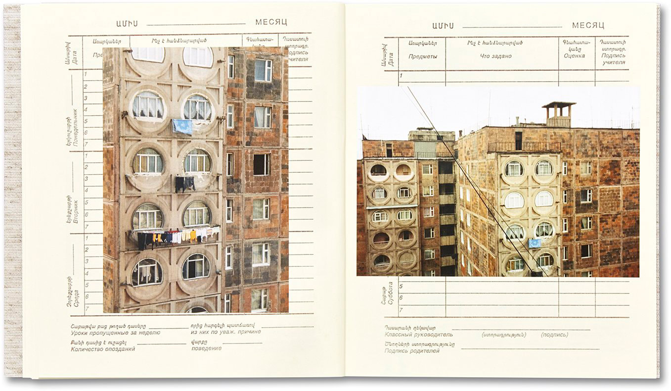
yerevan - ursula schultz-dornburg (2019)
this book, i would say is not your typical photobook, due to the fact that it want inetended to be publishes while or after the pictures were taken, instead the images from a trip to Yerevan had been compiled into an armenian school diary and given to her daughter. this book has been described as "A poignant travelogue from a mother to a daughter" as it documents her travels through the city's remote sites. the mixture of black and white images and colour images, i feel shows two sides to the city, one that is hopeful and one that appears to be more derelict.
this book is the only book i have seen at this time that has been designed in this way. its an extremely creative way to display a piece of photography work. it inspired some ideas i had for displaying my own work, as my work mainly centers around memories and nostalgia
this book is the only book i have seen at this time that has been designed in this way. its an extremely creative way to display a piece of photography work. it inspired some ideas i had for displaying my own work, as my work mainly centers around memories and nostalgia
Photobook Research
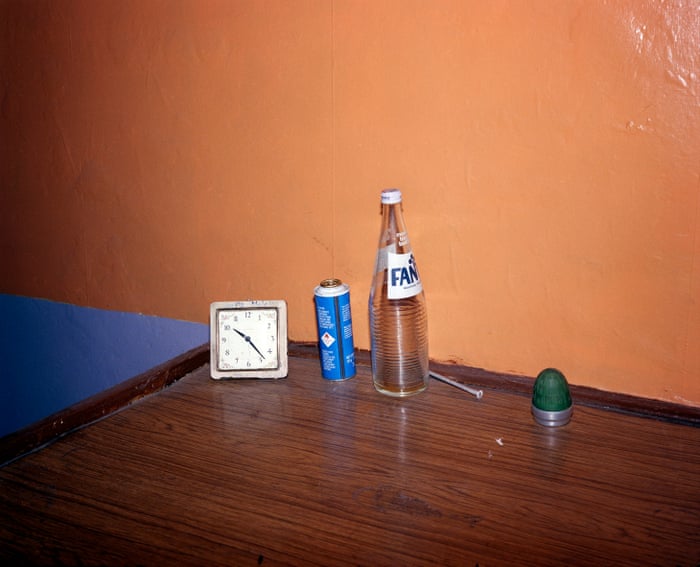
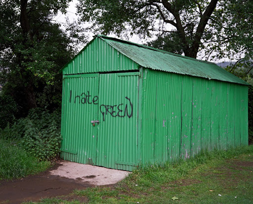
During the first photoshoot for my photobook, i went back to the area that i lived in and the area that i frequented when i was a child, around year 4 - year 6 in primary school. I felt a sense of fascination upon seeing how these places had changed, improved, become deserted or had become breeding grounds for drug use, often with paraphernalia scattered around them.
A common theme here is that they all looked mainly abandoned or had little activity of life in them due to timing etc. but the viewer could still see that there was activity there at one point in the near past. i achieved this by taking images that has mainly no people in them and of parts of places that looked exceptionally derelict.
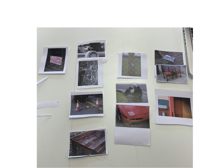
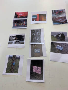
sequencing challenge
we were set a challenge to sequence a selection of 12 of Mr Nicholls' recently taken images as though they would be featured in a photobook.
I had two seperate versions of the sequenced images, with the intentions to have the both of them take very different routes with the same base images . in my first sequence i placed the sign that says ' closing down' first so that it would tell a narrative of a place that has recently been closed. in my second i placed the image of a car bonnet first so that it would tell the narrative of a car crash and the effects it has had on a place.
I had two seperate versions of the sequenced images, with the intentions to have the both of them take very different routes with the same base images . in my first sequence i placed the sign that says ' closing down' first so that it would tell a narrative of a place that has recently been closed. in my second i placed the image of a car bonnet first so that it would tell the narrative of a car crash and the effects it has had on a place.
|
|
book dummy
my dummy book was mainly un complete, this is due to me not having a title for my book and having not written the text and captions to go along with some of the pictures. due to my book having a lot of pages i had to resort to gluing the binding together. for this i opted for short edged binding, for it to have a notebook feel . i would like for the finished product to experiment with ring binding or regular book binding.
currently my book has nearly 20 images, i will go back and re edit some of the images as they look quite dark and i have a mixture of landscape and portrait images, this means that i would like to have my images slightly off centre on squared paper. to have a slightly a-symmetic / left of centre feel to it.
i'm looking at getting my final product printed by a POD service. however this may mean i have to sacrifice the idea of having the book bound at the top of the page and instead having to adopt a long edged bound book idea, unless i were to design the entire book sideways.
Im going to add an introductory piece of writing, explaining what i chose to focus on and Why i had done this, this writing will also explain the title, of which i havent got a final version of. However, i will have thought of one and started designing the physical version of my photobook by the 13th of March.
Final Product
due to the situation around the pandemic, i have not been able to get my book printed as i want it to be, i have designed it so that it opens as though it is a short bound book, with everything being rotated towards the binding in the center of the pages, this looks weird on the file and in the pdf version. i thought about printing them myself and binding them, which i was considering from the beginning before dismissing it and opting to professionally bind it. after considering it again, i have again not decided which method i will choose to do when i can and will probably do both, to see which i prefer.
i had the main arrangement of images fixed in my head after completing a dummy version of the book, however i added a couple of images that i had formerly cut from the selection, back into the book as i grew to love them as i loved the images that i had always picked to be in the book.
i designed the front cover , back cover and 1st page on Photoshop, using the font 'splendid 66' that i downloaded from Dafont.com. i used the same aspect ratio as the book would be in, however i did this all 'right way up' so that i could rotate it in bookwright.
i have uploaded the pages of this book to my weebly as a slideshow, so that it can be viewed in my intended order as i await a physical copy.
